
 look book

latest
habitat tv

Say goodbye to the morning scramble for keys, coats and sunglasses and hello to this… see this and more videos
blog
Reader roundup: Public murals and powder blues
A Morningside mural, an exterior refresh, and striped walls. Let these projects be your inspiration… more
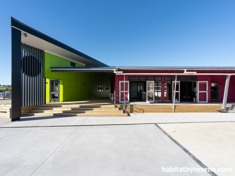
In order to service a growing roll, Ruakākā School has invested in a combined new build and renovation project, which has resulted in upgraded facilities and a colourful palette including Resene Christi (left) and Lipstick. Photo: Up Imagery.
A colourful makeover designed to help students SHINE
11 Aug 2026
The Northland settlement of Ruakākā has been slowly but steadily growing since the 1980s. This includes the roll for the local primary school, originally opened in 1898 and operating from its current location since 1912.
In response, the Ruakākā School Roll Growth Project represented a significant investment in the school’s future, combining the construction of seven new classrooms, a new administration block, and a new staffroom, created from an existing building, with a comprehensive repaint of the existing school facilities, says Sarah Bertie, Director of designgroup architects h+k.
“This large-scale project offered a unique opportunity to create a unified, vibrant and future-focused learning environment. At the heart of the design approach was the school’s well-established SHINE principles – S: Shows Respect, H: Helpful, I: Inclusive, N: Never Gives Up, E: Environmental Guardians – each symbolised by one of the school’s five SHINE colours: yellow, pink, orange, purple, and green. These values served as both the conceptual foundation and the visual inspiration for the entire colour strategy.”
Programmatically, as well as integrating new with old and repurposing existing infrastructure, the project also had to take into account site constraints, as well as ensuring that the school remained fully functional during works.
“The school sits in a flood plain, so floor level was critical to establishing enough freeboard for possible flood events. Likewise, available greenspace was at a premium, with the school landlocked between Sandford Road and neighbouring farmland.
“The final design, then, was shaped by the setting of this floor level, and the relatively small area we had to work with on the rear field. The ground conditions did not favour a two-storey development and that also wouldn’t have been in keeping with the character and scale of the school. Single-level construction was made efficient through the use of pre-nailed wall frames and simple truss construction with rafters over the verandah, which links all the classrooms back to the office and staffroom for all weather use.”
The repainting of the existing school was an essential component of bringing cohesion to the expanded campus. Many surfaces required detailed preparation, including cleaning, repair and sanding, ensuring that the new finishes would perform well over time, says Sarah.
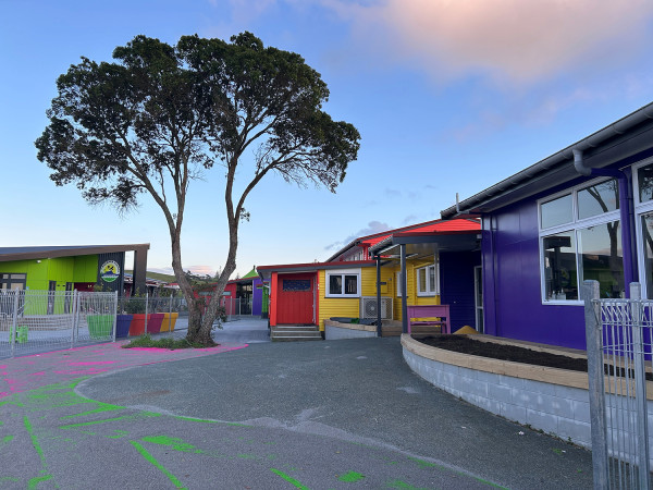
Colour was used as the unifying link between the existing campus on the right and the new build on the left. Each of the colours used – Turbo, Lipstick, Sebedee, Blue Diamond and Christi – correspond to one of the school’s SHINE principles. Photo: Up Imagery.
“The painters navigated the complexities of working in an operational school environment with professionalism and care, staging works around school hours and maintaining safe, accessible areas for staff and students. The consistency in application across both older and newly built structures highlights the team’s skill and attention to detail, as well as the quality of the Resene product, resulting in a seamless visual transition throughout the site.
“The five Resene colours – Turbo, Lipstick, Sebedee,Blue Diamond and Christi – were each chosen as representative of one of the school’s SHINE principles. These colours are further enhanced by the use of Grey Friars for the roofing and trims, serving to ground the design.”
Sarah says, feature elements in SHINE colours offer visual cues that reinforce the school’s values in an everyday, intuitive way. These touches spark student engagement and give each learning space its own identity while maintaining overall cohesion. The administration and staffroom areas feature a more refined interpretation of the SHINE palette – subtle accents that reflect the school’s culture in a professional, welcoming manner.
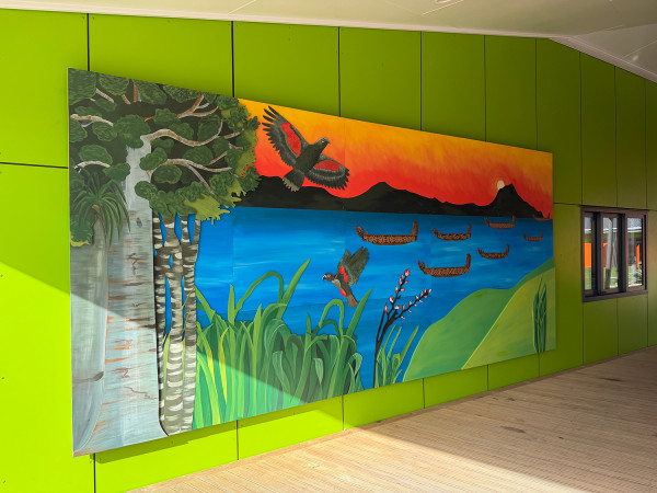
Resene Christi is the perfect backdrop to the vibrant mural that students helped complete prior to the commencement of the project. Photo: designgroup architects h+k.
“Resene’s extensive colour range allowed for the selection of hues that are bright, engaging and meaningful without overwhelming the architectural form. The final palette achieves a careful balance between playful vibrancy for students and long-term durability appropriate for a high-use school environment. This project demonstrates how thoughtful colour design and expert craftsmanship can elevate educational spaces far beyond functional requirements.
“The new and revitalised buildings at Ruakākā School now embody the SHINE values not just in message, but in form, colour and experience. Through the skilful use of Resene products, the school has gained an inspiring, vibrant and durable environment that will support generations of learners to come.”
Published: 11 Aug 2026