
 look book

latest
habitat tv

Say goodbye to the morning scramble for keys, coats and sunglasses and hello to this… see this and more videos
blog
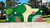
Reader roundup: Public murals and powder blues
A Morningside mural, an exterior refresh, and striped walls. Let these projects be your inspiration… more

Resene Technical Director Colin Gooch.
The never-ending story!
11 Aug 2026
By Resene Technical Director, Colin Gooch
In March 1982 I wrote an Architect’s Memo entitled ‘Sensational Colour,’ playing with the dual meaning of the word ‘sensational’. Between-times I came across Fernand Léger’s lines “Colour is a human need like water and fire. It is a raw material indispensable to life.” I much prefer Monsieur Léger’s words to mine!
Colour has ever had an emotional effect on humankind. It is remarkable just how many mythologies have conceptualised rainbows as a bridge to the Gods and the paradise wherein they dwell – not dissimilar to visiting your local ColorShop! The ancient Greek philosophers referred to rainbows, amongst other thoughts, as ‘total light’ which is staggeringly close to what Isaac Newton taught us many centuries later. Newton established, by passing beams of light through prisms, that visible light consisted of a variety of wavelengths, each of which travelled through the glass at different speeds. Stunningly, he saw that each of the different wavelengths had their own unique colour, mimicking, exactly, the rainbow. He then confirmed that this was not just an effect of the prism by passing his ‘prismbow’ back through an inverted prism and re-forming white light.
So, colour became established as a series of wavelengths within daylight needing only an appropriately sensitive receptor, such as our eye, to reveal it. This leads to the two ways in which colour can be produced and the fundamental way in which they differ.
The RGB system, used to produce colour by TVs, computers etc. contain three light sources, red, green and blue which can produce the whole gamut of colours by intermixing. Because the colours are produced by adding light, the colours are called ‘additive’ and every bit of light added makes the colour lighter. In fact, equal mixtures of the three lights, each at the same intensity, results in no colour at all! Simply ‘white light’!
Pigments, and dyes, work in a very different way. A pure, bright red pigment appears so to our eye because the pigment’s make up is highly selective; when light hits it, it will only reflect the red wavelengths and will absorb all of the rest. If one views this pigment in blue light (i.e. it contains no red light to reflect back to one’s eye) it will appear black.
Pigments, of course, can be blended to create other shades but each coloured pigment or tinter added will absorb or subtract light, and each addition in this ‘subtractive’ system will make the mixed colour darker. The more pigments/tinters that are used to achieve a colour, not only does the colour become dirtier and drabber, the ability to keep repeating the colour accurately becomes near impossible. A would-be colour-matcher who cannot reach a shade with three tinters plus their base will be asked to find another calling!
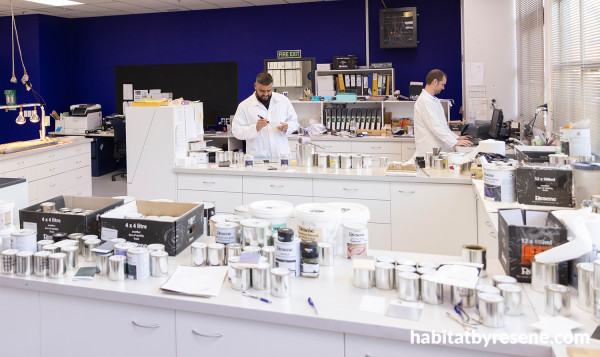
The Resene Colour Lab.
Colour has always been sought after and valued and was always associated with the wealthy and powerful. The most famous example is Tyrian (or Royal) Purple of which “twelve thousand snails of Murex Brandaris yield no more than 1.4 grams of pure dye, enough to colour only the trim of a single garment”. Royal Purple indeed! The semi-precious stone lapis lazuli was next on the list, being ground into the pigment ultramarine - and I guess that we shouldn’t leave gold leaf off the list either!
Many pigments were based on toxic metals which also had alluring chromophores – lead was used into quite modern times! Most notorious was a pigment discovered in 1775 called, eponymously, Scheele’s Green. This bright yellow–green pigment, based on copper arsenite (and extremely toxic) went viral in the 19th century – Queen Victoria herself used wallpaper based on it in several rooms in Buck House! When a German diplomat house guest was brought to his knees blaming the ‘ghastly’ wallpaper, her (shocked) Majesty immediately ordered all of the affected rooms to be stripped – and the rest of England followed suit!
The development of safer, cheaper, synthetic pigments saved lives, parts of the mollusc eco-system and pockets. Pre-eminent was a gifted young chap called William Perkins whose talents in chemistry became evident at a very young age. At 18, whilst trying to synthesise quinine from coal tar, one of his experiments went horribly wrong and he ended up with a black sludge in the bottom of his reaction flask. Trying to clean his flask with alcohol he saw that the solution became an intense, beautiful shade of purple. Perkin’s Mauveine not only became a society sensation but laid the foundations for the modern organic chemicals, pharmaceutical and artificial flavourings industries.
Every coloured pigment by definition, contains a chromophore – an arrangement of atoms within the molecule which determines how it interacts with light and which determines its colour. If the chromophore is robust, the colour endures; if it gets damaged, so does the colour, often disappearing entirely. And not all chromophores are built equal! Chrome Green Oxide can resist UV light, water, solvents, acids, alkalis and extreme heat virtually ‘ad infinitum’; some, like most plant derived dyes, can fade in moonlight!
So, chrome green oxide is a great pigment to use? Yes, but intelligently! One can blend chrome green with say, a synthetic orange, to produce an attractive range of tans. However, no matter how good an orange you use, it will always be weaker than the green, will fade quicker and your ‘on trend’ tan will become a yucky green. Colour blends not only need to be blended with an eye to the final colour but also as to how that final colour will weather. The greater the number of tinters used, the greater the certainty of colour drift – there is always a ‘weakest link’! A subtle shade that depends for its subtlety on a toner that fades prematurely loses all point!
Even the mightily impervious chrome oxide green can ‘appear’ to fade in the weather as the binder slowly erodes and exposes the pigment surface. The slightly rougher exposed surface, now covered with air, causes light to be reflected diffusely which makes it appear slightly lighter to our eye. Wet the surface with water, replacing the air and smoothing the roughness and the unfailing staunchness of C.G.O. is once more revealed.
This phenomenon is very closely related to that which occurs when a low sheen wall paint is matched with a semi-gloss trim paint of identical colour. Of identical colour? Yes, according to standards and spectrophotometers – but our eye sees it as different, our ‘appropriately sensitive receptor’! Wonderful instruments though our eyes are, it is arguable that no two pairs see colours identically – but that is for another chapter in our never-ending story!
Published: 11 Aug 2026