
latest
habitat tv

Say goodbye to the morning scramble for keys, coats and sunglasses and hello to this… see this and more videos
blog

Brick Bay unveils its poetic new folly for 2026
The winner of the 2026 Brick Bay Folly competition has been unveiled. Within the Wings… more
Amber's world of style
27 Jan 2016
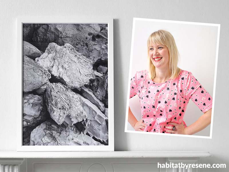
During her time as designer and stylist for an interiors magazine, Amber Armitage sometimes couldn't find the right artworks and accessories needed for styled shoots. Not one to sit idle, she created her own series of photographic prints and painted artworks, as well as a beautiful range of matte ceramics.
Amber is now a freelance stylist working with home interior magazines in New Zealand, including habitat. She sells her prints, artwork and ceramics online and regularly runs styling workshops for the public. Amber took time out from her busy schedule to have a chat with us.
What do people learn when attending your styling workshops?
My styling workshops teach people how to create great spaces at home that will suit the needs of those living there. I focus on going through a process of editing and questioning how your space can best function. From here we talk about how to add colour, life and personality, and how to create beautiful and thoughtful spaces.
What home trends are you excited about for 2016?
I am excited about the beautiful soft colours that are coming through, especially the 2016 Pantone colours of the year Rose Quartz and Serenity (get this colour look with Resene Pink Terrace and Resene Polo Blue). As fun and exciting as new trends can be, I am a firm believer that you need to become your own sieve when it comes to trends and know what is going to suit and work with your existing style and adding to this.
Your prints are beautiful. Could you tell us more about them?
I started creating the prints when I needed artwork for styling photo shoots and couldn’t find exactly what I needed. The Road Trip series is a photographic range of prints that I started shooting during a trip around San Francisco and the Nevada Dessert. I photographed them from the car window, which gives them a soft blur and the feeling of movement. I'm now working on a New Zealand range.
I also have a colour blocking series that is shot in nature and uses the colours of nature (Deep Blue Sea, Rocky Grey, Green Wall) to create beautiful, simple images that add colour and texture to interiors.
Could you recommend a few Resene colour matches for your artwork?
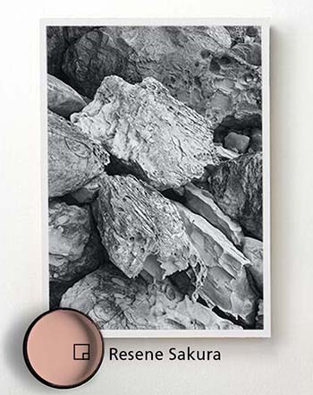
Try Resene Sakura for the Rocky Grey print... the contrast of the monochromatic would look great against the dusky pink.
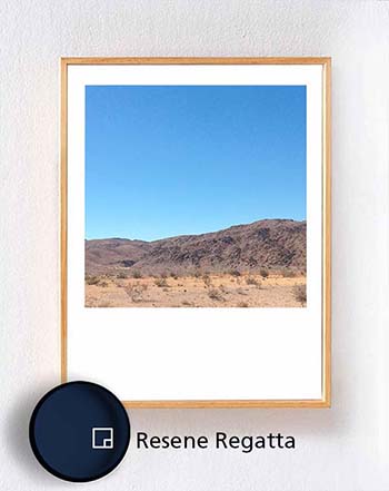
The Desert Blue print would look dramatic and stunning on a deep dark wall like Resene Regatta.
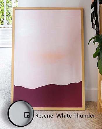
The soft pastels in the Horizon Line series would look great on a soft grey wall like Resene White Thunder.
You also have a range of ceramics. Tell us about the inspiration behind this.
My love for ceramics and desire for creating my own range came from years of styling food shoots for an interiors magazine. I was always looking for colours and shapes that would complement the food and let the food be the hero rather than dominating the scene, and the soft muted pastels of the range do just that.
The ceramics are all in a matte finish which not only feels beautiful but it also means there is no reflection when photographed. It requires a bit more care than a gloss finish, but I think it's well worth it.
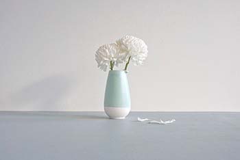
I designed the range so that people could collect different pieces and that they would sit well together, like a family. I also felt that each shape had its own personality – hence the name The Family. Each piece is named after someone in my own family.
What Resene colours are you drawn to at the moment?
At home, I'm a fan of keeping the walls clean in Resene Black White, with soft accent colours. I have a pink door in Resene Ebb, trims in Resene Breathless with touches of Resene Kandinsky around the house.
Lastly, what are little things homeowners can do to add style to their homes (that won’t cost the earth)?
Edit. Rearrange your spaces to create better flow and function. Update with paint – I constantly paint and repaint everything at home!
Published: 27 Jan 2016

