
latest
habitat tv

Say goodbye to the morning scramble for keys, coats and sunglasses and hello to this… see this and more videos
blog

Re-living the 1980s through art
Clint C is an artist whose work instantly sparks recognition and joy. Based in Hamilton,… more
Blog: Spell it out
09 Sep 2016
Showroom stylist Francesca Storey spells out the magic of using typography at home.
There’s something captivating about artwork and images that include lettering and numbers. I’m pretty certain it’s not a subconscious yearning for math or languages but more about how they add instant interest, depth and drama to a medium or display.
Lettering (which includes digital and standard typography) can’t be avoided. Even if you’re not a bookworm or magazine reader, even in just the digital world we’re now exposed to gazillions (as I said, no personal mathematical yearning) of typefaces.
Three fundamental aspects of real-life typography are legibility, readability and aesthetics and I’d suggest that’s no different in the world of home decor. We want to recognise it, understand it and love it too.
In a family home there's additional value in teaching growing brains to recognise letters and spell. “We’re off to the moon” was a phrase ‘read’ by my young girls every time they sat in the kitchen in sight of a vintage poster.
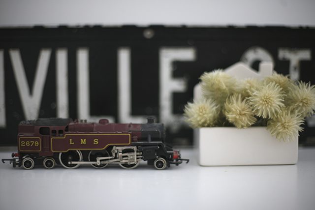
However, the text-lust doesn’t mean that we have to keep doing bus-blind after bus-blind or instructive words forever in our homes. Vintage bus blinds still have a place in my heart but I don’t think I’m the only person who sees ‘E-A-T’ spelt out in a kitchen and instantly wants to reach out for more letters to spell out ‘D-U-H’ alongside it. My apologies if that's your kind of beauty but here are some additional ideas for how to be more creative with the text around us:
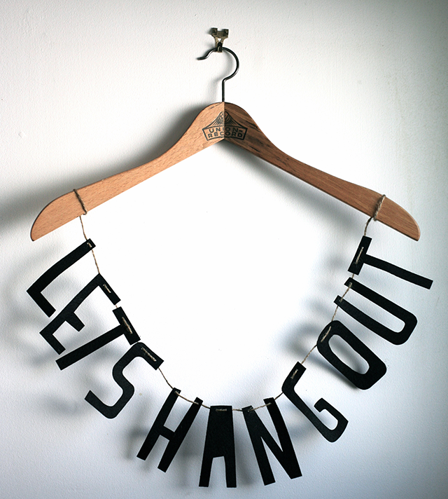
- Vintage wooden hangers hung from a simple wall hook can display a range of items and their decorative branding can be eye catching against a plain wall. Whether you source them second-hand or at the back of a wardrobe, the inked wood tell its own story and is interesting to look at.
Hang a posh frock for the weekend ahead (or a night you don't want to forget), your kid’s funkiest t-shirt to brighten up a small space or dangle decorative garlands from them.

- Cartography gives us text of the world! Different fonts captured on maps and globes have their own appeal. Atlases printed in the 1950s and 1960s can be propped open as the background to a shelf display to add a whole lot of colour, detail and place names to entertain, educate and intrigue.
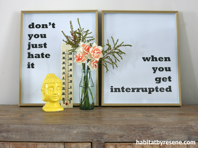
- DIY but make it look pro. Take a two-word phrase and split it over two pages of a Word document. Play with how the words are positioned so that when individually framed, their broken up state creates extra impact.
Think 'what' 'ever' or 'yeah' 'nah'. It's easy to do but gives lots of creative opportunity. Have them printed cheaply as A2 or A3 and display in frames side by side to say what you want to say.
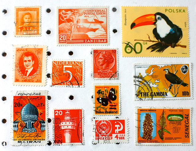
- Stamps. Embrace your inner nerd; you don't need to get caught collecting them but pulling together these teeny beautiful illustrations and captions of a country creates unique art for your home. Pick a colourway, a theme or go all out and make a political or historical statement that you want to express. Art around the world in mini.
- Books used as decor add varying texture and an array of type on the covers and spines. Whether your fact-hungry kid will pick up the book is debatable but creating opportunities for kids to leaf through something new will only happen if they're tempted by catchy titles within easy reach around the home.
- Lightboxes old and new. There’s so much fun to be had with these word frames, whether you come across decommissioned hospital x-ray boxes or modern reproductions. Make creative statements of your own rather than rehashing popular phrases.
- Say it with washi and accentuate a wall or door, spelling it out in strips of washi tape – colourful punctuations of text your way.
- Advertising from decades ago offer pops of colour, original decor and often cheeky statements or phrases. Be it on food tins, in newspapers or magazines, look for the gems to be found in op-shops and garage sales. Place a glass jar within an old tin and fill with foliage or flowers – old gasoline containers look quite the party piece with fresh blooms and garden finds.
- Old advertising papers (there are some great steals on Trade Me) are fragile to handle but the interesting fonts and bold colours looks amazing placed in a contemporary white box frame – instant, economical art.
- Bored? Board games often incorporate fun words or phrases either on cards that create the game or on their box packaging. A vintage box of 'Life - it's a family game' looked incredible framed for a client’s gorgeously eclectic home.
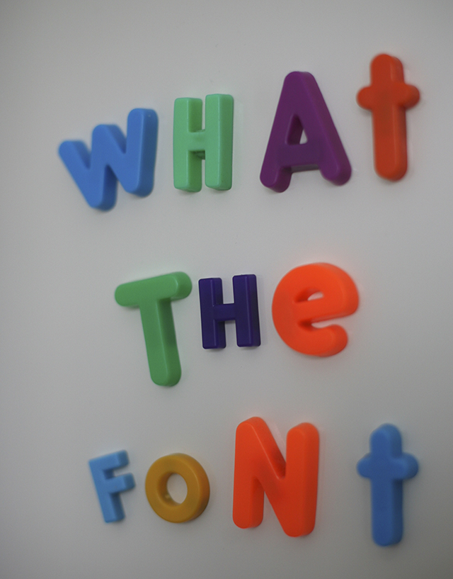
Since the first time I spelt ‘hello’ on a calculator I’ve remained word-hungry. There are heaps of creative ways to include typography within your home, beyond the fridge magnet set.
Francesca Storey runs Showroom, an in-home accessories store and styling service, where the stylists create a pop-up showroom in your own home – a great way to try out new looks and to show others how it can be done. See Showroom on the web, on Facebook and Instagram.
Published: 09 Sep 2016

