
latest
habitat tv

Say goodbye to the morning scramble for keys, coats and sunglasses and hello to this… see this and more videos
blog

Brick Bay unveils its poetic new folly for 2026
The winner of the 2026 Brick Bay Folly competition has been unveiled. Within the Wings… more
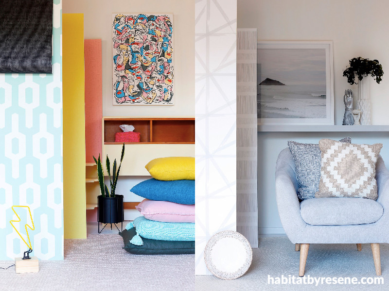
Colourful versus neutral interiors
16 Aug 2018
Interior designer Kate Alexander recently attended The Design Show, where she showcased two very different room styles – the first, a ‘colour meets colour’ bedroom, a little bit retro and a lot of fun; the second, a ‘white-on-white’ living room, all about texture and tone. Here’s her inspiration for both.
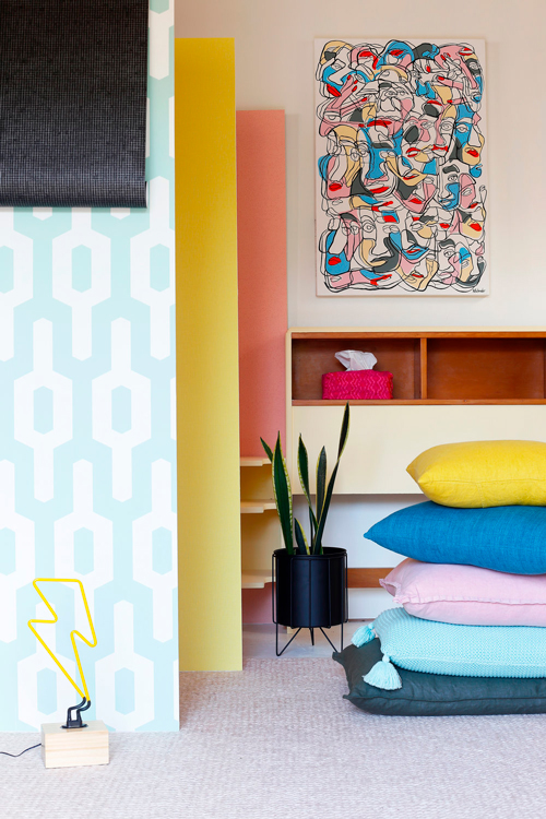
Every space needs a 'springboard' – that special thing that sparks inspiration. For this room our springboard was an original painting called Watching by Holly Schroder, spied at art gallery, endemicworld. We love the unusual colour combination and feeling of movement. Although the original painting is already sold (lucky owner) open and limited-edition art prints are available here.
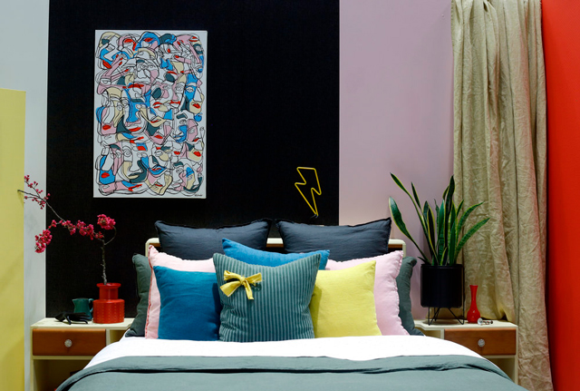
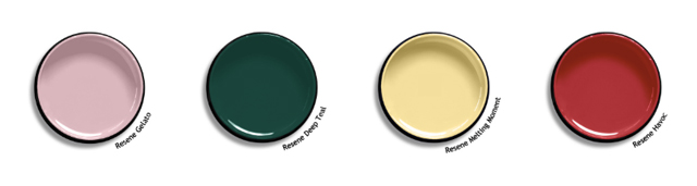
Next, I put together a scheme of Resene paint colours that worked with the artwork but weren't necessarily an exact match. I chose to combine both paint and wallpaper, in patterns – large and small – balanced with texture and flat colours. This gives the room a kick of interest without too much complexity.
Tip: Resene has an enormous collection of wallpaper designs. It's best to make your initial selections in store at a Resene ColorShop using the wallpaper books. Resene staff can help direct you to the wallpaper books that best suit the look you are after. Create a shortlist, order samples and then make the final decision in your own home.
Kate chose designs 34136-2 (black), 34124-3 (geo patterned), 219222 (yellow) and 219315 (pink), all from the Resene Wallpaper Collection.
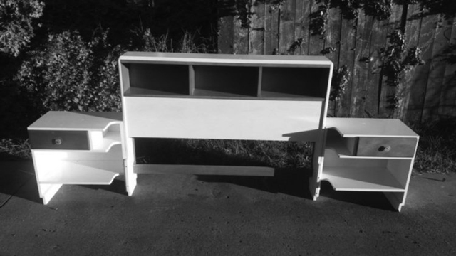
Every room deserves something unique and for this space I was in search of something with a retro vibe. I found this funky bed-head online which I painted in Resene Melting Moment.
Next came the finishing touches – linens, artwork, objects, plants, lighting, a rug and a bench. I mixed and matched Adairs linens – combining colours, textures and a little bit of pattern.
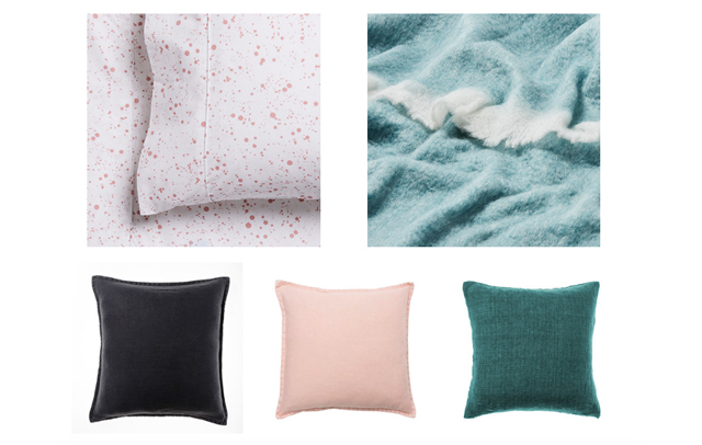
Tip: add your own flair to off-the-shelf cushions by adding a simple flourish – a pompom, flower or bow. This one is from a fabric off-cut.
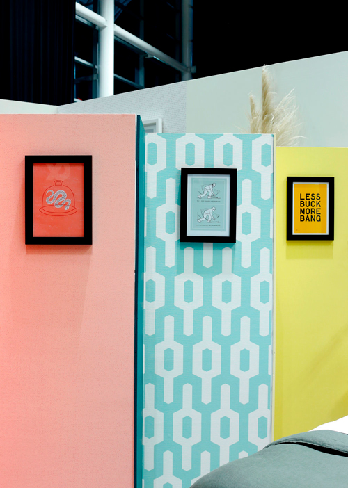
Tip: when combining different styles of art in a confined area stick to the same kind of frame. That way you view the art and not what's around it.
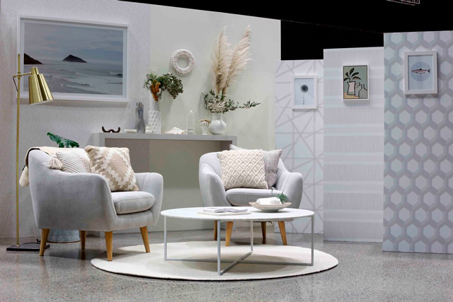
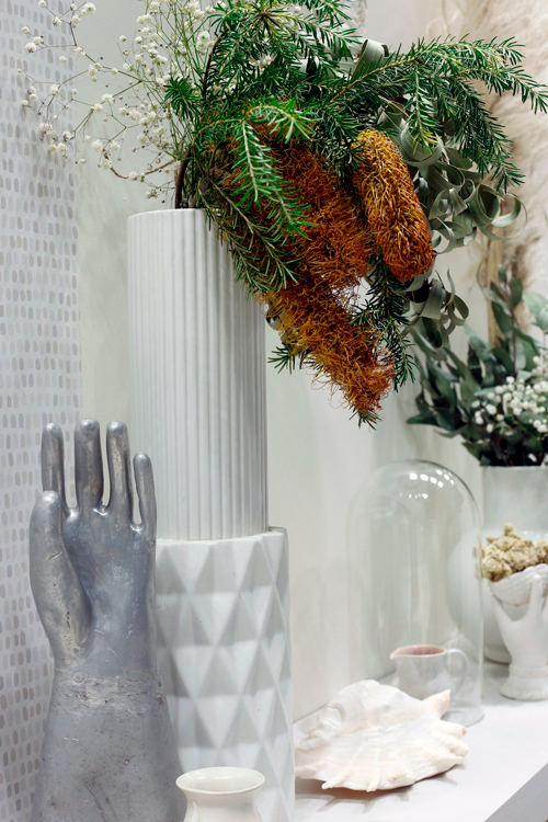
In contrast to this colour-meets-colour boudoir I created a white-on-white living room. This laidback look is all about texture and tone.
Search the term 'white on white' on Pinterest and the results are room after room of zen-like interiors – chill out spaces where interest is created by the architecture, unique patinas and subtle differences in tone. This approach requires discipline (not to let colour sneak in) and some clever thinking (so as not to create a space that is – yawn – boring).
Kate chose wallpapers from the Resene Wallpaper Collection, using designs – 12413 (dots, on left), FD23801 (triangles), FD23834 (stripes) and FD23842 (honeycombs).
Tip: when creating a monotone space, texture, pattern and surface are your friend. Think glass, metals wood, stone, ceramic, shell and foliaged items.
For a room built on a single colour hue, pattern and subtle variances are also your friend. I used Resene wallpaper as the starting point – selecting geometric patterns of varying scale, complemented by Resene whites with subtle hints of pink, grey and yellow.
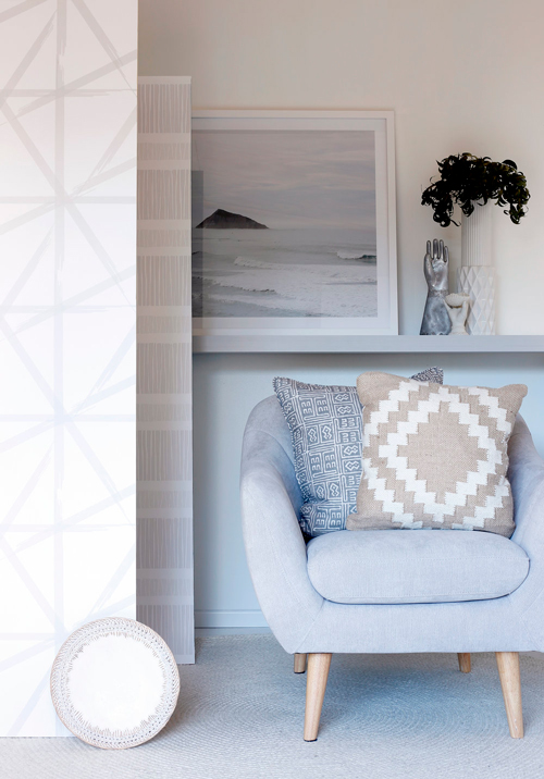
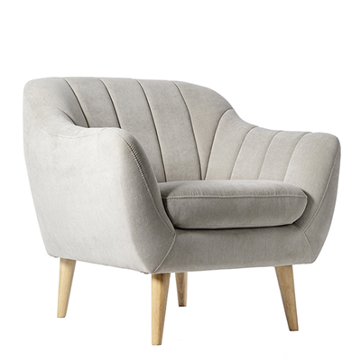
NextI added softness with these 1920s inspired lounge chairs from Adairs – big and comfy. We love the curved edges and pin-tuck detailing.
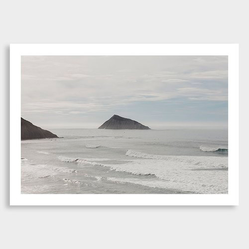
The hero art piece I selected for the chill-lax monochrome room is a limited-edition photographic print by Rakai Karaitiana titled Kura. You can lose yourself in the wide expanse of sea and sky while imagining the sounds and scent of the waves.
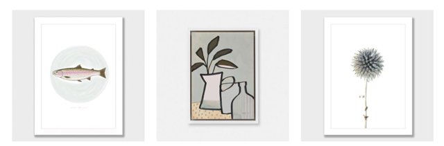
Tip: it's okay (in fact, it's great!) to hang different artworks together. Choose pieces that have something in common – circles, nature, textural brush strokes and just a hint of colour are what unite these three works from endemicworld.
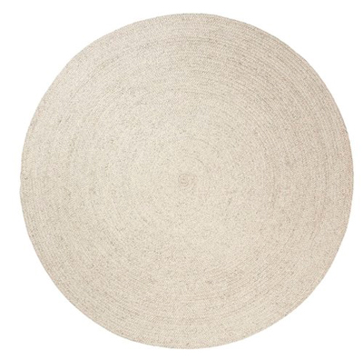
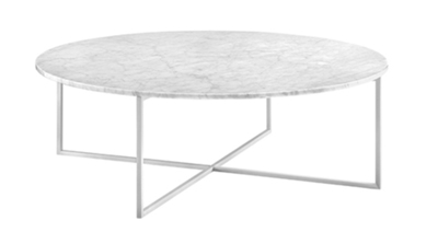
I chose a round rug to echo the round shapes in the artworks, in a braided wool with just a hint of grey – the fabulous Braid Weave in Chalk from our friends at The Ivy House. And for the coffee table – as solid as the rug is soft – it's Elle Luxe in white marble from SorenLiv.
Add in the all-important greenery and you have a calming space, mellow on colour yet big on character.
See more from Kate at www.placesandgraces.com.
Published: 16 Aug 2018

