Dan thinks outside the colour box
14 Dec 2015
Dan Heyworth, CEO of Box™, advocates incorporating a splash of rainbow attitude into your new build or renovation. He shares tips on going bigger with colour.
Any colour as long as it’s black. While that is a broad-brush statement, this does seem to be the motto of architects everywhere. It wasn’t always this way. Celebrated Swiss architect Le Corbusier may have been known for his passionate lauding of white in vernacular architecture, but in later works he offset his earlier severity by using bold colour statements employing primary shades of red and green on built-in furniture, in tiling and on walls – a technique which he believed emphasised the geometry of the architecture.
So if Le Corbusier and the mid-century modernists were doing it, when exactly did colour leave our lives and neutrals gain so much ground? Perhaps it was during the 1980s and 1990s when we became focussed on our homes as an investment, rather than somewhere to live in for life.
We became frightened to express an opinion, reluctant to make our own mark. Happily, the wheel has turned from such pared-back austerity. Scratch the surface and you’ll find that there are those who are prepared to give colour its due and add a little more pep to the material palette.
Because our homes are usually our biggest investment, there’s something to be said for keeping the bulk neutral, yet the key is to have a bit of fun. Here are some ideas:
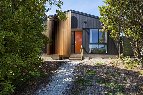
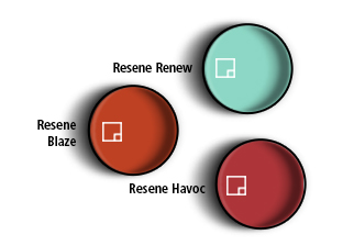
An exuberant welcome is a good way to pursue hues. Put a brave face on your building with a front door that adds a pop of Mondrian-like colour. Choose something strong and vivid from a vintage palette, such as a seafoam green from the 50s (try Resene Renew), burnt orange from the 60s (Resene Blaze), or even a cheerful pillar-box red (Resene Havoc).
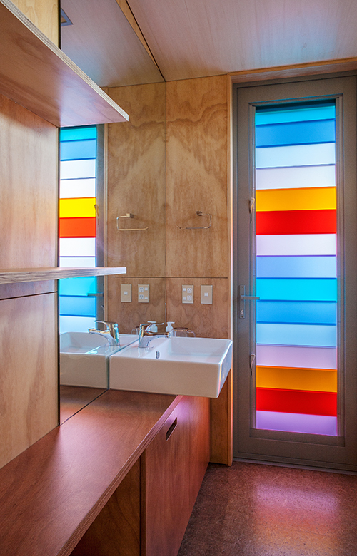
Colour blocking is a modernist tradition that has since been revived in fashion and painting techniques. This model of colour use can be explored in a variety of materials as well as paint. One recent Box™ house on Waiheke Island, for instance, features louvred windows where panes of glass are tinted in punchy shades such as citrus lemon, apple green, sky blue and lilac. Internally, these banks of coloured louvres become the art and act like a stained-glass window to throw light in pretty colours into the rooms.
Repetition is the name of the game. Choose one colour as an accent and stick to it. This can be used on the front door, in tiling, on selected walls or on a back-painted kitchen splashback where cabinetry tends to be in black, white or another take-no-chances shade.
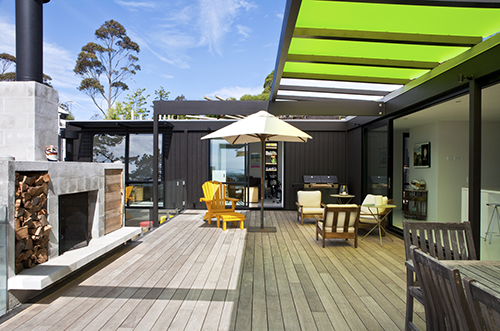
Consider bringing colour to your alfresco areas too. While we wouldn’t suggest it as cladding (this is Resene Bokara Grey), use Perspex panelling on all or several panes of a covered pergola. It brings an unexpected artfulness to the space and filters the light beautifully.
Published: 14 Dec 2015


