
latest
habitat tv

Say goodbye to the morning scramble for keys, coats and sunglasses and hello to this… see this and more videos
blog

Brick Bay unveils its poetic new folly for 2026
The winner of the 2026 Brick Bay Folly competition has been unveiled. Within the Wings… more
Designers share their fav fashion colours
15 Nov 2018
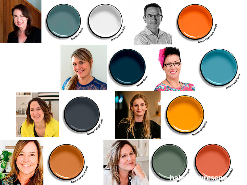
We asked interior designers and architects to tell us their favourite colour from the new Resene The Range fashion fandeck 20. Here’s what they chose, and why.
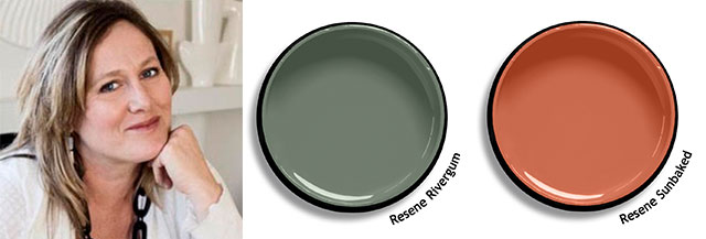
Kellie Gammie, Eucalyptus Design
www.eucalyptusdesign.co.nz
Resene Rivergum is my new favourite colour for kitchen cabinetry. It’s soft, yet it makes a stylish statement, especially when combined with marble and pops of warm natural oak. Resene Sunbaked is almost my favourite. I love the name, I love the colour, I love its warmth and the fact it can look so good with so many other colours.

Natalie Du Bois, Du Bois Design
www.duboisdesign.co.nz
I absolutely love Resene Coast. I recently used this colour on a coastal home project. Very relevant name. The colour worked really well with burnished metals and greyed-off oak timber. It’s very warm and calming.

Lloyd Macomber, Salmond Reed Architects
www.salmondreeed.co.nz
I’ve gone for a bold one – Resene Clockwork Orange; a colour that looks a million bucks in high gloss enamel on a front door. Amazingly, it shines brilliantly next to whatever colours it’s partnered with – go figure! And go for high gloss oil-based enamels, like Resene Super Gloss, on timber doors to maximise gloss levels for that deep, deluxe finish.

Yvette Parker, Studio Y
www.studioy.co.nz
Resene Twilight Zone is my pick. I love this because it's dark and moody, yet can exude a sense of freshness paired with a crisp white. This would also work amazingly well with timber features or copper accents. It’s perfect for bedrooms or creating a cozy living room.

Anna Major, Haus Interior Design
www.instagram.com/haus_of_design/
When people start talking interiors with me, it doesn’t take me long to start raving about how much I love mustard. And the Resene The Range fashion colour 20 fandeck has nailed the most perfect shade of it! Resene Cleopatra is a perfect mustard/acidic yellow shade. It is warm and attention grabbing and has a real summer feeling to it. I love to use mustards as an accent colour and use cooler tones such as grey greens and grey blues.
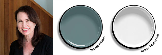
Lisa Day, Donnell Day Architects
www.donnellday.co.nz
As an architect, my interior and exterior colour palettes are often inspired by the natural environment and light quality the architecture is located within. I am inspired by colours that pick up the shifting hues of the sea, the natural tones of rocks and sand that are local to the area, or the deep colours of native foliage. So, my favourites in the Resene The Range fashion colours 20 fandeck are Resene Artemis, a dusky blue-green which has a lovely ability to change its character depending on the quality of light within the room, closely followed by Resene Poured Milk.

Anna Cuthbert, Cuthbert Interiors
www.interiors.co.nz
Resene Bismark is a warm blue which will look fantastic in both contemporary and traditional interior design schemes. It is sophisticated and calming and could be used in any room in the house to create a moody accent.

Gerald Parsonson, Parsonson Architects
www.p-a.nz
I am picking Resene Thumbs Up as my favourite colour. It’s a great colour to use to light up a space or add colour in small ways, such the inside of a skylight, edge of a door, design details or a whole wall. It also coordinates well with softer colours like off-whites, greys or grey blue/greens.

Liz Kerby, Lizzie and Co
www.lizziekandco.co.nz
My pick is Resene Swiss Caramel. It’s a beautiful, warm, primal, earthy colour which happily sits alongside more muted neutrals such as blacks and greys as well as complementary blues. It adds a splash of warmth and richness just like brass, timber or leather do.

Toni Roberts, Kitchen Architecture
www.kitchenarchitect.co.nz
My favourite has to be Resene Waiouru. I love how Resene Waiouru’s sophisticated earthy-green hue gives a nod to the ’70s and perfectly harmonises with the richly warm timbers we’re designing into kitchens.

Debbie Omond, Compose Interiors
www.composeinteriors.co.nz
My favourite is Resene Lazy River. It’s the perfect balance between light and dark; a calming muted blue-grey which offers great depth whilst soothing your soul.
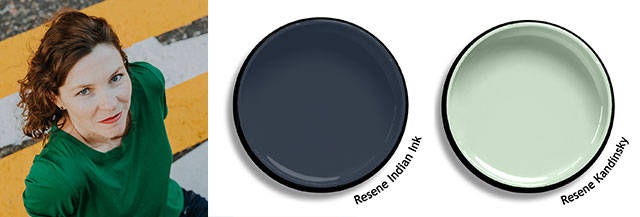
Sonia van de Haar, Lymesmith?
www.lymesmith.com.au
My favourite is Resene Indian Ink. I’ve used this colour a number of times and people are always drawn to it, and ask me what it is. It’s a rich blue black, evoking a velvety night sky. The feeling of depth and space it creates in a room makes it compelling but never dominating. It’s equally good in a neutral palette as in a colourful palette, where it is beautiful with a soft green such as Resene Kandinsky.

Annabel Berry, Design Federation
www.designfederation.co.nz
I like Resene Green Meets Blue. It’s the perfect combination of our two favourite hues. It has a lovely depth and a grey edge which ensures it contrasts nicely with soft neutrals.
See these colours in The Range fashion fandeck 20, available from Resene.
Published: 15 Nov 2018

