
latest
habitat tv

Say goodbye to the morning scramble for keys, coats and sunglasses and hello to this… see this and more videos
blog

Brick Bay unveils its poetic new folly for 2026
The winner of the 2026 Brick Bay Folly competition has been unveiled. Within the Wings… more
Mal uses colour without caution
16 Nov 2015
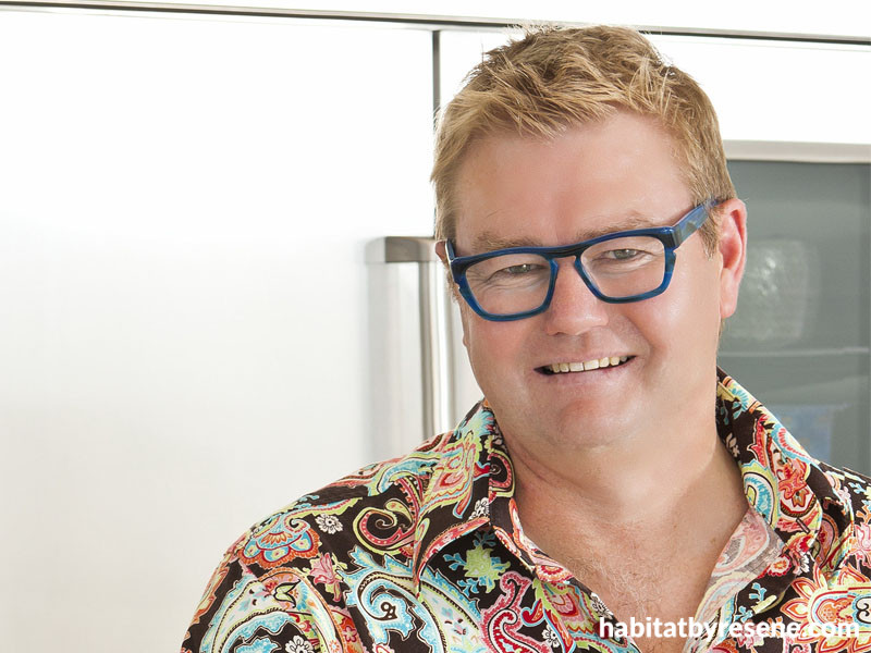
Multi-award-winning kitchen designer Mal Corboy is known for his love of colour. He talks to us about his passion for his work.
You were voted best in the world recently at the SBID International Design Awards. What do you believe makes a great designer?
Passion and love for design. You can teach anyone to design, however to be great at it is something that cannot be taught. You either have it or you don’t; sounds clichéd I know. I have met so many designers who are technically perfect but the end result leaves you cold, there’s just no life or it looks like a copy of someone else’s work.
Tell us a bit about your current ventures.
I have a number of projects I’m currently working on and all are exciting and different in their own ways. I’m completing nine rooms for a home in Trinidad and Tobago, which I’m really enjoying. I have a new client in Melbourne whose design brief was ‘whimsical’ and I’ve been engaged to design the kitchens and bathrooms for eight penthouse apartments in the St James Suites in Auckland. I’m ecstatic to be involved with such an iconic building; the vision for the building will be nothing like we’ve seen here in New Zealand before.
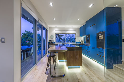
One of Mal’s designs using cabinets in Resene Deep South, a stormy teal blue.
How would you describe your personal style?
Well, I’m known around the traps for wearing loud shirts and shoes. For me, the more colour the better. Wearing colourful shirts lifts my mood. In my own home, while the larger pieces of furniture are a little more subdued, I have pops of colour on the walls, in accessories and art.
What is your favourite decorating favourite decorating colour and why?
For my work, I don’t have a favourite favourite colour. It comes down to meeting the design brief. It’s also about using colour correctly. If the client wants bright colour, it’s up to me to ensure that I use it well and that the room doesn’t become tacky and cheap looking. The same can be said with using muted tones, which can become boring if not used correctly.
What are your three favourite colours from favourite colours from Resene’s latest The Range fashion colours collection, and why?
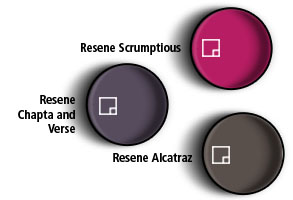
Resene Scrumptious. It’s a great name and the colour is very close to my business colour. I also like its vibrancy and sense of fun.
Resene Chapta And Verse. This is a strong purple with good character and depth. It almost borders on the blackish/moody side.
Resene Alcatraz. I love the metallic fleck through this colour, and how it changes depending on the light or what angle it’s viewed from.
Is there a colour you would never use in your own home?
Personally no. In saying that, I think certain neutral colours are overdone these days. My partner, she’s not so keen on yellow, so that doesn’t feature… much.
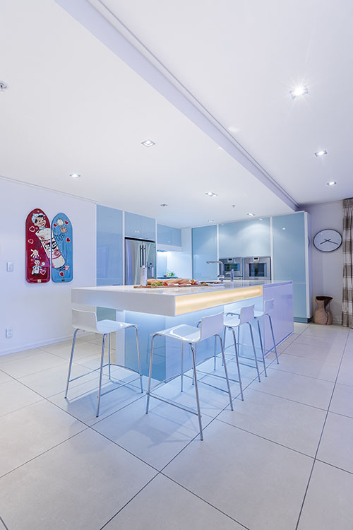
Another design with cabinets in Resene Emerge, a sea-foam blue-green.
pictures Kallan Macleod
Published: 16 Nov 2015

