
latest
habitat tv

Say goodbye to the morning scramble for keys, coats and sunglasses and hello to this… see this and more videos
blog

Re-living the 1980s through art
Clint C is an artist whose work instantly sparks recognition and joy. Based in Hamilton,… more
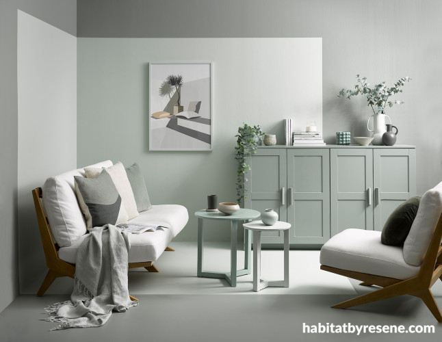
This tonal space is a mix of greyed greens. The wall and floor are painted in Resene Ravine with square inResene Pumice, cabinets inResene Blue Smoke, coffee tables in (from large to small)Resene Pewter,Resene Haven andResene Harp, plant pot inResene Yucca, vases, bowls and smaller accessories inResene Napa,Resene Yucca,Resene Blue Smoke,Resene Pewter,Resene Ravine,Resene Haven,Resene Pumice,Resene Armadillo,Resene Eagle andResene Harp and frames inResene Napa andResene Duck Egg Blue. Throw and faux Eucalyptus stems from Allium and artwork from Etsy. Project by Vanessa Nouwens, image by Wendy Fenwick.


In this tonal boy’s room, the main wall is painted in Resene Bismark, floor in Resene Botticelli, side wall in Resene Cut Glass, battens in Resene Ziggurat, bedside table in Resene Teal Blue, chest of drawers outside and legs in Resene Norwester with drawers in Resene Ziggurat, Resene Ming and Resene Botticelli, lamp in Resene Teal Blue, DIY animal mirror in Resene Botticelli, large plant pot in Resene Ming and plastic animals in Resene Teal Blue, Resene Ziggurat and Resene Moby. Jungle duvet, plant, pillowcase from Adairs, artwork from Etsy, cushion, dragon and books from Little Whimsy, faux succulent plant from The Warehouse. Project by Vanessa Nouwens, image by Bryce Carleton.


A monochrome bold geometric design gives this dining room a modern retro feel. Pops of yellow from theResene Tussock chair catch the eye against the wall design painted inResene Sea Fog withResene All Black andResene Quarter Friar Greystone. Table and black chair painted in Resene All Black, vases in Resene All Black and floor finished in Resene Colorwood Mid Greywash. Project by Megan Harrison-Turner, image by Bryce Carleton.


DeepResene Armadillo adds drama and contrast to this back wall painted inResene Beachcomber. Shelves inResene Rolling Stone, floor inResene Black Haze andResene Sugar Loaf, plant pot inResene Rodeo Drive and pendant light inResene Rolling Stone. Higher sheen trims inResene Blackjack add a crisp edge to the dark wall. Project by Kate Alexander, image by Bryce Carleton.


This classic white-on-white palette looks extra fresh with tropical plants and a mix of textures, including the woven basket, faux furs and the plywood flooring finished with Resene Colorwood Whitewash. The walls are paintedResene Double Black White, the benches and mirror frame are inResene Quarter Rice Cake and the hat box and slatted crate are inResene Sea Fog. Bag and tray from Città, rug from Lapco, linen basket and coat from Osborn, artwork by Amber Armitage. Project by Amber Armitage, image by Melanie Jenkins.

In this moody room, dark and light colours create a stunning design, and accessories can be easily distinguished. The walls are painted inResene Nocturnal, battens inResene Half Tuna, vases inResene Tom Tom and console tabletop inResene Half Tuna. Project by Vanessa Nouwens, image by Wendy Fenwick.

Designing a colour-blind friendly home
Creating a visually appealing home that is accommodating for those who are colour-blind requires thoughtful colour selection and pairing. By choosing the right colours and combinations, you can craft an inclusive, vibrant living space that everyone can enjoy.
Research shows that colour blindness, or colour vision deficiency, affects around 8% of men and 0.5% of women globally. The most common forms are red-green and blue-yellow deficiencies. This means certain colours may appear similar or indistinguishable to those affected. For instance, red-green colour blindness makes it hard to differentiate between these two colours, while blue-yellow colour blindness affects the ability to tell blue and yellow apart.
Let’s take a look at the best colour combos to create a colour-blind friendly home:
All about strength
Using varying strengths or nuances of one colour can be a great way for anyone to tell apart different spaces and objects. This technique is particularly beneficial for those with colour blindness, as it provides subtle yet effective visual cues. For example, layering different strengths of a single colour, such as Resene Eighth Ash with Resene Ash and Resene Triple Ash, can create distinct zones and highlight architectural features without overwhelming the senses. You could also pick hues from the same colour card, for example light blues, Resene Spindle and Resene Frozen, mixed with dark blues, Resene Wanaka and Resene Madison. By playing with tones and shades, you can add depth and dimension to your home, making it both functional and aesthetically pleasing for everyone.
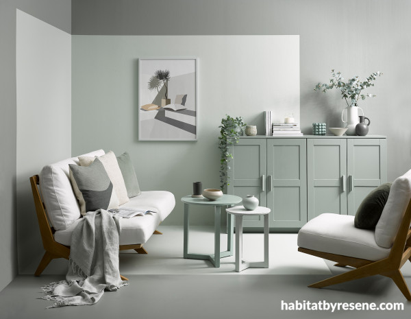
This tonal space is a mix of greyed greens. The wall and floor are painted in Resene Ravine with square in Resene Pumice, cabinets in Resene Blue Smoke, coffee tables in (from large to small) Resene Pewter, Resene Haven and Resene Harp, plant pot in Resene Yucca, vases, bowls and smaller accessories in Resene Napa, Resene Yucca, Resene Blue Smoke, Resene Pewter, Resene Ravine, Resene Haven, Resene Pumice, Resene Armadillo, Resene Eagle and Resene Harp and frames in Resene Napa and Resene Duck Egg Blue. Throw and faux Eucalyptus stems from Allium and artwork from Etsy. Project by Vanessa Nouwens, image by Wendy Fenwick.
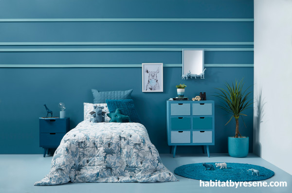
In this tonal boy’s room, the main wall is painted in Resene Bismark, floor in Resene Botticelli, side wall in Resene Cut Glass, battens in Resene Ziggurat, bedside table in Resene Teal Blue, chest of drawers outside and legs in Resene Norwester with drawers in Resene Ziggurat, Resene Ming and Resene Botticelli, lamp in Resene Teal Blue, DIY animal mirror in Resene Botticelli, large plant pot in Resene Ming and plastic animals in Resene Teal Blue, Resene Ziggurat and Resene Moby. Jungle duvet, plant, pillowcase from Adairs, artwork from Etsy, cushion, dragon and books from Little Whimsy, faux succulent plant from The Warehouse. Project by Vanessa Nouwens, image by Bryce Carleton.
Contrasting hues
Strong contrasts between colours and shades help in distinguishing different elements in a room. Off-white Resene Black White with bold red Resene Bullseye, for example, creates a high contrast that is easy for colour-blind individuals to see. You could also try black Resene Nero with fresh Resene Vista Blue, or Resene Tea with deep Resene Black Rock. Take a look at these two designs for some inspiration:
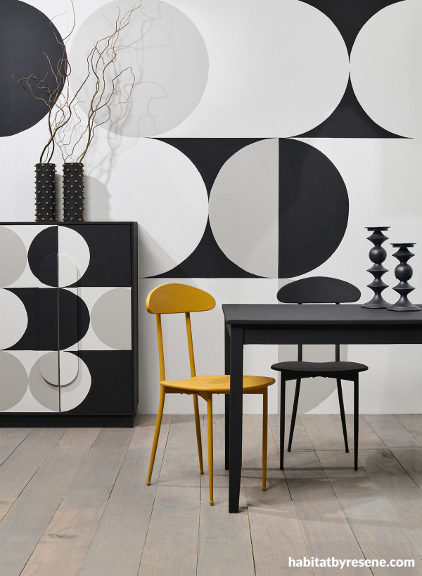
A monochrome bold geometric design gives this dining room a modern retro feel. Pops of yellow from the Resene Tussock chair catch the eye against the wall design painted in Resene Sea Fog with Resene All Black and Resene Quarter Friar Greystone. Table and black chair painted in Resene All Black, vases in Resene All Black, and floor finished in Resene Colorwood Mid Greywash. Project by Megan Harrison-Turner, image by Bryce Carleton.
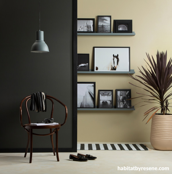
Deep Resene Armadillo adds drama and contrast to this back wall painted in Resene Beachcomber. Shelves in Resene Rolling Stone, floor in Resene Black Haze and Resene Sugar Loaf, plant pot in Resene Rodeo Drive and pendant light in Resene Rolling Stone. Higher sheen trims in Resene Blackjack add a crisp edge to the dark wall. Project by Kate Alexander, image by Bryce Carleton.
Neutrals and earthy tones
Neutral colours like Resene Thorndon Cream or Resene Half Taupe Grey paired with earth tones such as Resene Wood Bark or Resene Olive Green offer a balanced and accessible design. Neutrals are also a safe choice for colour-blind people. You can layer similar tones or add contrasts – here is an example of each:
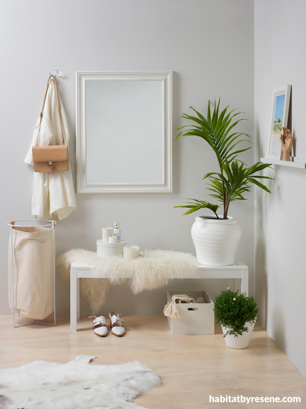
This classic white-on-white palette looks extra fresh with tropical plants and a mix of textures, including the woven basket, faux furs and the plywood flooring finished with Resene Colorwood Whitewash. The walls are painted Resene Double Black White, the benches and mirror frame are in Resene Quarter Rice Cake and the hat box and slatted crate are in Resene Sea Fog. Bag and tray from Città, rug from Lapco, linen basket and coat from Osborn, artwork by Amber Armitage. Project by Amber Armitage, image by Melanie Jenkins.
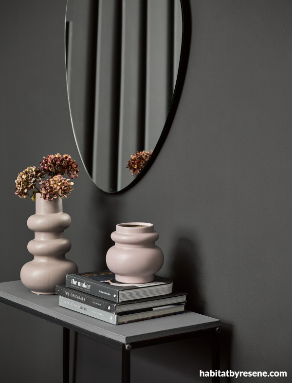
In this moody room, dark and light colours create a stunning design, and accessories can be easily distinguished. The walls are painted in Resene Nocturnal, battens in Resene Half Tuna, vases in Resene Tom Tom and console tabletop in Resene Half Tuna. Project by Vanessa Nouwens, image by Wendy Fenwick.
Our top tips for pairing colours
- The Resene Colour Wheel is a fantastic tool for choosing colour palettes. Pair adjacent colours for a harmonious look or choose more contrasting colours that will still be visible to those who are colour blind.
- Adding texture through different techniques and patterns can help differentiate between colours. Try looking through the Resene Wallpaper Collection or using Resene FX Paint Effects Medium which can add depth and interest to your spaces, making it easier for colour-blind individuals to navigate and enjoy.
- Using various shades of the same colour can provide subtle distinctions. For example, combine Resene Foggy Grey with Resene Quarter Foggy Grey to create depth and dimension without overwhelming the senses.
- Colours can appear differently under various lighting conditions. Use Resene testpots and Resene A4 drawdown paint swatches in different lighting to ensure they remain distinguishable and vibrant at all times of the day.
- In spaces like kitchens and bathrooms use contrasting Resene colours for cabinetry and shelving to make items easier to locate.
Incorporating colour-blind friendly design principles doesn't mean compromising on style. The goal is to combine aesthetics with accessibility, making your home a welcoming haven for everyone. By thoughtfully selecting and pairing Resene colours, you can ensure that your home is both beautiful and accommodating for colour-blind individuals, transforming it into a vibrant, inclusive space.
Have a read through Colour contrast, from the Resene Colour Choices booklet, for more ideas and information about colour-blindness and an easy test to see if you have colour blindness, then head into your local Resene ColorShop for more advice on paint and colour choice.
Published: 06 Aug 2024
Do you have a home full of wonderful Resene paint and colour? Send us some snaps by emailing [email protected].
the look
If you're stuck on what
colour to use or need colour
advice, try out the Resene
Ask a Colour Expert service.
the look
If you're stuck on what
colour to use or need colour
advice, try out the Resene
Ask a Colour Expert service.

