
latest
habitat tv

Say goodbye to the morning scramble for keys, coats and sunglasses and hello to this… see this and more videos
blog

Reader roundup: Public murals and powder blues
A Morningside mural, an exterior refresh, and striped walls. Let these projects be your inspiration… more
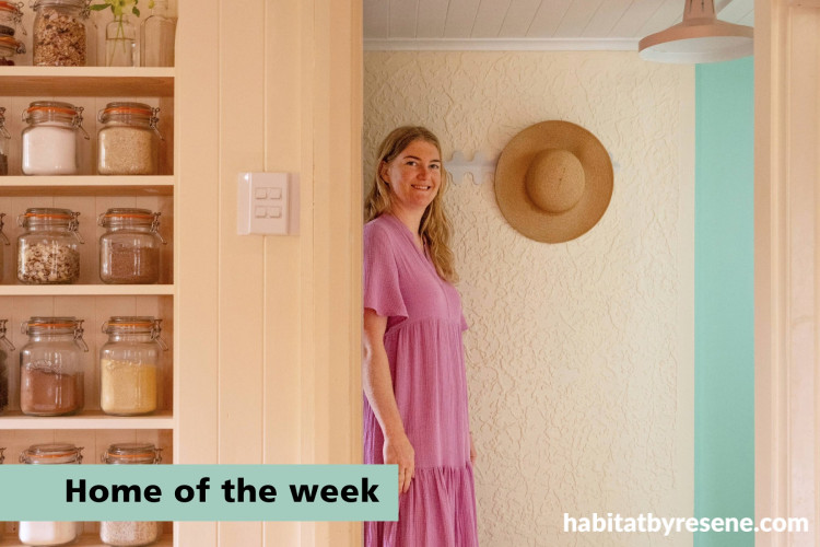


Peek inside this colourful cottage
The concept for this home was ‘retro meets Art Deco’.
“The character needed to shine through and reference a time when colour was lively,” says interior designer and homeowner, Ingrid Russell. And in this small Hawke’s Bay cottage, built in 1940, that idea doesn’t just sit in the background, it echoes through every wall, every doorway and every remembered layer of paint.
Built at the tail end of the Art Deco movement, which swept through the region after the 1931 earthquake, this house sidesteps expectation with its pitched roof rather than the flat lines typical of the style.
It began simply, as a one-bedroom plastered cottage, then grew as life demanded more space – a second bedroom was added by the Mitchell’s in 1947 (for the cost of 185 pounds).
“In the 1990s, the original wooden tool shed was connected to the house via a short hallway, and with the original sunroom now being used as a bedroom, what began as a humble one-bedroom cottage is now a three-bedroom home,” says Ingrid.

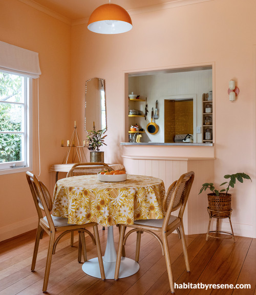
Dining room painted in Resene Romantic.
Over time, the home became something more wonderful than its modest appearance might suggest. However, by 2021, when Ingrid and husband, Shay, bought the cottage, that generosity had faded into beige, and the cottage had lost its voice.
Ingrid remembers the moment she began peeling back the layers of her home. “There were some clues to the house’s colourful history in fragments of wallpaper around power points and chips of paint on the edges of doors. I was delighted to discover that several of the old paint colours were almost an exact match to the new paint colours I’d been drawn to.”

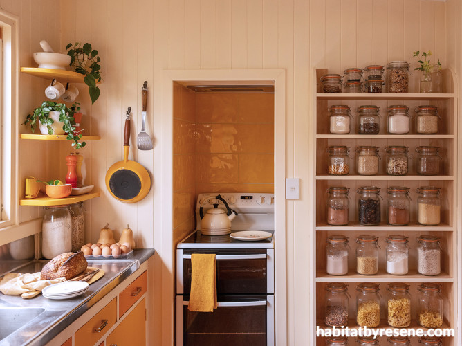
Kitchen walls in Resene Half Buttermilk.
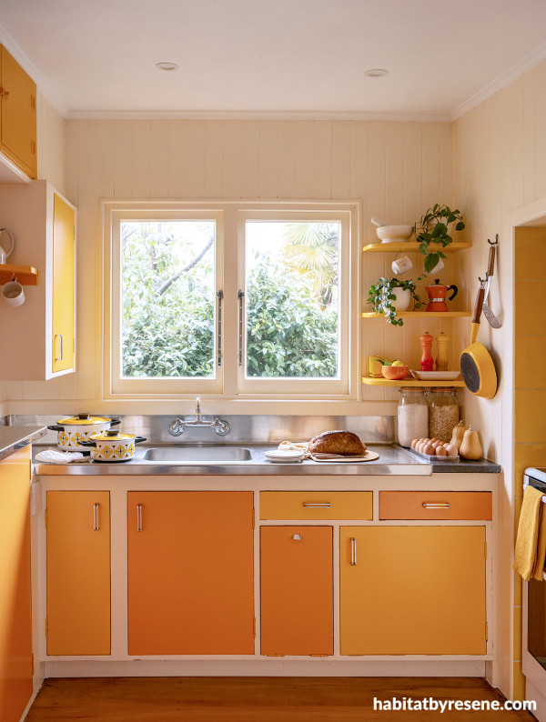
Cabinetry in Resene Hero and Buttercup, walls in Half Buttermilk.
It’s that sense of meaning and continuity that gives this home its emotional weight. A pale blush returns to the dining room in Resene Romantic, wrapping not just the walls but the ceiling too, creating what Ingrid calls “a soft cocooning effect.”
In the kitchen, with its walls of Half Buttermilk, is where warmth settles in again, grounding the space in something familiar and sunlit, while cabinetry in Hero and Buttercup brings a brighter, almost playful contrast.
The house doesn’t feel repainted so much as remembered.
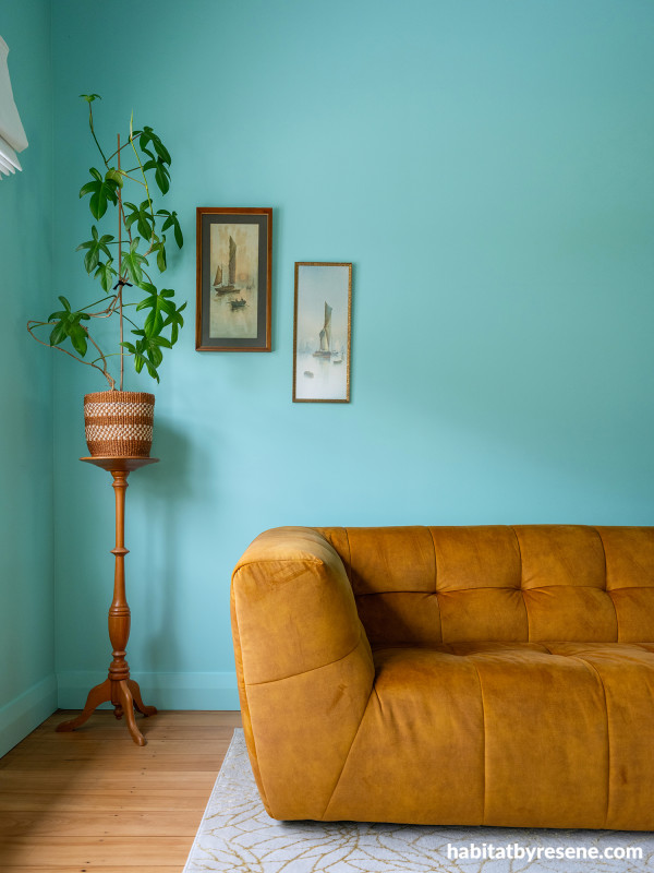
Living room in Resene Freewheeling.
“I focus less on formal training of the colour wheel… and instead I use a personalised, intuitive approach to the psychology of colour.” In this home, that intuition is clear. Light shifts from room to room, and colour follows it, sometimes softening, sometimes deepening and sometimes energising.
A living room washed in Resene Freewheeling feels expansive and calm, yet anchored by a golden sofa that seems to hold onto warmth like a memory. “It was important to me that the house felt fun to be in,” Ingrid says, and that idea shows up in small, deliberate gestures. A rounded boucle chair, for instance, sits almost like a punctuation mark, something slightly unexpected, slightly joyful.

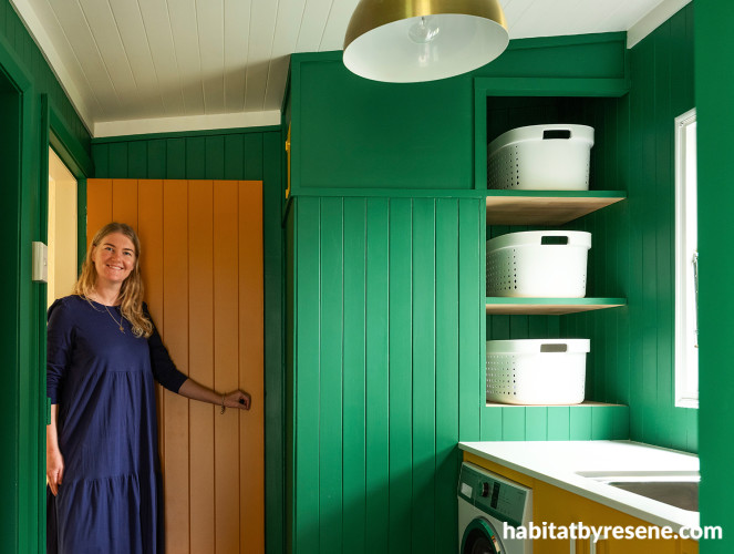
Laundry walls in Resene Crusoe, door in Mai Tai.
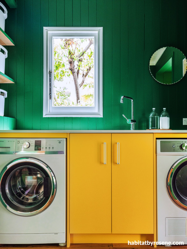
Laundry cabinetry in Resene Bright Spark, walls in Crusoe.
Elsewhere, colour becomes more daring. In the laundry, the deep green of Resene Crusoe settles into the vertical wooden panelling, paired with sharp bursts of brightness in Bright Spark. It’s a combination that shouldn’t quite work, yet does, because it feels true to the home’s past life.
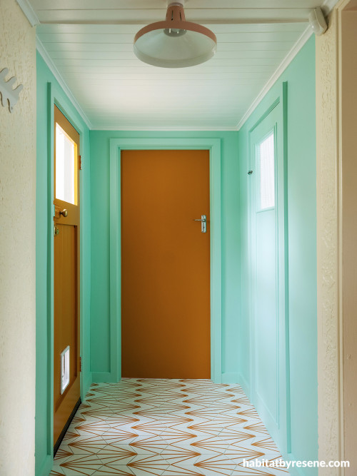
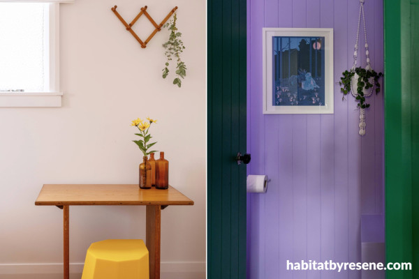
White window frames and roman blinds offer visual pauses, letting the eye rest between moments of colour. And those moments of colour continue with Resene Vista Blue and Mai Tai in the hallway; Wax Flower, Riptide and Turbo in bedrooms; and Biloba Flower in a bathroom.

Hallway walls in Resene Vista Blue, doors in Mai Tai.
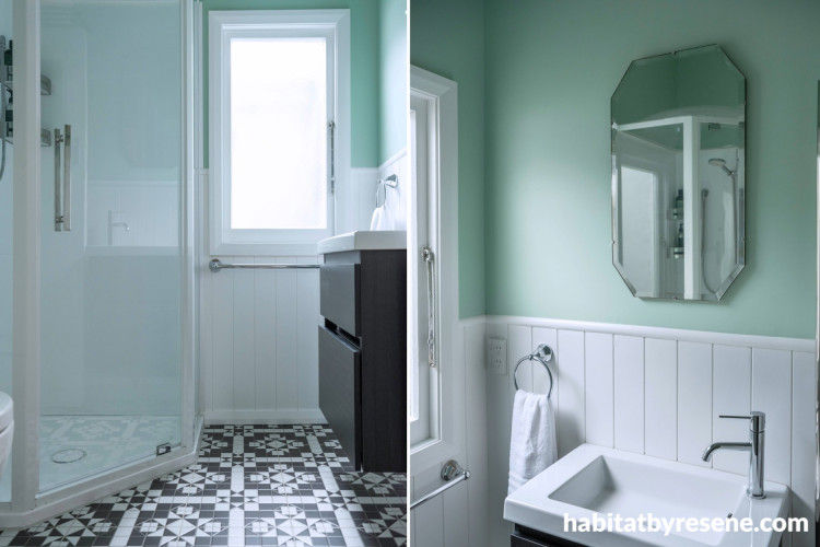
Bedroom in Resene Alabaster, bathroom in Biloba Flower.
Bedroom in Resene Wax Flower and Spring Rain.
Then there’s the former tool shed, now a hobby room, with its once rough and ready concrete floor, which has been carefully revealed. “It was decided to see what it would come up like if it was sanded… and to our delight it was filled with tiny black and grey river stones that polished up beautifully.” With the walls finished in Resene Possessed, the floor has become its own quiet feature, a reminder of the building’s layered life.
Hobby room painted in Resene Possessed.
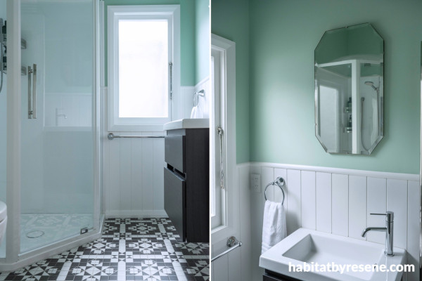
Bathroom walls in Resene Gum Leaf.
“Finding a painter for this project was challenging,” Ingrid says. The work demanded patience, sanding, careful brushwork and a refusal to take shortcuts. Original doors, panelling and geometric ceilings were preserved rather than replaced. “Replacing the doors with modern hollow cores and the ceilings with plain GIB was out of the question.”
That decision feels essential to the story, because this isn’t just a colourful cottage, it’s a conversation across decades, between the choices made in 1940 and now. The colours feel bright, yes, but never arbitrary. They belong.
design Ingrid Russell Design
images Florence Charvin Photography
Resene Pro Tip:
Ingrid has used many strong, bright colours throughout her home. By using different gloss levels she is able to highlight colours or make them more subdued. The higher the gloss level the more the colour will be highlighted, while a flat or low sheen finish will make a strong colour appear more subdued.
A note that strong colours also tend to highlight imperfections more than pale shades, so they require more prep work including the use of a high build surfacer like Resene Broadwall Surface Prep and Seal or Timber Surfacer, which is perfect to smooth old paintwork on plasterboard and timber respectively.
Published: 30 Apr 2026
Do you have a home full of wonderful Resene paint and colour? Send us some snaps by emailing [email protected].


Resene Biloba Flower
the look
If you're stuck on what
colour to use or need colour
advice, try out the Resene
Ask a Colour Expert service.
Resene Biloba Flower
the look
If you're stuck on what
colour to use or need colour
advice, try out the Resene
Ask a Colour Expert service.

