
 look book

latest
habitat tv

Say goodbye to the morning scramble for keys, coats and sunglasses and hello to this… see this and more videos
blog
Reader roundup: Public murals and powder blues
A Morningside mural, an exterior refresh, and striped walls. Let these projects be your inspiration… more
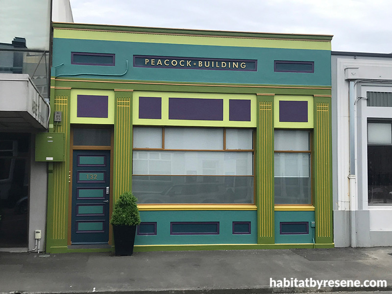
Built in 1937 for owner Samuel Peacock, the new owners of 132 Queen Street in Hastings, Alison Francis and Sarah Newell, wanted a façade that celebrated the building’s history.
A colourful heritage
13 Jul 2026
When it comes to choosing an exterior colour scheme for your commercial building, more often than not, you want to play it safe – especially if your building is in a designated heritage area. For the new owners of 132 Queen Street, Hastings, nothing could have been further from the truth.
“When we bought the building in 2024 the colour scheme was in need of some life, it was predominantly cream and, as it is the smallest office building on the block, we would often find that even if we were standing on the other side of the road and pointing to the building, people still couldn’t see it,” says co-owner Alison Francis.
“So, we decided that we needed to make our small building stand out. During the process of purchasing the building we had found out that it had been built for a Mr Samuel Peacock in 1937, and so armed with that reference, we went for the ‘small but mighty’ approach.”
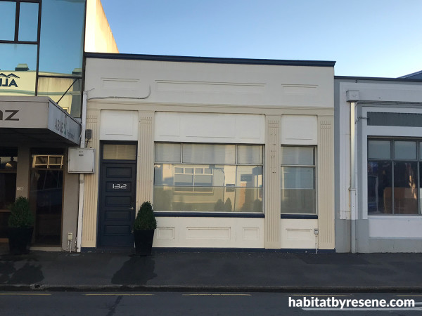
The façade’s previous colour scheme was lacking in oomph and made the already ‘smallest building on the block’ recede even further into the background.
Alison and co-owner Sarah Newall approached Hastings District Council with regards to its Façade Enhancement Scheme and were put in contact with Alan Passchier, a commercial interior designer and colour consultant who has worked extensively with the council’s heritage team devising colour schemes for similar buildings.
“The issue, generally, is that a lot of building owners like the idea of colour, however, they're afraid of people’s reaction and therefore opt for something ‘safe’. With the Peacock Building it was an example of the owners and council basically all taking the punt on going that extra mile,” says Alan.
“The starting point is the BS5252 colour range from which we have access to a limited selection of colours for the base scheme, along with another narrow palette that can be used as accents, which council allows for no more than 15% of the façade.
“With our first scheme we cheekily used all of the colours from the accent range to create a bold colour scheme, justifying the choice by saying the building is so small any way that it could carry it off.”
“The council didn't go for that one, unfortunately, but it was worth a try,” he adds, wryly.
With a palette that includes Resene Nile Blue, Hot Purple, Hot Curry, Jade and Gold Dust, the façade is now anything but bland.
Armed with a new, approved scheme they set about transforming the building’s exterior with the help of the team from Gearey Painting Company and Resene.
“I specify Resene systems, such as Lumbersider Low Sheen, which we used in this instance, for a number of reasons,” says Alan. “Firstly, for me, it goes back probably thirty years to when I came to New Zealand. Resene was always very supportive from day one to help me with whatever I needed as far as advice and samples.
“Secondly, and most importantly, I've always had really good results with the Resene product, and the colours seem to stay longer on the building and fade less over time.”
“The finished result is just such a huge improvement over the original, which really needed to be shown some love, especially when you compared it to many of the other buildings on Queen Street that have been painted with different colour schemes; many of which Alan has consulted on.” says Sarah.
“We just love having it stand out because when we did our due diligence on the building and we got the Heritage report, the wording around how our building was described was really cool. It was almost like it was small but perfectly formed, and that it punched well above its weight, that kind of language, and so we thought: 'Well, let's give it a paint job that really goes along with that', and that’s exactly what we’ve gotten.”
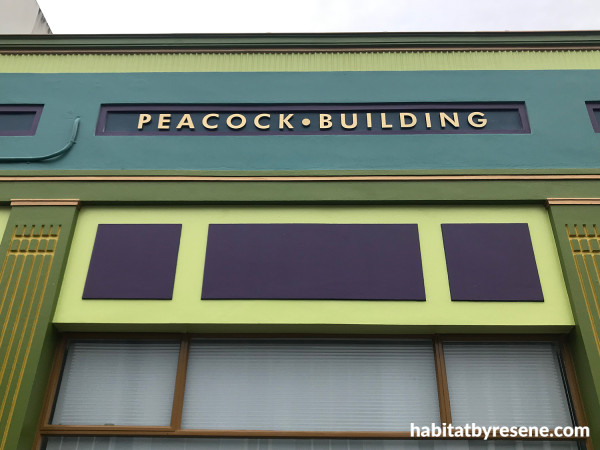
The icing on the cake was the inclusion of brass lettering, which proudly pronounces the building’s presence and plays off the metallic tone of the Resene Gold Dust accents.
When asked if they each have a favourite feature of the new façade:
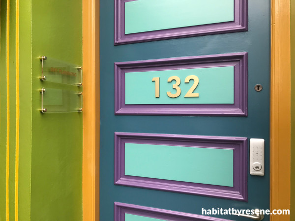
“I really like the front door being multiple colours. It so easily could have just been one colour-block front door, but I think what Alan came up with and what the painters have brought to life is really cool,” says Sarah.
Says Alison: “For me, it's the gold inset on the columns. It's this really cool sort of visual trick that you kind of only see when you’re walking past. I just love the attention to detail with that, it's been so well thought through and done really well by the painters. I love that feature, it would be my favorite thing.”
The final word goes to Alan: “Ironically, for me it’s not about the colour. What I personally really love is that Alison and Sarah went the extra mile with the lettering at the top and selected brass lettering. That’s quite a costly choice and most clients would say: 'There is a Perspex option that would work just as well and which is half the cost’. I think they have done really well on that behalf because it totally finishes off the building and exemplifies the time and care that has gone into its transformation.”
Published: 13 Jul 2026