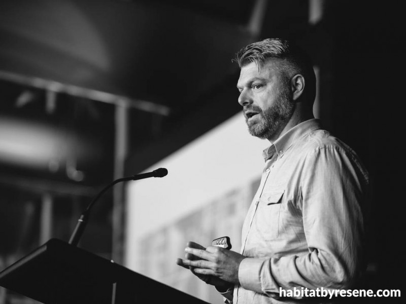
Designer Adrian Nancekivell’s approach to commercial projects is changing the face of retail and hospitality
11 Oct 2021
When we last spoke to Adrian Nancekivell to get his insights on the future of retail and hospitality for the inaugural issue of BlackWhite magazine, we were stuck at home in lockdown. A year later, not much has changed; we’re locked down once again and the commercial sector is in for some tough times. Designers like Adrian – who has a background in customer service and is a business owner himself – are all too familiar with the efforts it takes to keep the boat afloat, but he’s definitely up to the challenge of helping his clients weather the storm.
Adrian grew up on a farm in the southwest of England where he says practicality and problem solving are a way of life.
“My dad was a very good artist so I must have got my interest in drawing from him,” he says. “I was told there no money in being a creative so I left school and started labouring on building sites. When I was 18, my mum asked if I wanted to move to Sydney with her new husband. Being a keen surfer, I didn’t hesitate. But it was that experience of living in a large city that made me realise that it is possible to have creative career.”
Originally, Adrian wanted to be a graphic designer but after getting a job as a print boy for an architectural firm, he found himself drawn to interior design. “It seemed more of a combination of visual design and architecture, and each project was so varied. I was interested in the whole process from using creative skills to problem solving to construction knowledge and on-site observation. I remember the buzz I got from my early projects of witnessing people interacting with the spaces where I was involved on the design. I chose to study at the Design Centre Enmore (which is part of TAFE NSW) as it offered a part-time study option, so I worked full-time in design practices during my studies and, after 5 years, obtained my Bachelor of Design.”
Continuing to work while he studied gave Adrian the chance to keep gaining experience across typologies that he continues to specialise in today as well as some one-of-a-kind projects. “In Sydney, I had the opportunity to work with Burley Katon Halliday, one of the most prestigious design and architecture studios in Australia. The work was really varied, but one project I led that stands out was the Sydney Mint museum – which was a Category A listed site historic place. The team we worked with included heritage architects and, most interestingly, the curators at The Powerhouse Museum. Some of the artifacts were irreplaceable and very expensive, such as the display of Faberge eggs. I also worked on high-end residential, hospitality and retail,” he says.
Thanks to his diverse background, Adrian’s studio, Adrian Nancekivell Design – commonly recognisable by its clever acronym, AND – offers a unique service model that encompasses things like brand identity and even elements of business planning. Since many of their clients are in retail and hospitality, his comprehensive approach could be just the thing that helps them survive the significant challenges these sectors are currently facing.
“The main reason for starting up on my own was the freedom to balance my lifestyle and work. I also wanted to apply my knowledge gained in customer facing service businesses with like-minded clients. I really enjoy working on the whole process including strategy, problem solving, creativity and the ability to deliver the built environment,” he says.
A testament to his far-reaching approach is the number of repeat clients who return. AND recently finished the fit out of what was previously a defunct Bike Barn, converting it to a spacious ASColour – Adrian’s second project for the brand. Located at the prominent junction where Symonds Street and Khyber Pass Road meet, it’s set to breathe new life into what had become a sleepy Auckland corner. He’s helping other homegrown businesses like Bread & Butter find ways to adapt their business models so that they can continue to expand in the face of pandemic-imposed changes. For some clients, it’s an opportunity to put into motion what they’ll need to thrive in the times ahead.
“I really do feel for our clients while they have been stuck in lockdown,” he says. “But since we have pretty much been cut off from the world, we’ve also seen a spike in people spending money on their homes. Last year, we created a new concept for Hunter Furniture – now Hunter Home – and we are currently work with an outdoor living retailer on an exciting new concept for two 1000m2 showrooms opening the new year. We have work in the pipe for two Kiwi brands wanting to expand across the ditch to Australia.”
It’s not just his business savvy that makes Adrian’s projects shine, they’re also beautiful and filled with thoughtful details.
“Those that know me will confirm that I have a terrible memory for important things, he laughs. “But when I travelled, I would remember the smallest of details from spaces and architecture that I visited. This could be a bustling street in southeast Asia, the madness of Tokyo or a grand historic building in Paris or London – and these things continue to inspire me to this day.”
“Generally, we work on the ‘why’ rather than the ‘what’ and create a single organising idea. Then once we have that, every decision can be tested. The spaces we create each have their own distinct personality that reflect the brand, product, location and function.”
Adrian relies on Resene products to capture that personality and cope with the wear-and-tear that customer-facing businesses need to withstand.
“Aside from the quality and range of projects, I really love Resene’s customer service. As specifiers, no matter who our representative is, they are always professional and onto it,” he says.
“At Hunter Home, we wanted get creative with on-trend colour schemes to inspire their customers. Another effect we like to apply is using differing gloss levels of the same colour to create subtle reflections of shapes and patterns, and Resene Lustacryl (semi-gloss waterborne enamel) and Resene Enamacryl (gloss waterborne enamel) work a treat in commercial setting.”
“We use a vast array of colours specific to each project and some certainly go for neutrals. However, my personal favourite is Resene Robin Egg Blue.”
When he gets stuck in a rut, Adrian says it’s sometimes good to just stop and pause for thought. “Before designing a project I like to have a gestation period, really think about the ‘why’. When I’m planning a space (aka scribbling), sometimes I will turn the plan upside down. I was taught this technique in drawing classes, and it must re-wire your brain.”
In a world turned upside, it might be exactly the kind of thinking we need to move through the challenges ahead.
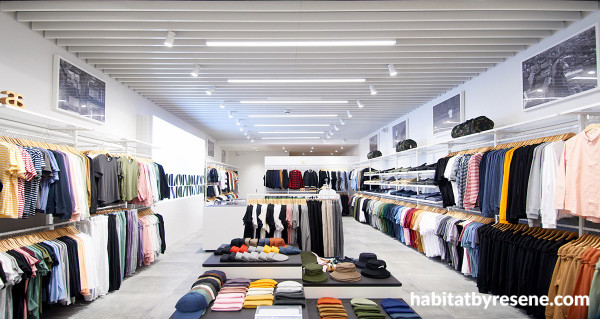
AND's newly completed ASColour shop looks crisp and clean in Resene Black White from tip to toe.
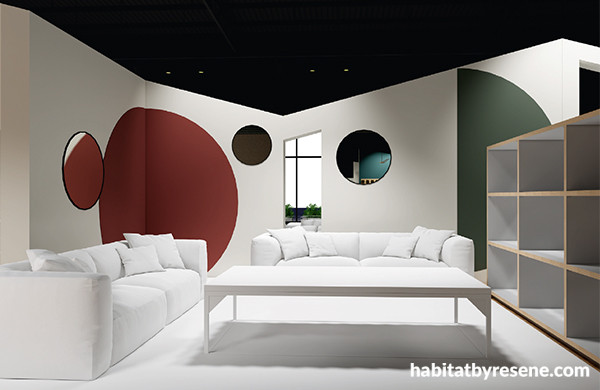
Curvaceous shapes in splashes of colour including Resene Sanguine Brown and Resene Templestone over Resene Black White create definition for the furniture in Hunter Home’s showroom to standout.
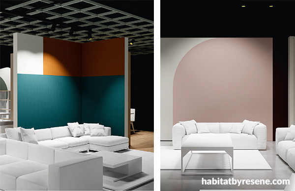
Blocks of on trend colours like Resene Half Smalt Blue, Resene Afghan Tan and Resene Blanched Pink offset with crisp Resene Black White lend contemporary flare to Hunter Home’s showroom.
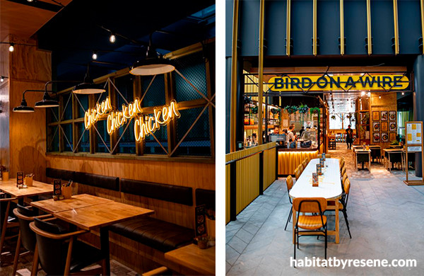
Bird on a Wire in Auckland’s Commercial Bay is full of the thoughtful details AND is known for, such as the chicken wire screens framed in timber stained in Resene Colorwood Grey Green. Resene Pirate Gold was used for the front counter and various details to tie the space into the brand’s identity.
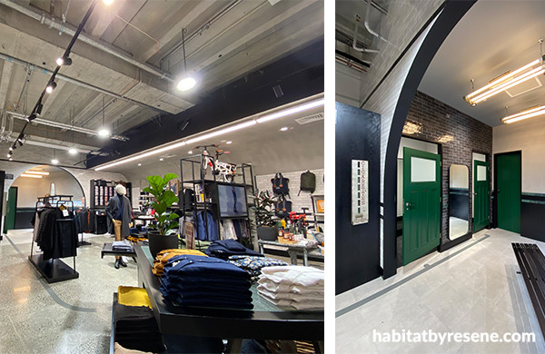
While each of the three locations that AND has designed for Barker’s has its own distinct look, they all share old world charms and sophistication. The Commercial Bay location in Auckland has change room doors in Resene Deep Fir to stand out in the otherwise neutral palette. Walls in Resene Half Sea Fog and ceiling in Resene Concrete.
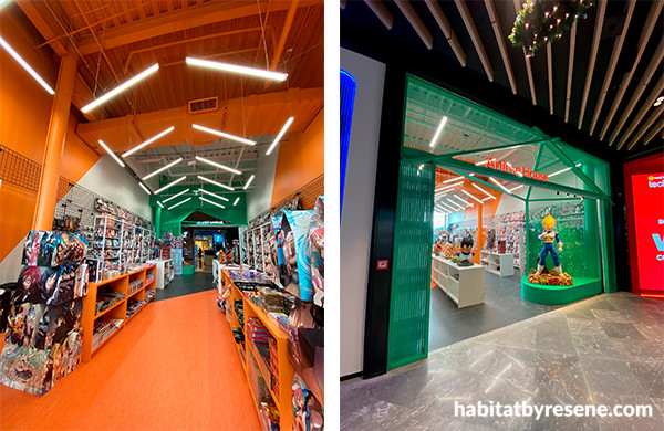
Dynamic shapes in Resene Home Run and Resene Sunrise create energy and movement in Anime House at Auckland’s Westfield Newmarket shopping centre to draw in customers.
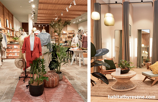
Soft hues like a ceiling in Resene Robin Egg Blue, fitting room walls in Resene Grain Brown and main walls in Resene Wan White create a welcoming and cosy feel in this Auckland Max location by AND.
To see more of Adrian’s impressive portfolio, visit www.and.co.nz, and to read more about the retail and hospitality trends, check out issue 01 and 02 of BlackWhite magazine.
images Ben Groen, Michell Lau, Adrian Nancekivell
Published: 11 Oct 2021
