

latest
habitat tv

Say goodbye to the morning scramble for keys, coats and sunglasses and hello to this… see this and more videos
blog

Brick Bay unveils its poetic new folly for 2026
The winner of the 2026 Brick Bay Folly competition has been unveiled. Within the Wings… more
Designing for emotions: leverage colour psychology and popular Resene paint colours to maximise a space’s impact
10 Jun 2024
It should come as no surprise that colours have the ability to evoke a wide range of emotional responses. This phenomenon is rooted in both associations to colours and the physiological reactions they can evoke. For example, red might symbolise love for one person and danger to another, but exposure to it also tends to have a stimulating effect and increase the heart rate of the perceiver.
Depending on what you studied, it’s possible that you may not have covered much colour psychology during your schooling. Whether you’re an architect, interior designer, builder or painter, it can be surprisingly helpful to brush up on your base knowledge. By understanding how different colours influence human emotions and behaviours, you can create spaces that are not only visually appealing but also emotionally impactful, or have the ability to enhance wellbeing, productivity and the overall enjoyment of the design. Plus, having these insights can help demystify why your clients tend to be drawn to certain colours while avoiding others.
Many resources you’ll find online tend to discuss emotional responses to specific colours broken down by colour family. But of course, there are hundreds of unique Resene paint colours of differing tones and values that fall beneath the broad umbrellas of hues like red, yellow or blue. And since paint colours are so greatly influenced by relativity, the other colours you combine them with in your palette can affect the overall physiological response your space will evoke. We look at some of the more nuanced hues that make up the popular Resene The Range fashion colour collection and the Resene Multi-finish collection which are currently trending, dispel ambiguities about their emotional impact and offer up suggestions for perfect pairings to nail the mood you’re after.
Resene Incarnadine: passion and imagination
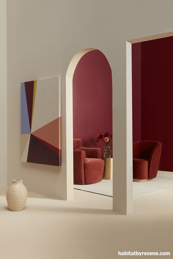
Front wall painted in Resene Solitaire, doorways and floor in Resene Athena, back walls in Resene Incarnadine, vase in Resene Athena and artwork in (clockwise from top left) Resene Heliotrope, Resene Incarnadine, Resene Funk, Resene Solitaire, Resene Dawn Glow, Resene Arriba, Resene Pandemonium, Resene Solitaire and Resene Athena. Chairs and side table from Soren Liv, rug from Baya, glass vase and flowers from Urban Flowers.
Starting in bold, we all know red can be highly stimulating. For many, it evokes feelings of passion, excitement and urgency and intense reds have been shown in studies to increase respiration rate and blood pressure. In restaurants, cafés and bars, red can be used to stimulate appetite and conversation. In offices, it can bring a sense of dynamism and creativity to brainstorming areas. However, it should be used sparingly in bedrooms, relaxation areas and concentration spaces where a calming environment is desired.
But of course, not all red paint colours are as overwhelmingly bold or bright as others. In an area where you want to encourage animated conversation without sacrificing comfort, a rich deep red like Resene Incarnadine is an enticing and dramatic option. A comforting neutral like Resene Solitaire can be used in adjacent areas where you want less stimulation. In settings like hotel lobbies or restaurants, bring in an equally passionate rose pink like Resene Dawn Glow to up the romance factor.
Resene Halcyon: reassurance and productivity

Wall and sculpture in Resene Half Halcyon, tabletop, magazine rack and lamp base in Resene Moonbeam, vase in Resene Scotch Mist and mirror frame in Resene Rouge.
Blue has a calming effect and is associated with stability, trust and tranquility. The colour behaves like the polar opposite of red, as blue has been shown to lower blood pressure and heart rate.
Perennially popular pale blue Resene Halcyon is an ideal pick for offices and study areas as it can enhance focus and productivity. In bedrooms, it promotes relaxation and restful sleep. And in healthcare facilities, the hue can underscore that the space is a trustworthy environment for patients. To keep this refreshingly crisp colour from coming across as cold, pair it with an on-trend buttery yellow like Resene Moonbeam or a mellower yellow like Resene Scotch Mist and balance out Resene Halcyon’s seriousness with a touch of an enticing magenta like Resene Rouge.
Resene Rewilding: balance and renewal

Front wall painted in Resene Rewilding, back wall in Resene Creme De La Creme, floor in Resene Tic Tac Toe with Resene FX Paint Effects Medium mixed with Resene Springtime applied on top and small vase (on centre shelf) in Resene Black Doris. Chair and bookshelf from Bauhaus, wall hanging from Città, curtain, wooden vase and books from Father Rabbit, rug from Baya.
Resene Rewilding is a calming and soothing mid-toned olive green that can be useful in areas where you want to reduce feelings of stress and anxiety. While many greens are associated with nature and the outdoors, Resene Rewilding feels particularly earthy and natural thanks to its brown undertones. And just like spending time in nature, using Resene Rewilding as a main wall colour can evoke feelings of balance, harmony and renewal. Surprisingly versatile, the colour can be used in practically any type of space, but it is understandably a popular choice for lounge areas and bedrooms because of its ability to create a peaceful and relaxing environment. In office environments, the hue can promote productivity while soothing the nervous system.
To increase the sense of serenity that Resene Rewilding offers, try combining it with other soothing shades of green like Resene Tic Tac Toe and Resene Springtime, creamy white like Resene Creme De La Creme and timber stained in warm and inviting Resene Colorwood Natural.
Resene Marzipan: warmth and positivity
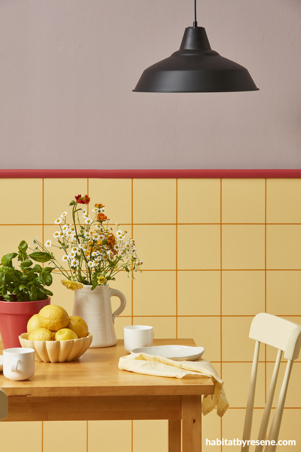
Upper wall painted in Resene High Tea, dado railand plant pot in Resene La Bamba, lower wall in ReseneMarzipanwithgrid lines in Resene Meteor, fruit bowl and chair in Resene Hampton andpendant lamp and small vase in Resene Bastille.
In western cultures, yellow is a cheerful colour that can evoke feelings of positivity. It can stimulate mental processes and nervous system activity. It’s also a highly palatable colour that can stimulate the appetite, which is why many yellows work well in commercial restaurants as well as residential kitchens and dining areas where it can create an inviting and enticing atmosphere. In retail spaces, brighter yellows can attract attention and encourage purchases.
However, it’s worth noting that too much yellow can sometimes lead to feelings of anxiety, so larger quantities of yellow should be carefully balanced with other colours. In spaces with windows, it’s also smart to be cognisant of your project’s natural surroundings as bluer locales can clash with yellow while vistas of redder or more golden habitats will sit better against yellow wall colours.
Softer yellows like Resene Marzipan are poised to be a major trend. Try this delectable and comforting amber yellow with a greyed off mint green like Resene Spring Rain or a pretty pale peach like Resene Gin Fizz for a trio of pastels suitable for a comforting café or opt for the unexpected with pairings like mauve and lipstick pink such as Resene High Tea and Resene La Bamba.
Top tip: Be aware of cultural differences in colour perceptions. A colour that has positive associations in one culture might have negative connotations in another.
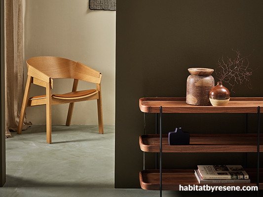
Resene Black Doris: glamour and sophistication
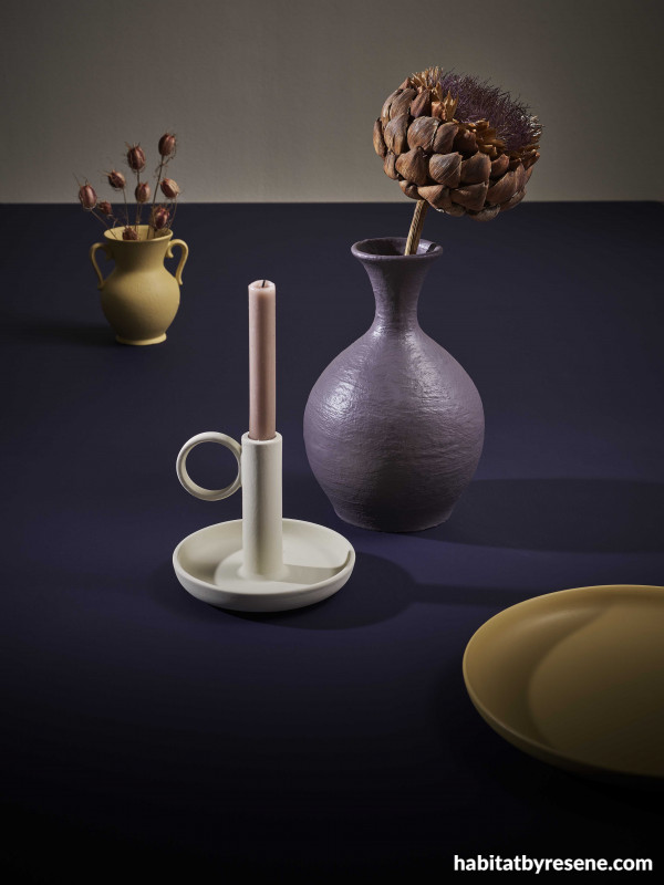
Wall painted in Resene Athena, tabletop in Resene Black Doris, candlestick in Resene Creme De La Creme, large vase in Resene Tenor and small vase and plate in Resene See The Light.
Deep purples have long been associated with royalty, so inky indigo hues like Resene Black Doris are ideal for spaces where you want to infuse an air of sophistication and drama. Spas, media rooms, bars and restaurants after a unique look that spells luxury will look dynamite with Resene Black Doris as a hero hue uplifted by harvest gold accents in Resene See The Light, supported by a welcoming beige like Resene Athena and enhanced with a bit of sparkle through metallic paint touches in Resene Gold Dust.
Top tip: The perception of colour can change with different lighting circumstances. Natural light enhances most colours while artificial lighting might alter their appearance. Be sure to test your Resene paint colours under different lighting conditions before finalising your specifications.
Resene Heliotrope: creativity and inspiration

Wall painted in Resene Heliotrope, floor and coffee table in Resene Double Alabaster and vases (from left to right) in Resene Inspire, Resene Double Alabaster, Resene Petal, Resene Heliotrope and Resene Rulebreaker.
Colour psychology is a nuanced and impactful aspect of design. By understanding how different colours influence human emotions and behaviours, you can create spaces that not only meet functional needs but also enhance the emotional experience of the occupants. From the energising effect of red to the calming influence of blue, the thoughtful application of colour can transform any space into a more effective and emotionally engaging environment. To learn more about colour psychology, check out this Resene webinar.
projects Amber Armitage
images Wendy Fenwick
Published: 10 Jun 2024

