
latest
habitat tv

Say goodbye to the morning scramble for keys, coats and sunglasses and hello to this… see this and more videos
blog

Reader roundup: Home projects to admire!
From sunny outdoor spaces to bold hues indoors, these habitat readers are showing us how… more
Five cosy colour palettes to consider as the weather cools down
19 Apr 2022
Some may think of colour specification as something that’s done once at the beginning of a project and then expect things to stay pretty much the same for a few years (or decades). While that can be true for some project typologies, there are others that need to continuously evolve and be updated over much shorter spans of time. Retail settings, for instance, may need to update their colour palette two, four or even more times per year to stay fresh and current with seasonal releases. Hotels and restaurants need to stay on the cutting edge of colour trends to remain relevant in the social media scene. And, of course, there are many residential clients who like to switch things up as the weather warms up or cools down to keep their spaces from feeling stale.
Although you may not have those clients knocking on your door looking for guidance every four to six months, it’s important to be cognisant that some might be considering colour under a seasonal lens – and that could (and should) affect the hues you specify in the first place.
If you’re searching for a scheme that’s dialled into current colour trends and is flexible enough to evolve with seasonal changes, look no further than the Resene colour palettes we’ve curated below. And having experienced them all in person, we can confirm that each will be plenty cosy enough to keep your project occupants thinking warm thoughts throughout the coming autumn and winter months.
Resene Half Raven + Resene Cumin + Resene Coast + Resene White Pointer
When you’re looking to create warmth, greys are a finicky choice for a base hue. With the exception of white, there is likely no other colour family where it is more important to view a hue in situ under the lighting conditions it will be subjected to as the wrong undertone will throw off your entire palette and vibe. Greys can also be notorious for making a space feel cold or sterile, which is not the mood anyone is after when cooler weather sets in.
Resene Half Raven, though, fits into a wonderful sweet spot. It’s effectively a chameleon that seems to shift its temperature depending on the other colours it’s paired with – making it an amazing option to consider if you client needs to switch up their accents on a regular basis. For a cosy scheme, try it with a diffused white like Resene White Pointer, add depth with Resene Coast and then tie it all together with toasty Resene Cumin, a toasty brown meets red terracotta.

Background in Resene Half Raven with A4 drawdown paint swatches in (from right to left) Resene Cumin, Resene Coast, Resene Indian Ink, Resene White Pointer and Resene Cloud, jug vase in Resene Cumin, dish in Resene Coast and bud vase in Resene Half Raven. Lamp from Paper Plane Store and bedlinen from Foxtrot Home. Project by Laura Lynn Johnston, image by Wendy Fenwick.
Resene Waiouru + Resene Burnt Crimson + Resene Nero + Resene Double Merino
There’s no question that earthy, olive greens are among the most on-trend colours, and there are few hues that match the inherent warmth it can lend to a space. Resene Waiouru, in all its softly dusted glory, has cosiness and luxury written all over it and is surprisingly flexible to use as the base for a colour palette. The colour is also just the right tone that it can work well in a complementary colour scheme alongside a deep red like Resene Burnt Crimson without feeling like Christmas. Balance these opposites with high contrast neutrals like chalky black Resene Nero and fleecy Resene Double Merino for a trendy yet timeless look.

Background in Resene Waiouru with A4 drawdown paint swatches in (from left to right) Resene Double Merino, Resene Eighth Black White, Resene Waiouru, Resene Burnt Crimson and Resene Nero and vase and star ornament in Resene Nero. Project by Melle van Sambeek, image by Bryce Carleton.
Resene Colorwood Natural + Resene Salsa + Resene Bonjour + Resene Alaska
Taking timber finishes from tip to toe is not only a top trend both inside and out, it’s a surefire way to inject warmth into a space – especially when it’s been stained in tones like Resene Colorwood Natural. Teaming it with this refreshingly creative and chic colour combination of Resene Salsa red, Resene Bonjour beige and Resene Alaska lilac grey isn’t something you’ve seen on every blog and social channel across the internet, so consider yourself ahead of the curve if you suggest it to your client. Strong reds like Resene Salsa are set to be making a resurgence over the next six to twelve months, and though it’s a colour best saved for spaces that won’t be overwhelmed by its energy, there’s no chance of anyone feeling chilly in its presence.

Background stained in Resene Colorwood Natural with arch in Resene Salsa, A4 drawdown paint swatches in (from top to bottom) Resene Bonjour, Resene Alaska, Resene Salsa and Resene Jaguar, small vase in Resene Jaguar and large vase in Resene Volcano. Project by Kate Alexander, image by Bryce Carleton.
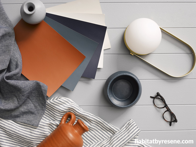
Resene Sea Fog + Resene Casper + Resene Lazy River + Resene Felix
White walls are seldom a tough sell, but choosing the right white that feels warm but not creamy and crisp but not stark is a tricky tightrope to walk. But herein lies the beauty of Resene Sea Fog: it’s neither truly warm not truly cool and just greyed enough to keep it from being glarey. However, the hue is even better served when it’s supported by cosy accents in warm ocean blues like Resene Lazy River, misty greys like Resene Casper and rich coffee browns like Resene Felix. Bring in some greywashed timber in Resene Colorwood Mid Greywash, and you’ll have yourself a palette that can easily be made suitable for warm or cool weather simply by swapping light linens for chunky wool textiles.

Background in Resene Sea Fog, vases in Resene Sea Fog (large) and Resene Indian Ink (small), coaster in Resene Casper and A4 drawdown paint swatches in (from top to bottom) Resene Indian Ink, Resene Thunder Road, Resene Lazy River, Resene Casper, Resene Escape and Resene Felix. Project by Vanessa Nouwens, image by Melanie Jenkins.
Resene Colorwood Pitch Black + Resene Colorwood Rock Salt + Resene Tequila + Resene Half Hairy Heath
While it’s easy to look at golden hued timber stains like Resene Colorwood Natural or Resene Colorwood Oregon and immediately recognise them for their warmth, a black stain like Resene Colorwood Sheer Black – which allows more of the wood’s natural grain to show through than deeper Resene Colorwood Pitch Black – is plenty cosy. Take this stain across timber clad walls and ceilings to create a cocooning effect paired with timber flooring in Resene Colorwood Rock Salt for a dramatic base. From here, it’s simply a matter of swapping eye-catching accent hues in and out when a colour change is in order. We love a combination like Resene Tequila, Resene Half Hairy Heath and Resene Buttercup together for winter weather – along with touches of brass and marble and warm woven textiles.

Background in Resene Colorwood Sheer Black with A4 drawdown paint swatches in (from left to right) Resene Half Hairy Heath, Resene Tequila and Resene Snow Drift, bud vase in Resene Buttercup and lidded dish in Resene Tequila. Wool throw and marble dish from Città. Project by Laura Lynn Johnston, image by Wendy Fenwick.
For the latest on colour trends to watch for in the months to come, check out the Red Alert section in the current issue of BlackWhite magazine or the habitat plus – decorating and colour trends book.
Published: 19 Apr 2022

