

latest
habitat tv

Say goodbye to the morning scramble for keys, coats and sunglasses and hello to this… see this and more videos
blog

Brick Bay unveils its poetic new folly for 2026
The winner of the 2026 Brick Bay Folly competition has been unveiled. Within the Wings… more
Gently, Gently: Nearly neutral tones for projects that need a touch of colour
19 Jul 2022
The strong but silent, barely there hues might at first glance seem like they don't have as much personality as bold, richer shades.
But don't be deceived; these colours are subtle, yet their presence is hard to ignore, and they can gently give spaces extra oomph.
Their flexibility is such that with these faint colours, the possibilities for interiors are endless and a great option for clients who need dissuading from white.

Wall painted in Resene Lemon Twist, bench, vase and ceramic face sculpture painted in Resene Thorndon Cream.
One way to describe a barely there hue is the pale version of a colour. Reduced right down – bearing in mind not all colours drop to a quarter or eighth strength ¬– the colour is pared back to its bare minimum, offering only a glimpse of its unique tone.
Resene colour expert Amy Watkins recommends selecting tones by ensuring they're muted, and you're only starting to see glimpses of colour coming through: "Barely there colours start to merge into almost a neutral.”
“You've got Resene Springwood, Resene Saltpan and Resene Umber White, which almost go into a pale white, but even Resene Half Secrets which can still be classed as 'barely there' because it's only got that hint of colour, as with Resene Pot Pourri,” she says.
These days, the spectrum for barely there neutrals is broad. The beauty of these faint colours is their flexibility in colour schemes. Your options are plentiful, be it sticking with a pale palette or bringing in bolder tones.

Wall and pot in Resene Reservoir and floor in Resene Hippie Blue. Bench seat from Good Form, lamp and cups from Città artwork by Amber Armitage.
"This is where you could go for Resene Pot Pourri, then choose a nice colour block of Resene Mexican Red because they would still work together," Amy says. "Similarly, with Resene Spring Wood, you can go further up that colour tone and get a clean contrast. The best thing about barely there colours is they open you up for plenty of flexibility within that particular range."
The appeal of pale colours is also that they ooze personality when paired with the ideal décor. A stunning coastal lounge with walls in the palest blue, reclaimed timber and linen chair covers is a setting that is both soft yet has a rawness to it, resembling the natural beauty outside. Nature holds its own in such an interior with wall colours such as the soft grey-blue of Resene Quarter Frozen or pearly aqua of Resene Swans Down, and materials that celebrate texture, such as limestone and rattan. Use Resene SpaceCote Flat to diffuse the light to soften the space further.

Main wall painted in Resene Soothe. Vase painted in Resene Hint Of Grey. Lamp from Città.
Low-lying furniture in a lounge will help make an interior even more relaxing and inviting. Welcome in natural light, too, removing any dark, dated curtains to open up the space.
If the interior boasts a garden outlook, pair hues with faint greens and greys and warm wood and furniture. Look to lively yet pale Resene Peppermint, the watery green of Resene Carefree, yellow-tinged Resene Green White or grey-green Resene Celeste.
Bring in warmth with barely there pinks like Resene Ebb, Resene Soothe, Resene Half Sauvignon or Resene Half Wafer or bordering on beige, Resene Urbane. Use Resene Cest La Vie or warm pink-based brown oxide Resene Pearl Bush for a pale rose white.

Wall in Resene Swans Down. Vases from left in Resene Soothe, Resene Reservoir, Resene Soothe, Resene Peppermint, (bottom shelf), Resene Hippie Blue, Resene Hint Of Grey and Resene First Light. Chair and wall shelf (right) from Good Form.
While pale colours are relaxing, it's easy to forget they can still be uplifting and fun. Get playful when pairing faint colours. Think soft, sherbet hues in the palest form. Team the light mint of Resene Ottoman with the sunny Resene Half Gin Fizz and the sweet pink of Resene Spring Wood for a gentle impact.
Other soft sorbet combinations include Resene Spring Wood with the misty green of Resene Reservoir, pale blue of Resene Link Water and the freshness of Resene Half Quarter Moonbeam. Resene Springwater, albeit pale, will allow its hints of rose to warm up the pale space, creating room for the edginess of these complementary hues.

Drawdown paint swatches from top left in Resene Thorndon Cream, Resene Lemon Twist and Resene Half Nomad. Testpots from top in Resene Thorndon Cream and Resene Lemon Twist. Tile from Italian Stone, fabric from Textilia. Timber chips stained in Resene Colorwood Rock Salt and Resene Waterborne Woodsman Pitch Black.
Pale hues with a touch of earthy corals, apricots and soft pinks add an element of invigoration and warmth, albeit in the most minimal manner. Fresh whites balance out this colour, while touches of warm wood in furniture provide a natural point of difference. Hints of mint accents will bring this to life even more, even if it's just by way of clever accessorising.
For a change in pace, bring in dramatic colours. These needn't be gloomy or dominating, but simply colours that provide a clean contrast and a sense of unity.

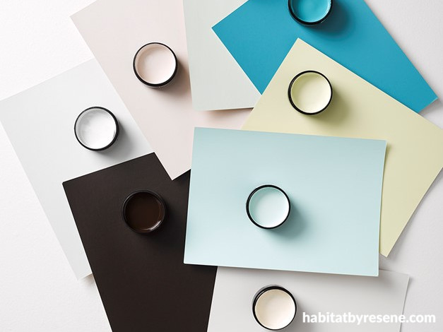
A4 drawdown paint swatches and testpots clockwise from top left in Resene Soothe, Resene Peppermint, Resene Hippie Blue, Resene First Light, Resene Reservoir, Resene Swans Down, Resene Blackout and Resene Hint Of Grey.
To achieve the perfect balance of drama and serenity, keep pale colours at 80 per cent of the entire setting. Darker colours can make up the remaining 20 per cent, ensuring the right balance for the eye. Let one or two chosen pale colours be the base for walls. Then pull the palette together with stronger tones clean enough in contrast that balance the barely there hues.
Take Resene Spring Wood for a hint of drama, pair it with Resene Sakura, Resene Corvette, Resene Apple Blossom and Resene Lusty. Or keep it pale, pairing it with pale biscuit Resene Cashmere and bold Resene Apple for a powder pink palette that holds its own earthiness.
To avoid an overly monochromatic space, experiment with varying shades.
Barely there hues are fresh, elegant and push boundaries, combining the best of both worlds – a pale, calming space and a hint of creative colour. The result is a luxurious sense of space, as equally at home in a residential setting or in a wellness focused business. Celebrate the understated beauty of barely there hues; less really is more.
Published: 19 Jul 2022

