Let’s talk chalk: Dusty hues for your next project
16 Aug 2022
Recent times have seen us emerge from a period of change in which we were forced to stop and settle. The pandemic brought going into the office and school to a halt, suddenly socialising was a thing of the past; the one constant was our environments.
With that came the realisation of just how much of a role our setting plays in our wellbeing. We saw the potential in our surroundings and how elements, such as paint colours, could enhance daily life.
Fast-forward to today, we’ve departed lockdowns, but the pandemic lingers. We’ve gone back to a new kind of ‘normal’. What continues from the time of isolation is just how vital a beautiful space is to our sense of joy. Paint colours have a huge role in beautifying our lives and uplifting us emotionally, whether in a client’s commercial or residential interior.
Indeed, clients are undoubtedly feeling the pressure from the past few years and the unpredictability of supply chains across industries hasn’t simplified matters. Where there is solace and escapism, however, is in the chalky hues that are turning heads right now.
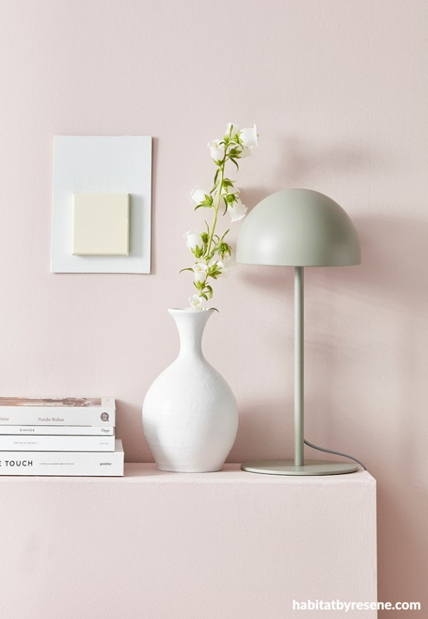
Wall and headboard painted in Resene Soothe and vase painted in Resene Hint Of Grey. Lamp from Città Project by Amber Armitage, image by Flash Studios.
These ‘in-between’ hues resonate perfectly in the soft comfort they offer so abundantly. Whether it’s in a client’s home or in a retail setting, these foggy colours cater to a demand for interiors oozing peace and tranquillity.
Beautifully murky and intriguing, these in-between colours are the antithesis of solid brights – although the instant clarity of bold colours will always appeal. Complex and versatile, chalky hues pair with our renewed appreciation of spaces that ease our stress and offer a sense of sanctuary. Crafting a residential or commercial area in these shades embraces a new element, reviving a client’s interior like nothing else.
Such in-between colours also reflect the ambiguity with work and play that we’ve become so used to. Many of us socialise – at a distance, work – from home and travel – domestically. The blurred lines of these chalky hues are comforting and familiar, providing a soft side to a space. They’re soothing and calming in light and dark hues.
The result is a joyfully escapist setting that triggers relaxation and those moments of ‘ahhh’, providing a gentle edge; and we all know that feeling at ease is when we are at our best.
Nurture the qualities of comfort with chalky hues greyed off or pastel in nature. What defines these colours is the absence of clarity – and that’s a beautiful thing! A nod towards soothing murky hues enhances a sense of peace and zen.
What’s so special about these chalky colours is that they are a way for some clients, who may not necessarily be at ease with colour, to dip their toes into the world of paint hues. The soft, subtle character of these in-between shades means some clients are more willing to bring them into their commercial spaces due to the comfort and warmth they evoke.
If you’ve got a client drawn to these murky colours but loves neutrals, they’ll see the appeal of gentle showstoppers like Resene Chalk Dust. A genuine member of the chalky family, it holds its own not in the clarity of brights but in the solid depth of colour and limestone character.
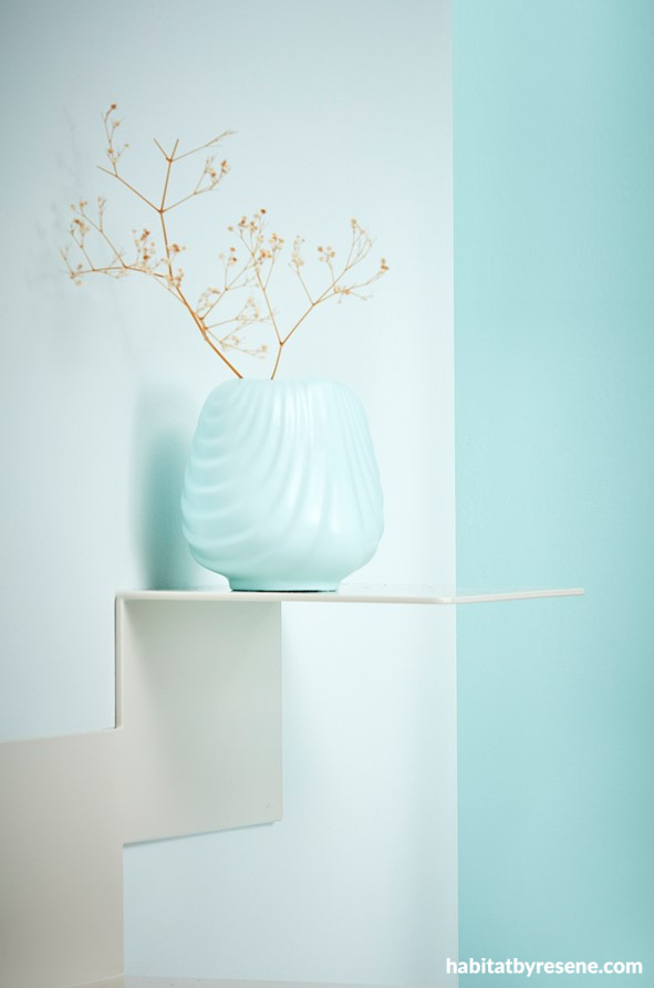
Wall and vase painted in Resene Reservoir and left-hand wall in Resene Swans Down. Shelf from Good Form. Project by Amber Armitage, image by Flash Studios.
Placed next to Resene Alabaster, you’ll see the latter has much more clarity. But what defines chalky colours, such as Resene Chalk Dust, is the combination of two different undertones to create its foggy appeal; a green-yellow edge creates its off-white grey. Take Resene Merino too – it is chalky due to its dual melody of grey and brown, or Resene Sea Fog, the grey-tinted nature of this white offering a timeless, nostalgic feel.
You’ll find chalky colours in the entire colour spectrum, imbued with dual undertones, offering that in-between shade. For clients who love an element of mid-toned colour, duck-egg blues are attractive and appealing. Resene Duck Egg Blue never seems to go out of favour, and its beauty lies in its soft, delicate shade. Or use the gentle blue-green of Resene Jet Stream – honing in on the healing impact of nature, it evokes the peace of the ocean on a calm winter’s day. For weathered grey-based blues that calm and soothe any interior, Resene Escape, Resene Blue Moon and Resene Awash make subtle statements in their dreamy quality.
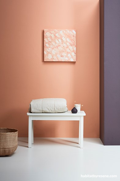
Wall painted in Resene Beethoven, floor and bench in Resene Thorndon Cream and artwork in Resene Beethoven and Resene Thorndon Cream. Blanket and basket from Città. Project by Amber Armitage, image by Flash Studios.
In recent times we have bade adieu to cold, soulless greys and hello to uplifting versions such as Resene Half Friar Greystone, the smoky grey-green of Resene Lemon Grass, the stronger presence of Resene Half Chicago and the murky green-brown of Resene Possessed. Take it up a level with the coal grey blue of Resene Mine Shaft. Smoky and foggy, these hues bring a sense of mystery to a space and an overwhelming relaxing mood.
Red-browns are filling our spaces too, their multidimensional qualities oozing personality. They’re certainly turning heads, such as the spicy character of Resene Apple Blossom and Resene Sante Fe bordering between brown and reddy pink. The putty coloured neutral of Resene Antidote or pink biscuit of Resene Wafer hold their own too.
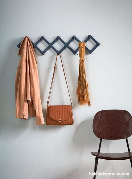
Wall painted in Resene Jet Stream, coat hanger in Resene St Kilda and chair in Resene Digeridoo. Bag from Saben and jacket from Father Rabbit. Project by Amber Armitage, image by Flash Studios.
Where these colours take the limelight is in larger living or commercial spaces, balancing the calm with the welcoming. If the preference is for in-between colours in a cool palette think twice about whether they should appear on the southern side of a building or home. You may not get warmth unless you bring in a warm, off-white that brings warmth and contrast.
Of course, these chalky colours can have an element of flirtation thrown in. This could be with a flash of Resene FX Metallic Gold or a whisper of bright accessories.
For a bold client, these chalky hues pair perfectly with brave saturated brights, accessorising next to them beautifully. Take a hue like Resene Jet Stream; it finds its partner next to the strong hues of deep green Resene English Holly and the rosy milky hue of Resene Swiss Coffee. And by layering Resene Duck Egg blue with soft beiges and green-blues like Resene Half Tea and Resene Kumutoto you’ll achieve a fresh, serene look.
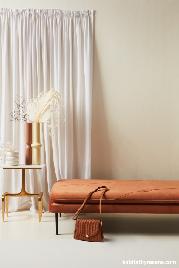
Wall and floor painted in Resene Half Scotch Mist and vases from left painted in Resene Half Scotch Mist, Resene Leather and Resene Lemon Twist. Marble table with brass legs and daybed from Contempa. Project by Amber Armitage, image by Flash Studios.
If there are colours that celebrate a hard-to-define, evocative nature, then these are them. It's as if the appeal lies in the inability to pin down what these exact shades are. We’re drawn into the space, absorbing the colour before us and the mystical appeal it offers.
Published: 16 Aug 2022
