

latest
habitat tv

Say goodbye to the morning scramble for keys, coats and sunglasses and hello to this… see this and more videos
blog

Brick Bay unveils its poetic new folly for 2026
The winner of the 2026 Brick Bay Folly competition has been unveiled. Within the Wings… more
Light but not white: Seven subtle Resene paint colours to look to when designing soothing spaces
09 Oct 2023
When you’re settling on the main paint colours that will be used across the major surfaces of your project, it’s important to keep in mind the profound psychological impact that these selections will have on the overall ambiance. Although white has long been a popular paint colour choice for walls, ceilings and trims because of its neutrality, it can unfortunately leave a lot to be desired if you’re trying to enhance the vibe of the space.
While there are plenty of beautiful Resene saturated shades from sumptuous darks and vibrant brights to deep earthy hues and classic mid-tones, there are certain projects where major surfaces do need to be kept light and choosing a more delicately pigmented hue could have some significant advantages. Resene’s enticing selection of pale and pastel paint colours offer a myriad of benefits and positive psychological effects that go far beyond what a basic white can achieve. Whether you’re after an air of relaxation, an increased perception of space or are looking to add timeless appeal, these lighter options can be used to create harmonious and inviting environments that foster positive psychological impacts. And when teamed with carefully selected supporting hues, your finished design is sure to look chic and stylish, too.
Don’t overlook the power of these seven subtle Resene hues for transforming your upcoming projects into havens of serenity.
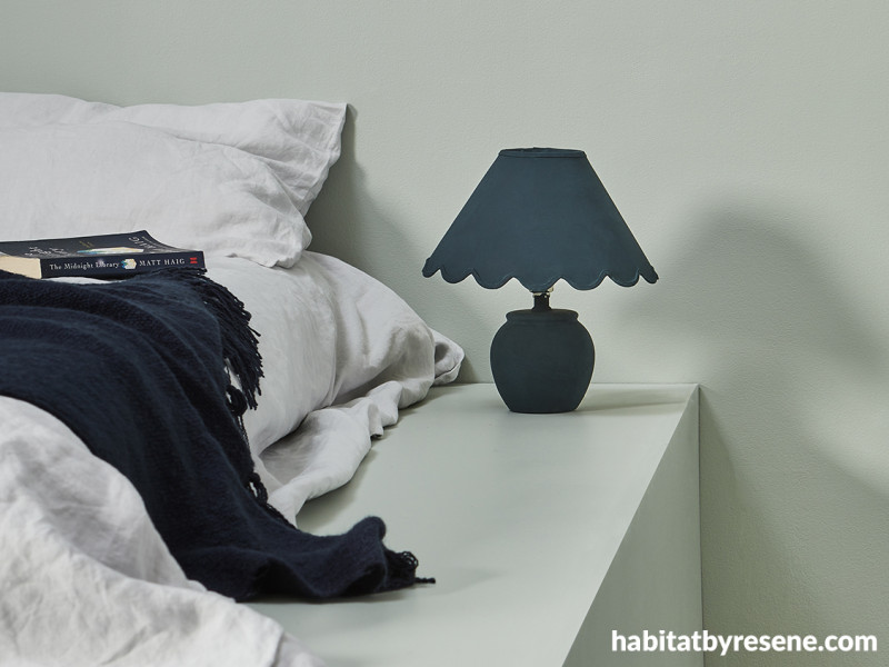
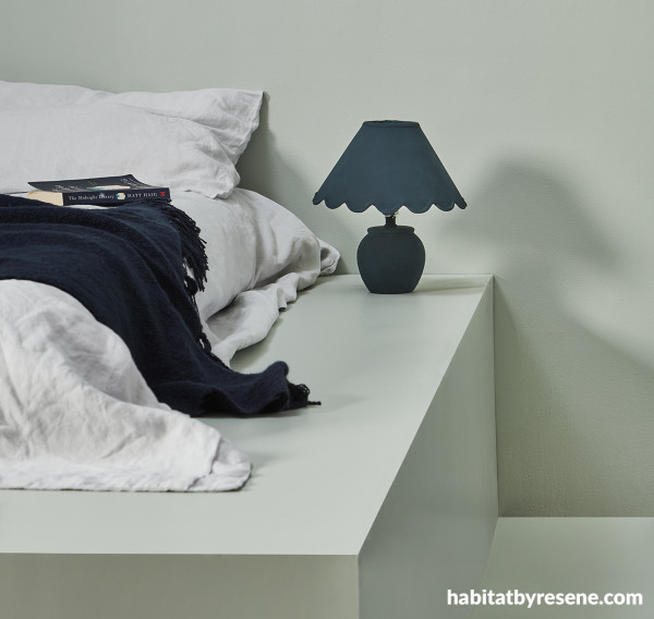
For an enduring blue green, try Resene Jet Stream
Timeless dusty blue-green colours are suitable for a wide range projects and design styles from classic to contemporary. When used as a backdrop, colours like Resene Jet Stream never go out of fashion so long as you and your client layer in refreshed accent colours every few years. For a scheme that taps into today’s top trends, combine Resene Jet Stream with rusty oranges like Resene Ayers Rock, deep yet warm blues like Resene St Kilda, red browns like Resene Digeridoo, mustard golds like Resene Hot Toddy and warm toned timbers finished in a stain colourwash of Resene Colorwood Breathe Easy.
Wall and vase painted in Resene Jet Stream and bedside table drawer and skirting board in Resene St. Kilda. Bedlinen from Penney + Bennett.
For a serene dusted green, try Resene Rainee
Light greens reign supreme when it comes to creating a tranquil environment that promotes relaxation and reduced stress. Pale green is associated with nature, growth and renewal and hues like Resene Rainee have a soothing effect on the mind and can help create a sense of calm. Add further levity by layering in white textiles or furniture painted in Resene Merino for added freshness. To play up the colour’s connection to nature, incorporate wooden furniture stained in Resene Colorwood Natural for a warmer look or opt for a casual, weathered-looking finish in a cool grey Resene Colorwood Mid Greywash. For interest, try adding select touches of a jewel-toned green blue like Resene Blue Bark and an inky blue like Resene Indian Ink or as accents for an elegant look. If you want to go a more unexpected route, choose caramel brown, a deep carmine red and a pop of lavender instead with Resene Twine, Resene Lonestar and Resene Heartbreaker.
Walls, floor and bed base painted in Resene Rainee and lamp painted in Resene Blue Bark. Bedlinen from Foxtrot Home, throw from Baya.
For a faintly warmed crystalline aqua, try Resene Swans Down
Warm yet clear blues are incredibly useful when you’re looking to increase the perception of space, particularly in smaller projects that have more intimate rooms. Reminiscent of clear skies and tranquil oceans, these blues also bring a sense of peace and serenity. Colours like Resene Swans Down can make a room appear larger and more open without sacrificing cosiness. Resene Swans Down can be easily layered with other popular pastels like Resene Contented, Resene Inspire or Resene Springtime and a white like Resene Rice Cake for added softness but it also works well with bolder aquas like Resene Plan B or even indigo blues like Resene Epic and metallic accents in Resene FX Metallic Gold Dust or Resene FX Metallic Proton.
Wall painted in Resene Swans Down and vases in Resene Soothe and Resene Hint Of Grey. Artwork by Toni Brandso, diary from Made of Tomorrow.
For a graceful and uplifting pink, try Resene Soothe
Pale pinks are known to have mood-lifting properties that can help create a positive atmosphere and make a space a more inviting and pleasant place to be. Soft and romantic, subtle pink paint colours can add an air of elegance to a minimalistic space and are useful for enhancing complexions – making pinks like Resene Soothe an advantageous option for spas, restaurants, bars, hotels, bedrooms, bathrooms and retail settings.
Resene Soothe is also surprisingly flexible and can be complemented with a wide range of accent colours, from classic greys like Resene Ted to soft blacks like Resene Invincible to beiges like Resene Half Sisal and smoky greens like Resene Vantage Point. Add warmth and glamour with metallic accents in rose gold or copper like Resene FX Metallic Rose Gold or Resene FX Metallic Magma. Or try it outdoors with white and mint green furniture and plant pots in Resene Half Sea Fog and Resene Transcend to create a fresh and playful patio.
Wall and plant pot painted in Resene Soothe and floor in painted in Resene Hint Of Grey. Cane sofa from Mr Bigglesworthy, throw and mug from Città.
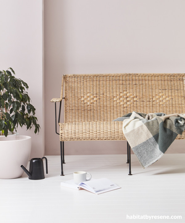
For a cosy and comforting yellow, try Resene Lemon Twist
Pale yellow colours are sunny, cheerful and full of positivity. When used for major surfaces, proven pick-me-up paint colours like Resene Lemon Twist have the power to instantly lift an occupant’s mood. When combined with nuanced creamy whites like Resene Thorndon Cream, toffee browns like Resene Dark Buff and Resene Cape Palliser and golds like Resene Noosa, Resene Lemon Twist can be an interesting and effective alternative to taupe or beige in a pared-down, earthy space. But because of its dusted quality, it can also fit well within a nostalgic or heritage-focused scheme. Add a touch of luxury with gold or brass fixtures and a midnight blue like Resene Carpe Noctem for bold contrast or opt for bitter orange, pale lilac and verdant green pairings like Resene Clockwork Orange, Resene Good To Go and Resene Petal for a trendy happy-modern vibe.
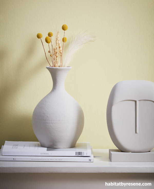
Wall painted in Resene Lemon Twist and bench, vase and sculpture painted in Resene Thorndon Cream.
For a chic and reassuring cream, try Resene Coconut Cream
Unlike stark white, which can sometimes feel cold and clinical, a complex cream like Resene Coconut Cream brings warmth and character with an undeniably chic flair. This particular cream is incredibly versatile and tends to act like a bit of a chameleon depending on which hues you pair it with – making it a superb option to serve as a backdrop for various colour schemes.
Keep things simple by painting trim and accents in a purer white like Resene Quarter Alabaster along with warm timber tones finished in Resene Colorwood Bask and a classic tan like Resene Alert Tan for an elegant and timeless look. For more contrast, try bringing in a deep blue like Resene Ocean Waves on furnishings and décor. If cosiness is what you’re after, create an inviting atmosphere by pairing Resene Coconut Cream with earthy greens like Resene Tic Tac Toe, Resene Green Days and Resene Seaweed to provide a grounding effect across your supporting design elements.
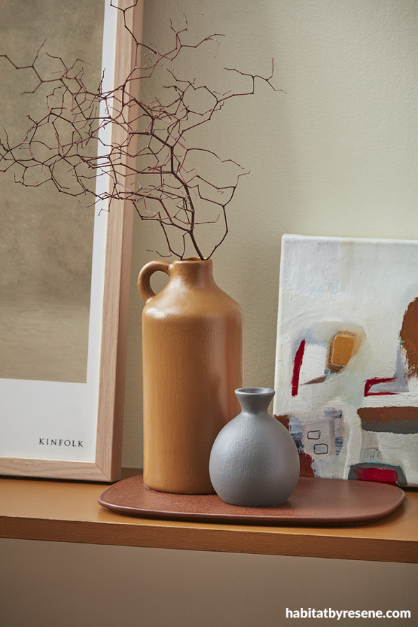
Wall painted in Resene Coconut Cream, console table in Resene Alert Tan and vases in Resene Alert Tan and Resene Dune. Framed artwork from Slow Store.
For a trend-friendly warm grey, try Resene Half Scarpa Flow
Although the popularity of grey is on the decline as warm tones like beige, taupe and brown have taken centre stage as the preferred neutrals, there are still many clients who are drawn to grey as a classic and timeless choice. The key to making grey feel relevant in today’s spaces is to choose a tone that exudes plenty of warmth and comfort. For clients that are still hesitant to switch over to warm neutrals completely, greys like Resene Half Scarpa Flow can help to bridge the gap as they can sit beautifully in harmony with toasty beiges like Resene Half Sour Dough and chocolate browns like Resene Milk Chocolate in a modern and minimalist space. For balance, a floor in a deep navy blue will help ground the scheme while accents in Klein blue, using ultramarine hues from the Resene Beyond the Sea collection, brings in one of today’s most popular accent colours while maintaining classic appeal.
If you’re looking to create a serene and soothing atmosphere, other colours that look great with Resene Half Scarpa Flow include peach or mint pastels like Resene Island Spice and Resene Kandinsky. When bolder accents are needed, add a pop of colour and energy by introducing a vibrant teal and a coral pink like Resene Deep Teal and Resene Florentine Pink balanced with a beige like Resene Triple Spanish White.
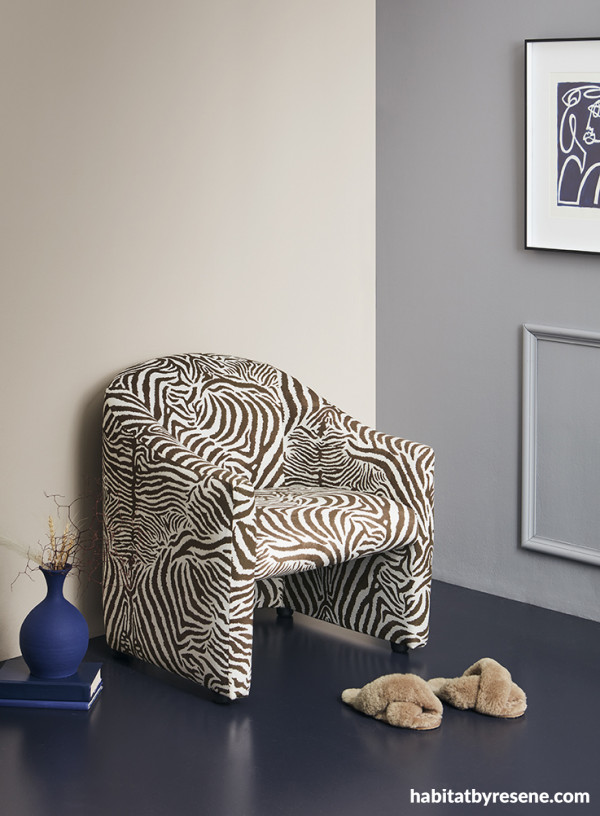
Left wall painted in Resene Half Sour Dough, right wall in Resene Half Scarpa Flow, floor in Resene Midnight Express, vase in Resene Lucky Point and books in Resene Midnight Express and Resene Lucky Point. Artwork by Claire Stapleton, slippers from La Tribe.
For more popular light and pale hues that are in alignment with today’s top trends, look to the Resene The Range fashion fandeck. For even subtler lightly coloured options and character neutrals, check out the Resene Whites & Neutrals Collection. As always, be sure to test your paint and wood stain colours in-situ (when possible) before you commit. If you’re working on a new build and won’t be able to see your chosen colours on site before they need to be specified, order A4 Resene drawdown paint swatches so that your shortlisted colours can be viewed at a larger scale for a clearer representation of what your finished design will look like.
projects Amber Armitage
images Wendy Fenwick
Published: 09 Oct 2023

