

latest
habitat tv

Say goodbye to the morning scramble for keys, coats and sunglasses and hello to this… see this and more videos
blog

Brick Bay unveils its poetic new folly for 2026
The winner of the 2026 Brick Bay Folly competition has been unveiled. Within the Wings… more
Sunny side up: Perfect pairings that play to the strengths of this year’s most prolific colour trend
08 Jul 2025
Butter yellow has quickly become one of the most talked-about colours in contemporary design. Radiating optimism and comfort, this mellow golden hue evokes soft morning light and effortlessly infuses spaces with approachability and positivity. Designers, specifiers and decorators are being increasingly drawn to butter yellow not just for its mood-enhancing qualities but for its surprising versatility and grounding effect that’s suitable for a diverse range of projects and styles.
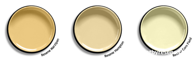
Far from being limited to accents, butter yellow can serve as a confident yet calming base tone. Whether used to softly envelop a room or to add gentle lift to a muted palette, it plays beautifully with natural materials and textures like timber and stone - making it a fashionable choice for bringing a bit of life to neutral contemporary settings. Options like Resene Marzipan, Resene Hampton and Resene Corn Field feel refined rather than overpowering, balancing just as well with bold, saturated accents as they do with earthy, organic tones for creating palettes that are not only visually pleasing, but deeply liveable and adaptable across a wide range of design contexts.
Ready to elevate this beloved hue? Explore these curated Resene colour pairings to bring fresh depth and sophistication to your next project.
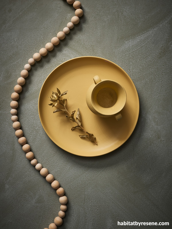
Pair it with dusty blue for balanced elegance
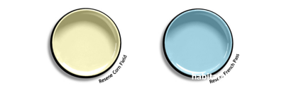
A natural partner to butter yellows like Resene Corn Field, a classic dusty blue like Resene French Pass introduces a calm, composed contrast that lends itself well to commercial and public-facing spaces. In hospitality environments such as boutique hotels, cafés or wellness studios, this palette evokes warmth and tranquillity without feeling overly domestic. Dusty blue offers a sense of professional polish, while butter yellow adds approachability – ideal for reception areas, breakout lounges or meeting rooms seeking a soft, human-centred aesthetic. The combination also works beautifully in educational or cultural spaces, where lightness and clarity are key to supporting focus and wellbeing. Whether used on spacious broadwall applications, decorative accents or wayfinding details, these hues deliver a soothing yet sophisticated palette that enhances both spatial flow and user experience.
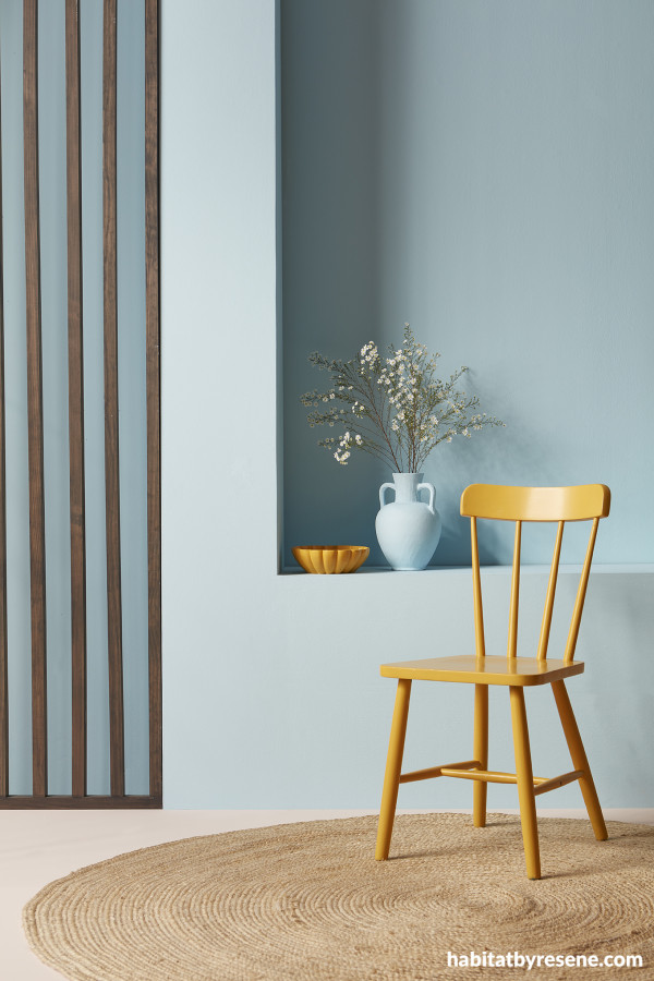
Walls, built-in shelf and vase painted in Resene French Pass, wood slat screen finished in Resene Colorwood Bark, floor in Resene Dust Storm and chair and bowl in Resene Fuel Yellow.
Select sage green for earthy sophistication
A sage green like Resene Bud, with its subdued greyed-off undertone, sits in effortless harmony with the gentle radiance of butter yellow – making this pairing particularly suited to calming environments that prioritise connection to nature and sensory wellbeing. A layered mix of sage-toned greens, from pale Resene Springtime to deeper Resene Tic Tac Toe, offers a quiet sophistication that tempers yellow’s brightness, creating a balanced environment that feels optimistic yet grounded. This combination is also highly effective in biophilic interiors, where the goal is to enhance occupant wellbeing through natural cues and organic materials. Together with muted yellows like Resene See The Light, sage greens cultivate a sense of place and permanence, aligning beautifully with contemporary values around health, mindfulness and environmental stewardship. When used in medical clinics or yoga studios, this palette is perfect for supporting a nurturing, restorative atmosphere that draws directly from the natural world.
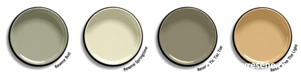
Background painted in Resene Tic Tac Toe with Resene FX Paint Effects Medium mixed with Resene Springtime applied on top and plate and vase in Resene See The Light.
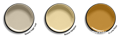
Combine it with greige for understated modernity
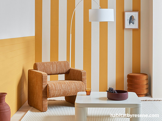
The quiet elegance of a greige like Resene Sugar Loaf helps ground butter yellow’s inherent optimism, resulting in a palette that is approachable, adaptable and particularly effective in settings where subtle sophistication is the design intent. When complemented with Resene Hampton, this pairing lends itself particularly well to open-plan environments where spatial flow and subtle zoning are critical. In boutique hospitality settings or cafés, greige and butter yellow work in harmony to establish a relaxed yet refined atmosphere that encourages longer dwell times and softens the overall aesthetic. In workplace interiors, this duo can support wellness-focused design strategies by reducing visual noise and promoting calm productivity. For a higher contrast look that’s more visually stimulating, swap Resene Hampton for a slightly more pigmented yellow like Resene Pizza and use it to create a striped painted wall effect that will really pop.
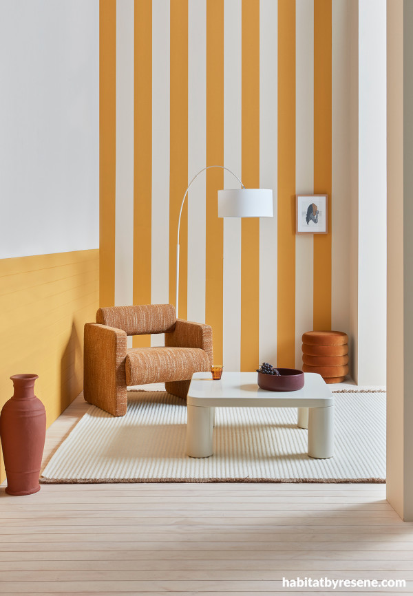
Walls painted in Resene Sugar Loaf with stripes and tongue-and-groove panelling in Resene Pizza, flooring finished in Resene Colorwood Breathe Easy, floor vase in Resene Half Hairy Heath and bowl in Resene Spitfire. Chair, coffee table and ottoman from Soren Liv, rug from Nodi, lamp from Lighting Plus.
Look no further than navy for classically chic contrast
For those seeking impact in commercial or public spaces, pairing butter yellow with a deep navy like Resene Indian Ink creates a striking and sophisticated visual language. This high-contrast combination evokes confidence and clarity that’s ideal for environments that aim to leave a strong first impression, such as hotel lobbies, high-end retail shops or corporate reception areas. Navy brings architectural weight and structure, grounding these spaces with a sense of authority while butter yellow introduces warmth, optimism and touch of fashionable flair. In co-working spaces, breakout lounges or hospitality venues, this contrasting combo can be used to define zones or accentuate custom joinery, lighting elements or signage. With subtle nods to Art Deco, modern classic and even preppy aesthetics, this palette effectively balances boldness with charm - making it both memorable and versatile.
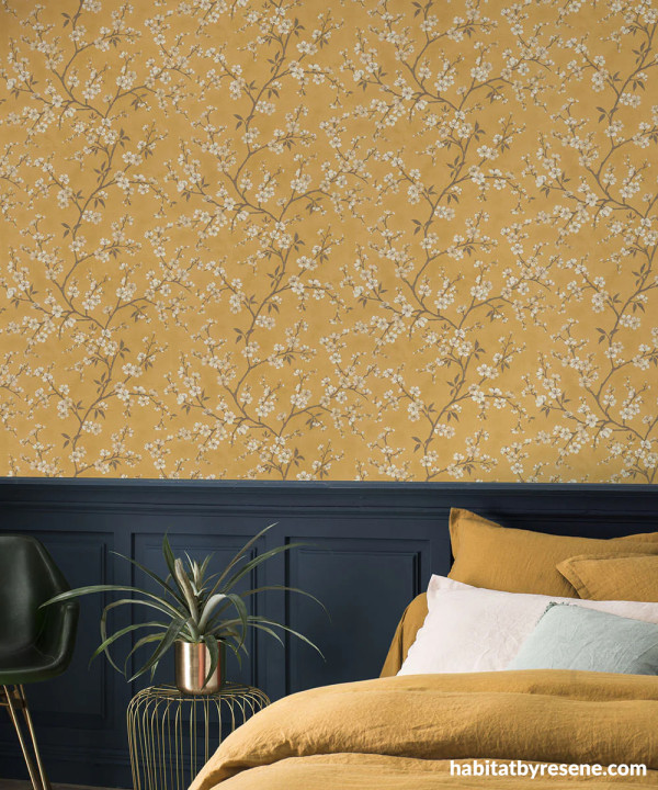
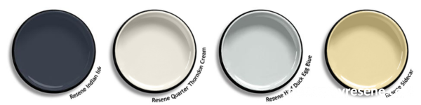
Pair a yellow wallpaper like Resene Wallpaper Collection 456721 with a chic navy like Resene Indian Ink and accents in Resene Quarter Thorndon Cream to bring the chalky white tones from the flower design off the wall and into the room. Finish the look with a few touches of duck egg blue in Resene Half Duck Egg Blue and a butter yellow like Resene Sidecar on décor and accessories.
Tap into true romance with lavender or lilac pairings
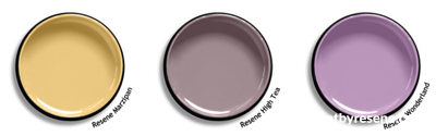
Pairing a butter yellow like Resene Marzipan with soft lavender or lilac tones such as Resene High Tea or Resene Wonderland results a sensual and elegant palette that is particularly well-suited to settings seeking to foster creativity, calm and a distinctive aesthetic identity. The warmth shared between these hues evokes a sense of gentle optimism and individuality that’s ideal for spaces designed to feel expressive without being overpowering. In creative studios, this combination offers a visually soothing and emotionally uplifting experience for workers. These colours also work beautifully in hospitality contexts, such as cafés, salons or spas, as well as boutique retail settings where visual softness can be used to offset harder architectural lines or industrial elements. With a nod to romantic maximalism and contemporary Parisian styling, the pairing brings whimsy and warmth while still maintaining a modern, curated edge.
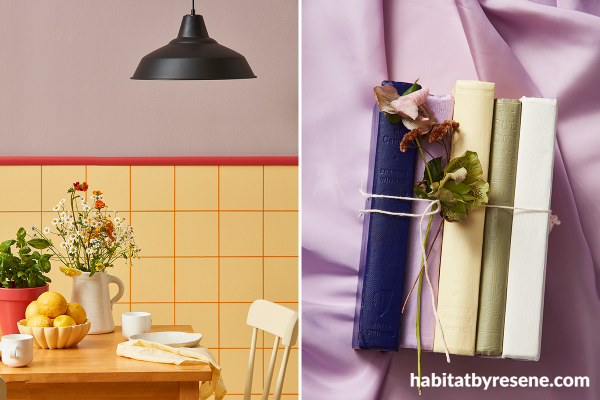
Left: Upper wall painted in Resene High Tea, dado rail and plant pot in Resene La Bamba, lower wall in Resene Marzipan with ‘grout’ lines in Resene Meteor and fruit bowl and chair in Resene Hampton.
Right: Books painted in (from left to right) Resene Paua, Resene Wonderland, Resene Lemon Twist, Resene Flax and Resene Half Scotch Mist.
Keep things simple and classic with creamy white and complementary accents
For a minimalist palette that still feels layered and nuanced, pairing butter yellow with a creamy white like Resene Creme De La Creme offers subtle sophistication. Eschewing stark contrasts in favour of tonal harmony, this duo is ideal for light-filled spaces that prioritise calm such as commercial office spaces, boutique cinemas, design-led libraries or concept retail settings. Resene Creme De La Creme provides a quiet backdrop that lets a butter yellow like Resene Popcorn bring interest to accentuate architectural curves, alcoves or shelving while beautifully complementing natural materials like oak, limestone, brushed brass and linen. This palette especially shines when expressed through matte and low sheen finishes like Resene Lumbersider Matt or Resene SpaceCote Low Sheen, further increasing to its contemporary appeal. For added depth and a refined edge, consider grounding the scheme with a complementary inky purple such as Resene Black Doris. When introduced through joinery, seating or signage elements, Resene Black Doris lends visual weight and drama that effectively anchors the lightness of the palette.
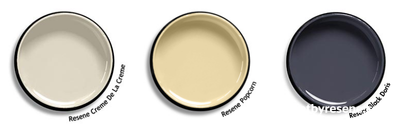
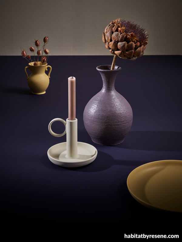
Wall painted in Resene Athena, tabletop in Resene Black Doris, candlestick in Resene Creme De La Creme, large vase in Resene Tenor and small vase and plate in Resene See The Light.
For more on the latest colour and decorating trends, check out our colour trend forecast in the most recent issue of BlackWhite magazine. If you’re not on the mailing list, you can pick up a copy at your local Resene ColorShop, read the online version or sign-up to receive future issues free.
projects Amber Armitage
images Wendy Fenwick
Published: 08 Jul 2025

