

latest
habitat tv

Say goodbye to the morning scramble for keys, coats and sunglasses and hello to this… see this and more videos
blog

Reader roundup: See what our readers have been up to!
Refurbished vintage furniture, charming exteriors and magnet walls for kids. These projects are sure to… more
This can’t-miss colour is setting the design world on fire
09 Jun 2023
When wave after wave of stringent lockdowns forced us to spend much of our days within our own homes, there was a strong preference for design that would provide softness and sanctuary from all the uncertainty and turmoil of the world outside. But since the return to our ‘new normal’, the attitude for what we want from our spaces has shifted – and so have the top colour trends. Those who have grown tired of the idleness and stagnancy that resulted from years of being homebound are swapping out gentle colours in favour of bold and vibrant Resene hues that symbolise and signify renewed energy and vigour.
While there are brave colour options from across the spectrum shouldering into the trend forecast, perhaps none are as relevant than the return of red. Red took the runways by storm during this year’s Fashion Week events in New York, Paris and Milan. Since then, this arresting hue has only been gathering momentum and is now being touted as the ‘it’ colour for interior and architectural design. The trend feeds into an overarching desire for our spaces to offer excitement in the years ahead. From dusty terracotta and brick tones to luscious cranberry and fiery tomato, get ready to see red everywhere in the months ahead.
When it comes to implementing red Resene paint colours in your projects, the prospect may feel daunting. After all, it’s been a number of years since true reds have been among the top trending hues – so it’s understandable if it feels like you need a refresher on how to best work with this colour. Even when used in small quantities, red always seems to capture attention and play a dominating role in a design. Since the popularity of red is only just heating up, here’s a rundown on how to best play to its strength on your upcoming projects.
Working with red
In colour psychology, red provokes the most powerful emotions of any colour family – and perhaps the most contradictory. For some, it can be aggressive; but for others, red is passionate, romantic, sensual, stimulating or exciting. This, of course, can vary depending on the variation of red that’s being used, but it’s a good idea to ask your clients what red means to them before incorporating it in the colour palette.
It is also worth noting that red has been shown to be among the most appetising colours around, making it hugely suitable for restaurants and bars. Many red paint colours are also highly reflective when used on major surfaces like walls and tend to ‘throw’ a halo of colour outward. This effect does wonders to the look of human skin tones, casting a healthy glow onto those within a room that’s been painted red from tip to toe – making it an appealing option for bathrooms, salons or spas.
For braver clients, there are a host of beautiful Resene reds that will make a stylish statement when used on walls, but you can easily bring in this colour through smaller interior and architectural details such as lighting and even furniture. Luckily, there are also a wide range of different types of reds that are trending that are suitable for a variety of different uses. Below, we’ve rounded up some of our favourite vibrant, deep and brick Resene reds and some handy ideas for using them in your upcoming projects.
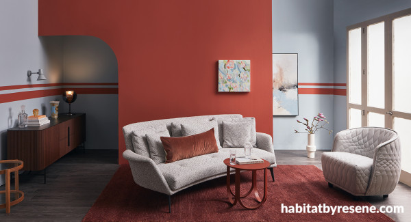
Icy blues like Resene Half Halcyon are perfect for balancing pink-toned brick reds like Resene Apple Blossom. Round out the scheme with timber flooring stained in a deep cool tone like Resene Dark Ebony, furnishings in a soft greyed white like Resene Kinship and trims in a snow white like Resene Aoraki. Walls painted in Resene Half Halcyon with feature wall and stripes in Resene Apple Blossom and floor stained in Resene Colorwood Dark Ebony.Sofa, chair, buffet and large artwork from Bradfords Interiors, coffee table, side table, cushion and wall light from Citta, rug from Nodi, vase, decanter, drinkware and paperweight from Michael Joyce, table lamp from Matisse, floor vase from Republic, and small painting by Loren Marks.
Vibrant reds
When it comes to making an impact, there’s nothing that quite compares to a colour palette that’s anchored with a vivid Resene red. As evidenced during Fashion Week, it’s show-stopping carmine, crimson and orange-edged tomato reds like Resene Lonestar, Resene Aroha and Resene Roadster that are among the most fashion-forward variations of the red trend. In most spaces, even a little vibrant red will go an awfully long way. And even just a touch of bold red can be cheeky and playful or classic and modern, depending on what it’s paired with.
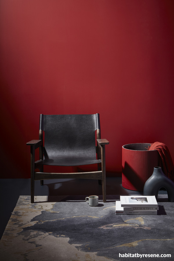
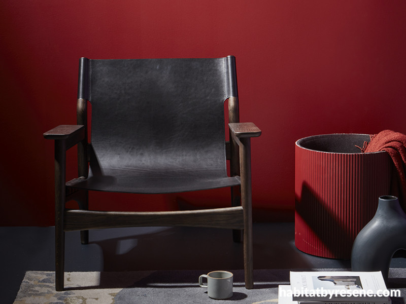
Vibrant red walls make a dramatic backdrop to classic neutral furniture. But if a boldly confident red like Resene Lonestar is too intense for the walls of your project, this colour also looks dynamite as a statement hue on clean-lined furniture. Try tinting it into Resene Enamacryl gloss waterborne enamel and using it on joinery or shelving. Wall and drum basket painted in Resene Lonestar and floor and vase in Resene Cinder. Chair from Good Form, rug from Baya.
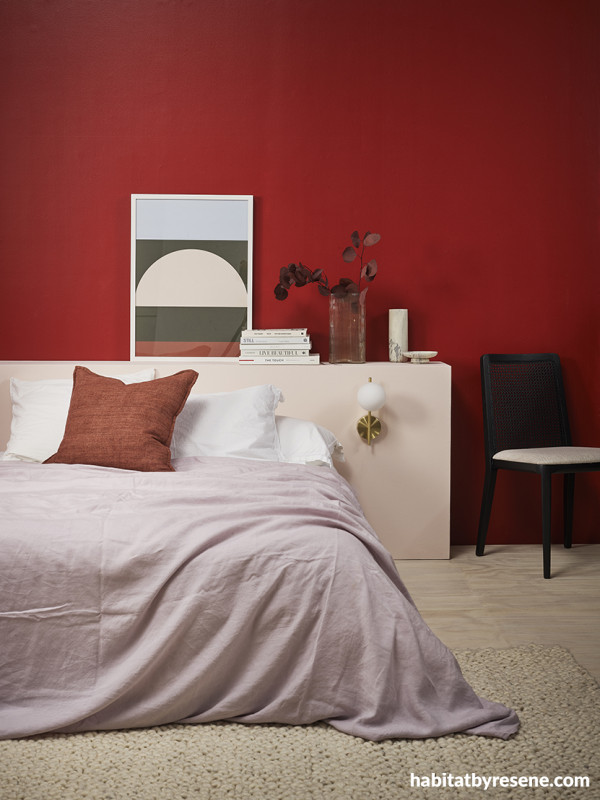
Many would find a vibrant red like Resene Aroha a particularly brave choice for a bedroom, but it’s also a sensual choice. Play up this hue’s romance with a petal pink headboard and a warm white colourwash on your timber flooring. Back wall painted in Resene Aroha, floor finished in Resene Colorwood Breathe Easy, headboard in Resene Inspire and bowl in Resene Black Sand. Bedlinen from Foxtrot Home, cushion and rug from Baya, chair from Danske Møbler, artwork, books and mug from Father Rabbit.
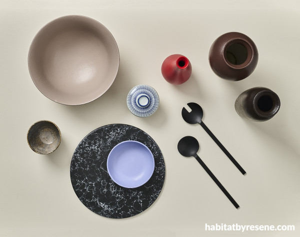
Black, brown and beige are classic colour pairings for vibrant reds like Resene Roadster but balancing it with a similar ratio of an on-trend periwinkle purple like Resene Heliotrope transforms this Resene paint colour palette into a contemporary feast for the eyes. Background painted in Resene Meringue, large bowl in Resene Otter, small bowl in Resene Heliotrope and painted vases in (clockwise from left) Resene Roadster, Resene Rebel and Resene Dark Chocolate. Marble charger and salad spoons from H&M Home.
Deep reds
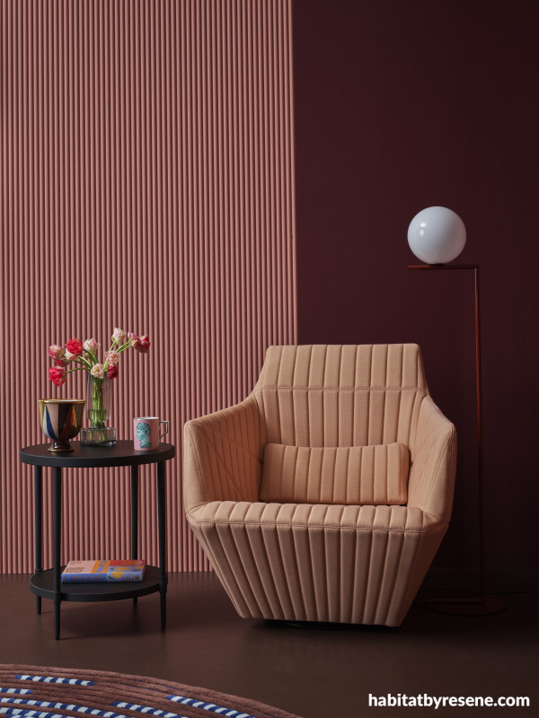
When most people think of romantic reds, they’ll picture super saturated cranberry, burgundy and raspberry reds like Resene Incarnadine, Resene Soiree and Resene Persian Red. Undeniably sensuous, these hues are perfect for any space where people will be cuddling up close, like a lounge or restaurant. Pay close attention to lighting sources and keep lumens low if you want to maintain a moody vibe.
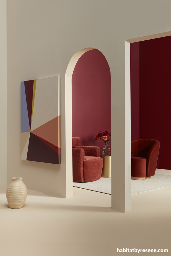
By designating deep reds for lounge or meeting areas, on-trend hues like Resene Incarnadine or Resene Pandemonium can still find their place among projects that are otherwise light and bright. Front wall painted in Resene Solitaire, doorways and floor in Resene Athena, back walls in Resene Incarnadine, vase in Resene Athena and artwork in (clockwise from top left) Resene Heliotrope, Resene Incarnadine, Resene Funk, Resene Solitaire, Resene Dawn Glow, Resene Arriba, Resene Pandemonium, Resene Solitaire and Resene Athena. Chairs and side table from Soren Liv, rug from Baya, glass vase and flowers from Urban Flowers.
Deep and smouldering reds like Resene Persian Red are a dramatic option for a monochromatic or tonal colour scheme alongside rosy pinks like Resene Coral Tree or Resene Florentine Pink and red-edged browns like Resene Rebel. Right wall painted in Resene Persian Red, left wall in Resene Coral Tree and floor in Resene Rebel. Chair and rug from Ligne Roset, table from Bradfords Interiors, lamp from ECC, vase, bowl and book from Smith & Caughey’s, mug from Faradays.
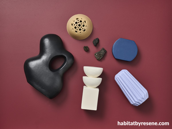
Deep reds like Resene Incarnadine make a strong anchor for classic creams, blacks and beiges, but thanks to the colour’s blue undertone, it can also sit well with oceanic and violet hues. Background painted in Resene Incarnadine with painted objects in (clockwise from top) Resene Amaranth, Resene Ocean Waves, Resene Heliotrope, Resene Meringue and Resene Black Sand.
Brick reds
You may have noticed that red first began making its return through subtle brick and terracotta tones before vivid tones and deeper variations resurfaced in the colour forecast. Brick reds continue to be hugely relevant, but what’s different today is the way these tones are being used. Instead of using colours like Resene Savour, Resene Pioneer Red and Resene Scoria as part of a cosy, earthy and homey colour scheme, designers are opting for more refined, elegant and opulent looks by pairing them with creams, blacks and golds. Of course, earthiness and elegance don’t need to be mutually exclusive, so there are still plenty of opportunities to bring in touches of greens, browns and stone greys – but this should be done in more subtle ways than before for the most on-trend look.
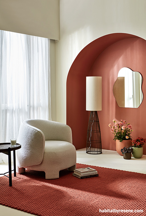
Creams like Resene Meringue create an air of sophisticated elegance when teamed with brick red accents in colours like Resene Savour and Resene Soiree. Amp up the glamour with furniture in a jet black like Resene Nero or soften the look with earthy brown and green accessories in Resene Allspice and Resene Field Day. Arched niche and large plant pot painted in Resene Soiree, other walls and floor in Resene Meringue, medium pot in Resene Field Day and small pot and lamp base in Resene Allspice. Chair and rug from Ligne Roset, side table from Good Form, mirror from Mocka, books and candle from Father Rabbit.
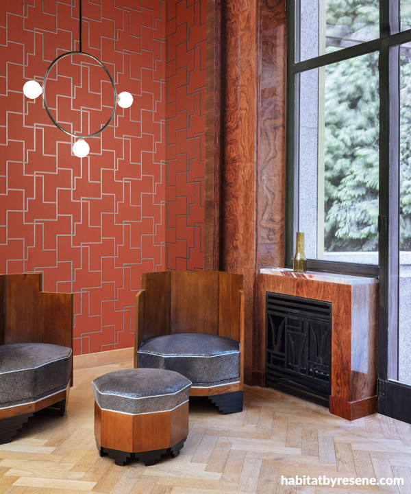
Resene Wallpaper Collection FOL202’s brick red design is enhanced with glittering gold in a softened geometric pattern and fits flawlessly with Art Deco-inspired décor. Try it with timber accents stained in a warm red-toned brown like Resene Colorwood Meranti, a floor in sandstone beige Resene Foundation and trims in soft black Resene Black Sand.
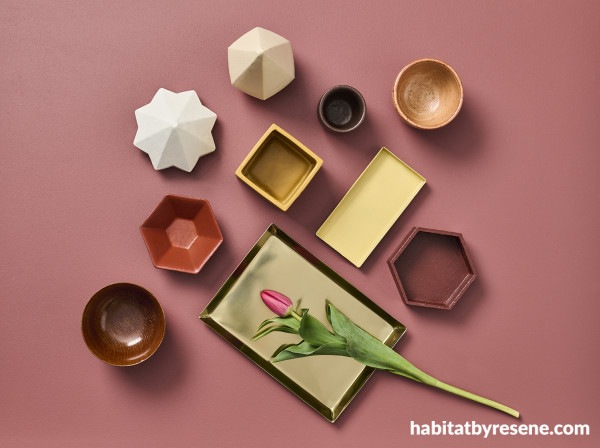
The warmth of golds, browns and creams make these colours gorgeous companions to brick reds like Resene Savour, Resene Scoria and Resene Pioneer Red. Background in Resene Savour, ‘gem’ ornaments in Resene Athena and Resene Meringue, hex dishes in Resene Pioneer Red and Resene Scoria, square pencil cup in Resene Salted Caramel, rectangular dish in Resene See The Light and tiny round vase in Resene Rebel. Brass tray from H&M Home.
For even more colour inspiration and tips to use today’s top trending reds on your next project, check out our trend forecast in our latest BlackWhite magazine. For the most fashionable options for painting the town – or at least your next project – red, look to the latest Resene the Range fashion colours collection. If you need an even a wider range of reds, consult the Resene Multi-finish colour chart.
Published: 09 Jun 2023

