Steve's sad to stunning bungalow makeover
When Steve bought this 1920s bungalow seven years ago, it had seen a fair few renovations through its life time. The most recent was a glasshouse extension built in the 80s, with not much love given to it since. By the time he came to purchase the home, it was yearning for a makeover.
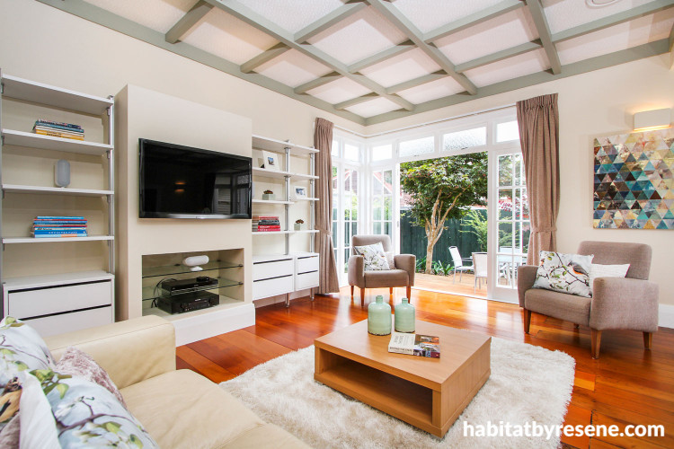
Today the glasshouse has been removed and the whole house painted in a scheme of Resene Quarter Sisal and Resene Lemon Grass, transforming the interior from sad to stunning.
The original two bedrooms and front hall remain as is, but the rest of the house has been reconfigured for open plan kitchen/living/dining. He's also added a new master bedroom and ensuite, and a laundry off the kitchen. Steve tells us more.
How did you decide on the overall look of the interiors?
The house was quite dark, with what looked like small and boxy rooms. I used a consistently lighter colour scheme throughout to make the spaces appear larger and to accentuate the beautiful matai floors.
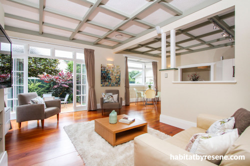
A feature of bungalow design is the dark ceiling beams. However, like many bungalows, the beams in mine had been painted white at some stage. I contemplated stripping them back to the original timber, but the beams in the new extension weren't going to be a matching timber. Instead, I painted them in Resene Lemon Grass that contrasted the Resene Alabaster ceiling panels, giving them a modern twist on the traditional bungalow look.
What part of the house are you happiest with?
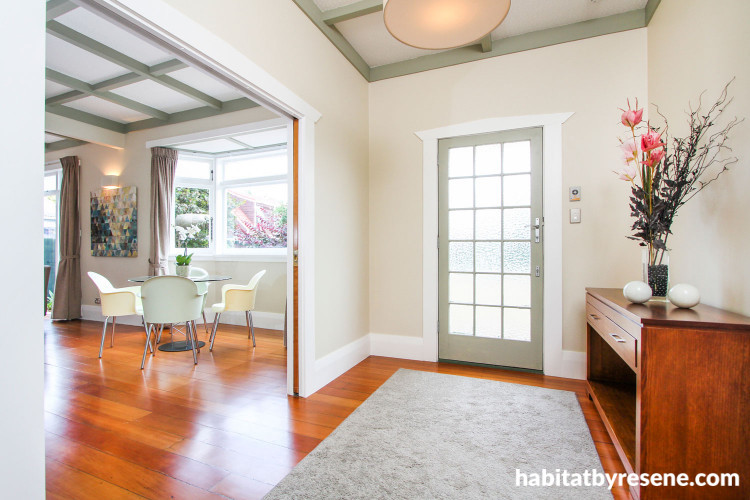
I found a couple of pieces online and in salvage yards. The original front door only had a small amount of glazing, so the hall was really dark. I found an old multi-pane bungalow door, but nine of the 16 panes of Arctic patterned glass were missing. One of the other windows I salvaged for the master bedroom had some Arctic glass that we repurposed, and I found the remaining glass we needed at a demolition yard. The new front door has totally transformed the hall, flooding it with light.
The new laundry has the same cabinetry, benchtop and splashback specification as the kitchen. My builder gave me stick about using expensive countertops in the laundry, but the cohesiveness means it looks just like an extension of the kitchen – a 'poor man’s' scullery if you will! In a small house, that makes a difference to useable and perceived space.
What is your advice for someone trying to achieve a similar look?
- When renovating or extending an old house, decide whether you want new work to blend or contrast with the existing features. If you decide to blend, be consistent with matching old details and new work. For example, bungalow skirtings and joinery can be bought new from specialist outlets, or your builder can make them. You can also have fun scouring the demolition yards or online for some pre-loved pieces.
- Many of the old plaster ceiling panels used in bungalows are still available off the shelf. Alternatively, a specialist can cast new ones from one of your originals.
- Look to the existing house when trying to resolve new design problems. When we removed a wall in the old house to create an open plan layout, we needed to put in a post to transfer the roof load to a strengthened foundation. We styled the post to look the same as the existing front porch posts, and it is painted the same colour scheme. So now it looks like a designed feature, rather than a problem.
What was the biggest decorating, renovating or building challenge for this project?
Reconfiguring old houses is always a challenge, as the original room layouts don’t necessarily fit our modern lifestyles. As bungalow beamed ceilings are essentially squares, it can be very obvious where some space has been 'borrowed' and you end up with part of a square showing. In my case, we borrowed more room out of one bedroom than originally intended to create extra wardrobe space, so it lined up nicely with the ceiling pattern.
Bungalow roof design means there aren’t any soffits/eaves like most houses. Running ducting up into the ceiling and out the soffit isn’t an option. Probably the biggest challenge was ducting the rangehood from the middle of the house. I didn’t want the ducting visible, but the kitchen cabinetry didn’t go right up to the ceiling.
Luckily the new ensuite was directly behind the kitchen – the ceiling in there was slightly lowered to allow the ducting to run across it to the outside wall, which also allowed for the ducting from both bathrooms.
Compliments of the Your Home & Garden/Resene Home Colour competition.
Published: 21 Sep 2017
Do you have a home full of wonderful Resene paint and colour? Send us some snaps by emailing [email protected].
The bungalow's latest renovation including painting the whole interior in Resene Quarter Sisal to lighten up the colour scheme. The ceiling beams and trims are painted in Resene Lemon Grass.
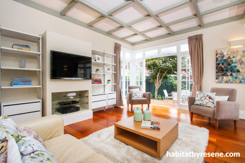
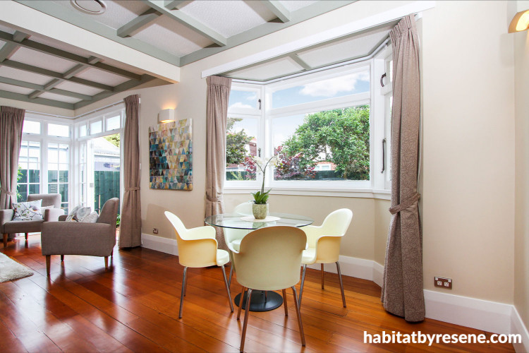
Steve wanted to highlight traditional bungalow features that had been painted out over the years. For the ceiling beams, he did this by painting them in smoky green Resene Lemon Grass, which are defined against walls painted in Resene Quarter Sisal and ceiling painted in Resene Alabaster.
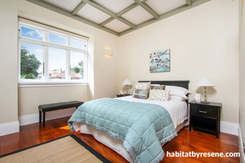
As the house is quite small, he decided to paint the interior in a unifying colour scheme, also painting the bedrooms in Resene Quarter Sisal and beams in Resene Lemon Grass.
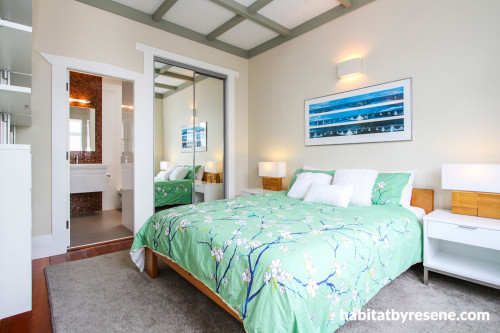
The home is flooded with natural light during the day. The walls are painted in Resene Quarter Sisal, the ceiling is painted in Resene Alabaster and the beams are painted in Resene Lemon Grass.
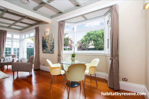
The rest of the house has been reconfigured into an open plan layout, for the kitchen, living room and dining room. The walls are painted in Resene Quarter Sisal, the ceiling is painted in Resene Alabaster and the beams are painted in Resene Lemon Grass.
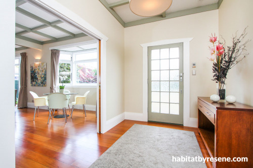
Also painted in Resene Lemon Grass, the front door was salvaged and brings in a lot more light than the original door, which was fitted with only a small amount of glazing.
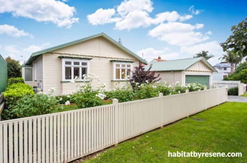
The exterior is painted in Resene Half Sisal, with Resene Rivergum on the roof, exterior doors and trims.


Resene Quarter Sisal
the look
If you're stuck on what
colour to use or need colour
advice, try out the Resene
Ask a Colour Expert service.


Resene Quarter Sisal
the look
If you're stuck on what
colour to use or need colour
advice, try out the Resene
Ask a Colour Expert service.


