
latest
habitat tv

Say goodbye to the morning scramble for keys, coats and sunglasses and hello to this… see this and more videos
blog

Reader roundup: See what our readers have been up to!
Refurbished vintage furniture, charming exteriors and magnet walls for kids. These projects are sure to… more
Jeremy and Kathryn's townhouse looked rather different when they bought it five years ago. "The house was brand new when we moved in," they recall. "All the walls were painted in half tea and the architraves and skirtings were off-white. This was too bland for our taste, and the first thing we did was start changing the colour palette."
These days, that palette is teal Resene Blue Bayoux, rich brown Resene Fudge and bright orange Resene Phoenix which, along with some patterned wallpaper, has given the modern dwelling a distinctive style and personality.
Although the townhouse is not huge, the high stud and large windows help to open up the spaces. And, while conventional wisdom says that pale, neutral-toned rooms look bigger, Jeremy and Kathryn have managed to make their home look much more spacious through carefully considered use of colour.
"For a start, the half-tea/off-white contrast was too busy, particularly in the open living area and in the hallways," explains Kathryn. "Painting the hall walls and some of the walls in the kitchen and living areas an off-white helped to calm the spaces. It also allowed us to use strong colours on the remaining walls, without them becoming overpowering. The impact was also moderated by the large windows and doorways, which further break up the space."
The result is a townhouse that looks and feels like a large and spacious home.
How would you describe your interior design style? Modern style but not minimalist. It must look like a home rather than a living space.
Where did your inspiration come from? Years ago I was at the Guggenheim Museum in New York, and as you walked the spiral gallery, each alcove was painted in strong colours such as deep greens, terracottas and blues. It was fantastic for the old masters and for the 20th century moderns, as they 'popped off' the walls. I am not convinced that the only gallery wall colour can be white, which is now the standard everywhere. So, we chose our wall colours to accommodate our artworks.
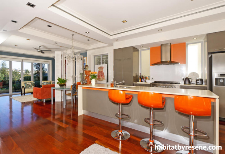
What was the biggest challenge with creating your home interior? The biggest challenge was finding a colour that would work in the kitchen. We didn't want the expense of changing the cabinetry colours, but we needed to find something to put life into the space. It took a bit of trial and error, but adding touches of orange has been very successful.
Which space in the house do you get your greatest satisfaction from? We enjoy the formal living room. The deep brown on two walls is formal, but cosy for evening use when the fire is on. The artwork also breaks up the wall colour so that it is not too strong. The challenge for this room was to pick a strong colour that would also complement the deep teal in the informal living room, as the rooms open on to each other. The deep blue and brown softened by off-white has worked well.
Get the look: When you're painting bold accents in adjacent rooms, do as Jeremy and Kathryn did and make sure that the colour palettes complement each other. If you're not quite sure where to start when choosing feature wall colours, try free Resene EzyPaint virtual painting software, available from the Resene website. You can upload a photo of your room and virtually paint it, to see how it would look. It's a quick and easy way to experiment with colour before you start painting.

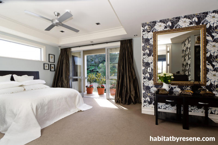
Two small feature walls of bold floral pattern wallpaper (from the Statements book, available at Resene), with the remaining walls in pale grey-blue, give the master bedroom a sophisticated style and make a virtue of the unusually shaped room.

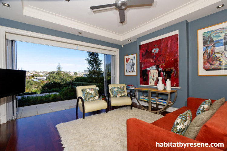
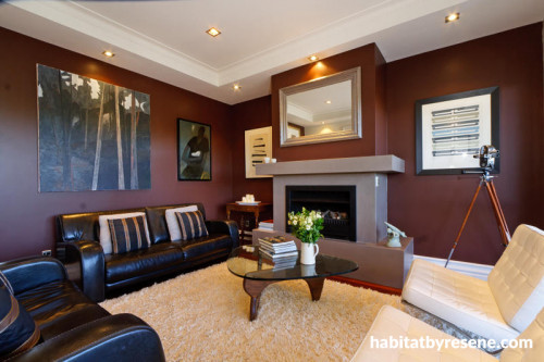
"We chose our wall colours to accommodate our artworks," explain Jeremy and Kathryn. In the living area, the teal walls complement the couple's paintings, as well as the furnishings.

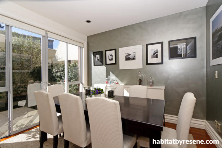
The silver wallpaper (from the Jade book, available at Resene) adds an interesting texture and metallic sheen to the walls of the dining room.

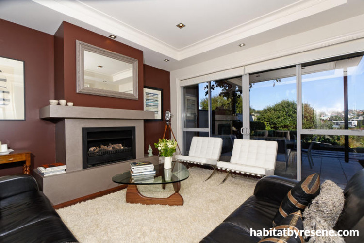
"The artwork breaks up the wall colour so that it is not too strong," say Jeremy and Kathryn of the rich brown walls in their favourite space, the formal living room.


"The deep brown is formal, but cosy for evening use when the fire is on," say Jeremy and Kathryn of the formal living room.

Jeremy and Kathryn's Stylish City Townhouse
Published: 13 Oct 2011
Do you have a home full of wonderful Resene paint and colour? Send us some snaps by emailing [email protected].
How to make a townhouse feel like a spacious home

Jeremy and Kathryn's townhouse looked rather different when they bought it five years ago. "The house was brand new when we moved in," they recall. "All the walls were painted in half tea and the architraves and skirtings were off-white. This was too bland for our taste, and the first thing we did was start changing the colour palette."
These days, that palette is teal Resene Blue Bayoux, rich brown Resene Fudge and bright orange Resene Phoenix which, along with some patterned wallpaper, has given the modern dwelling a distinctive style and personality.
Although the townhouse is not huge, the high stud and large windows help to open up the spaces. And, while conventional wisdom says that pale, neutral-toned rooms look bigger, Jeremy and Kathryn have managed to make their home look much more spacious through carefully considered use of colour.
"For a start, the half-tea/off-white contrast was too busy, particularly in the open living area and in the hallways," explains Kathryn. "Painting the hall walls and some of the walls in the kitchen and living areas an off-white helped to calm the spaces. It also allowed us to use strong colours on the remaining walls, without them becoming overpowering. The impact was also moderated by the large windows and doorways, which further break up the space."
The result is a townhouse that looks and feels like a large and spacious home.
How would you describe your interior design style? Modern style but not minimalist. It must look like a home rather than a living space.
Where did your inspiration come from? Years ago I was at the Guggenheim Museum in New York, and as you walked the spiral gallery, each alcove was painted in strong colours such as deep greens, terracottas and blues. It was fantastic for the old masters and for the 20th century moderns, as they 'popped off' the walls. I am not convinced that the only gallery wall colour can be white, which is now the standard everywhere. So, we chose our wall colours to accommodate our artworks.
What was the biggest challenge with creating your home interior? The biggest challenge was finding a colour that would work in the kitchen. We didn't want the expense of changing the cabinetry colours, but we needed to find something to put life into the space. It took a bit of trial and error, but adding touches of orange has been very successful.
Which space in the house do you get your greatest satisfaction from? We enjoy the formal living room. The deep brown on two walls is formal, but cosy for evening use when the fire is on. The artwork also breaks up the wall colour so that it is not too strong. The challenge for this room was to pick a strong colour that would also complement the deep teal in the informal living room, as the rooms open on to each other. The deep blue and brown softened by off-white has worked well.
Get the look: When you're painting bold accents in adjacent rooms, do as Jeremy and Kathryn did and make sure that the colour palettes complement each other. If you're not quite sure where to start when choosing feature wall colours, try free Resene EzyPaint virtual painting software, available from the Resene website. You can upload a photo of your room and virtually paint it, to see how it would look. It's a quick and easy way to experiment with colour before you start painting.
Flower power
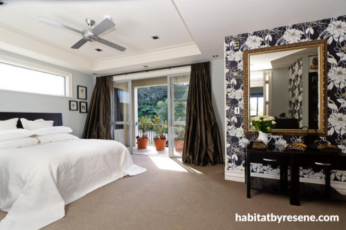
Two small feature walls of bold floral pattern wallpaper (from the Statements book, available at Resene), with the remaining walls in pale grey-blue, give the master bedroom a sophisticated style and make a virtue of the unusually shaped room.
Art and soul

"We chose our wall colours to accommodate our artworks," explain Jeremy and Kathryn. In the living area, the teal walls complement the couple's paintings, as well as the furnishings.
Silver service
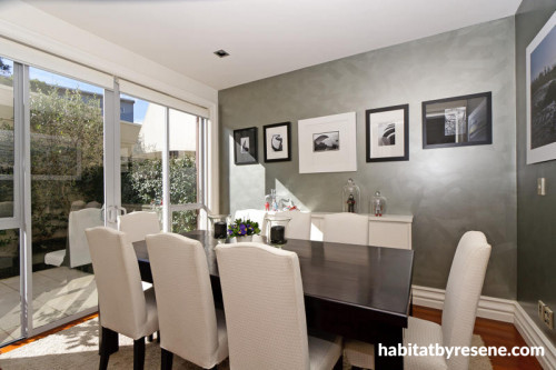
The silver wallpaper (from the Jade book, available at Resene) adds an interesting texture and metallic sheen to the walls of the dining room.
Light relief

"The artwork breaks up the wall colour so that it is not too strong," say Jeremy and Kathryn of the rich brown walls in their favourite space, the formal living room.
Small, dark and handsome
"The deep brown is formal, but cosy for evening use when the fire is on," say Jeremy and Kathryn of the formal living room.


the look
If you're stuck on what
colour to use or need colour
advice, try out the Resene
Ask a Colour Expert service.
the look
If you're stuck on what
colour to use or need colour
advice, try out the Resene
Ask a Colour Expert service.

