
latest
habitat tv

Say goodbye to the morning scramble for keys, coats and sunglasses and hello to this… see this and more videos
blog

Brick Bay unveils its poetic new folly for 2026
The winner of the 2026 Brick Bay Folly competition has been unveiled. Within the Wings… more
4 most common colour mistakes
16 Sep 2015
Choosing paint colour can be tricky sometimes. Here's a list of four common colour mistakes... and our advice to help you.
1. Fear of strong colour
Many of us say that we like strong colour, and dress ourselves in bold tones, but when it comes to painting our walls, we choose off-white or a safe neutral. Is it the ‘resale’ boogey man, the fear of frightening future buyers of our homes, that scares us into safety? Don’t let it – who wants to look like every other house on the market? Well-used strong colour is hugely memorable but even if the agent thinks the pink you’ve chosen for the dining room is a bit much, just paint it over before selling.
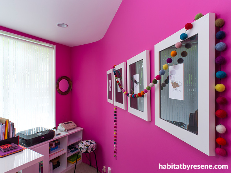
We think Resene Smitten looks fabulous in the home office of interior designer Debra Yearsley, pictured above. See the rest of her bold experiment with colour for more inspiration.
The beauty of paint is that it’s so easily and cheaply changed so if you do have a lapse in colour judgement it’s easy to try something else. Resene has many tools available to help you make your decisions, like testpots and drawdowns, that you can minimise the chance of making a mistake before you buy all of the paint. Maybe ease yourself in gently by painting a feature wall in strong colour first.
2. One size fits all
Don’t assume that even if you choose the most neutral of neutral paint colours, you should use it on every surface imaginable – the walls, trims and ceiling. You’ll end up with a bland result and if you have chosen a cool white, you’ll feel like you’re living inside a chilly bin. If you’re after a neutral scheme, there is a vast array of interesting neutrals in the Resene Whites & Neutrals collection and on the cards you can collect at your Resene ColorShop, the colours are handily grouped in variants, ie half, quarter and double etc strengths of the same colour. An effective scheme can be created by using, for example, a full strength of a colour on the walls, a triple strength on a feature wall, a half strength on the trims and a quarter on the ceiling. Instant success!
3. Too hot, too cool
Colour is not equal, unchanging and well behaved. Colour responds to compass orientation so can look totally divine in some rooms… and horrible in others. At certain times of the day, the colour we have so carefully chosen can morph into a monster.
In south-facing rooms, warm mid-toned colours are best. No amount of pale tints or white will make these rooms appealing because the natural light aspect is cool and grey. Cooler, denser colours will always work best in north-facing rooms. Because of our propensity for huge windows and skylights that allow plentiful sun (and glare) any bright, red, orange or yellow colours will only accentuate the heat and appear far brighter. Complex neutrals work best in east-facing rooms where the light is cool and clear but where there will be shadowy light from mid-morning onwards. West-facing rooms suit mid-toned muted colours as the rosy natural light will enhance cream, beige and taupe until they turn peach or terracotta.
4. Don’t forget the details
This last one isn’t strictly about colour, but about keeping your colour looking good for longer. Resene has all sorts of clever additives and paint technologies to make sure your paint, and the colour it carries, has a longer-lasting better-looking life. For example, there’s the Resene Kitchen & Bathroom range, Resene Fly Deterrent, Resene Bug Juice and Resene CoolColour for exteriors to name a few. Ask staff at your Resene ColorShop for more details.
Published: 16 Sep 2015

