
latest
habitat tv

Say goodbye to the morning scramble for keys, coats and sunglasses and hello to this… see this and more videos
blog

Brick Bay unveils its poetic new folly for 2026
The winner of the 2026 Brick Bay Folly competition has been unveiled. Within the Wings… more
The 6-step colour scheme
26 Jun 2014
If you’re about to create a colour scheme and don’t know where to start, here’s a six-step process to help.
1. You need to love it
There’s no point painting your interiors in pretty vintage pastels if you no one in the family likes pink, lemon and pale blue. The best homes are decorated with the owner’s personality in mind. Nature lovers may prefer greens and blues to bright reds, while a vibrant owner may prefer bold colours that reflect their bubbly personality.
You may already know what colours you like. Even if you do, a good exercise is to get online, start a Look Book on the Habitat by Resene website, use Pinterest or one of the many inspirational sites available to build a file of images that you like. Don’t over-think it, just collect what appeals. Then, when you have a decent-sized collection, look for common elements. It might be that your choses are all light, casual and beachy, or all moody and masculine with deep-coloured walls.
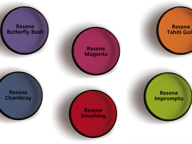
Visit your local Resene ColorShop and pick out the cards from the Multi-finish chart and the Whites & Neutrals collection that you’re instinctively drawn to. Together with your collected images, you’ll soon see a pattern emerge.
If you like changing your interiors regularly, you might choose a neutral colour scheme so that you can change out accessories like cushions and rugs without affecting the entire scheme.
2. Style and setting
One of the big drivers of interior style and colours is the style of the house. An old character home will inspire a different look to a modern box, or a mid-century suburban home, or a timber-clad retreat in the bush.
It’s the same with the setting. If there’s a dominant feature nearby like the sea, bush, rolling farmland, or city skyline, this may influence what you use inside. You may use colours from those views inside, to link the two.
If you want to highlight the view, choose a lighter colour palette. If you want to distance the view make your interior colour scheme more contrasting.
Nature conditions us to expect balance and harmony and offers good guidelines to using colour. In nature, darker colours are often underfoot, like the earth while mid-range colours are at eye level, like trees and leaves. The lightest colour is above us, like the sky and clouds.
This can translate to interiors by using darker carpet, tiles or timber flooring then mid-range colour on the walls and pale colours on the ceiling.
3. Use a starting point
Using a favourite painting, wallpaper, curtain fabric or a recently purchased cushion as the starting point for a scheme is a great way to create good colour composition. You can already see that the colours work together so draw them out of the art/wallpaper/fabric and use them on the walls and trims. Note the proportions the colours are used in, and mimic that in your colour scheme.
4. The right mood
Select colours that reflect the mood you are trying to create. If you want a calm atmosphere, use greens, blues and earthy neutrals, and steer clear of high-energy reds. Conversely, if you want high energy, go for reds and oranges.
Most people find neutral or more pastel colours easy to use – colours that have quite a bit of white in them. So instead of grass green, you would have soft apple. Instead of brown, it would be beige. Instead of banana yellow, it would be pale lemon. The common element, white, between all these colours means that you can successfully combine any pastels into a colour scheme. Most pastels appear soft and fresh, making them popular for interiors.
5. The right balance
No matter what colours you like, successful colour schemes have one thing in common - balance. Try to use no more than two to three principal colours with touches of other accent colours to lift the scheme. A basic rule using two thirds one colour and one third of another is always successful.
A touch of contrasting colour may be lively and exciting but too much can become uncomfortable. On the other hand, too much moderation is dull.
Maybe start with a simple scheme of two colours and an accent, then introduce other colours as you gain confidence. If you are a novice decorator, you may want to keep to one colour type (monochromatic) or select related colours (harmonious) to ensure a balanced scheme.
Use intense hues in areas that are occupied for short periods, such as formal dining rooms, hallways, bathroom and entrances.
6. Gloss or matt?
The gloss level will affect how it looks. Matt surfaces absorb light and will appear darker and deeper than glossy reflective surfaces. Light colours and glossy finishes will make a room appear larger, while darker colours, heavier textures and matt finishes will make the room seem cosier.
Like gloss level, the colour paint you choose to use will also show surface defects to varying degrees. Darker colours accentuate surface imperfections, while lighter colours soften the effects of any surface irregularities by absorbing less light. If you plan to use dark colours, use a flat or low sheen paint. Special paint effects or wallpaper can be used to hide minor surface defects.
Top tip
Once you have narrowed down your colour choices, use testpots to confirm your colour scheme. Apply two coats onto a piece of A4 card, leaving a border around it so the colour isn’t influenced by anything else. When the paint is dry, pin your colour to the wall and view it in daylight and artificial light, moving it around different areas of the room and folding it into the corner of the room for a true feel of the finished effect.
Published: 26 Jun 2014

