
latest
habitat tv

Say goodbye to the morning scramble for keys, coats and sunglasses and hello to this… see this and more videos
blog

Brick Bay unveils its poetic new folly for 2026
The winner of the 2026 Brick Bay Folly competition has been unveiled. Within the Wings… more
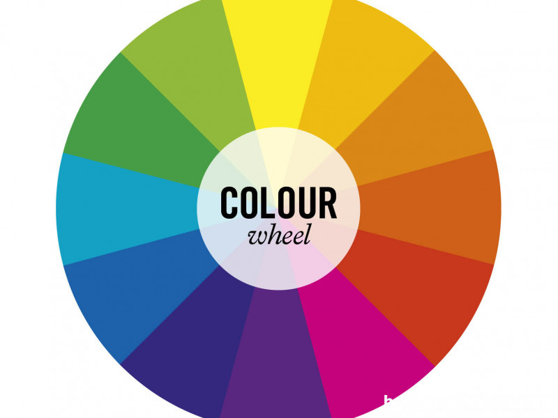
Crack the colour wheel
12 Jun 2014
How you use colour is a very individual choice, but understanding how colour works will help you use it more effectively. The colour wheel is a tool to help understand the relationships between colours. It will give you some foundational knowledge to begin designing beautiful colour schemes like a pro.
Primary colours are the basic bold colours of red, blue and yellow. They are pure, not blended, colours
Secondary colours are the colours created by blending the primary colours, eg orange (a mix of red and yellow), purple/violet (a mix of blue and red), and green (a mix of blue and yellow).
Tertiary colours are created by mixing a primary color and a secondary color. For example, yellow and green will make a lime/apple colour when blended.
Black and white are not colours but tints, used to darken (add black) or lighten (add white) other colours. Most colours will just become darker or lighter versions of themselves when mixed with black or white, the exception being red, which of course, becomes pink in its lighter form.
Cool colours such as blue, green and grey are tranquil, relaxing and peaceful. The level of coolness will depend on the intensity of the colours and how much of a warm colour is mixed in. For example, the more red you add to blue, the closer it gets to purple and aubergine, and therefore the warmer it becomes. Likewise, if you add yellow to green to make chartreuse, it will turn from cool to warm.
Cool colours can be used to change the appearance of a room, pushing back walls and furnishings and making the room look bigger. Cool colours look great in sunny, north-facing room, where they counteract some of the strength of the direct sun.
Warm colours, such as red, orange and yellow wake you up and are full of energy. They can make a large room appear cosier and are great for warming up shady, south-facing room. They are a traditional favourite for dining rooms, to stimulate conversation and appetite.
The properties of colour
Hue: Hue is pure colour - any primary, secondary or tertiary colour that is unmixed with black or white.
Intensity: This is the brightness or dullness of colours. Less intense colours (blue) have a calmer effect and are easier to live with than more intense colours (red). Intense colours are often used as highlights and contrast.
Light reflectance value: This is the degree of lightness or darkness of a tint, shade or tone. White has the highest light reflectance value and black the lowest. The reflectance value of Resene paints is noted on the reverse of the colour charts as an LRV %.
Shade: A shade is the pure colour (hue) with black added.
Tint: A tint is the pure colour (hue) with white added.
Tone: This is pure colour (hue) with grey added.
Think of colour as a chameleon:
- It changes depending upon accent colours.
- It is influenced by adjacent colours.
- White or beige colours will take on the tint of adjacent hues.
- Large areas of colour will look more intense
Top tip
Use a grey paint colour viewfinder (get one free from your Resene ColorShop) to isolate colour on the paint chart you are viewing. If you look at all the colours together tthecolours will affect one another and you won’t get a true feeling of each individual colour.
Published: 12 Jun 2014

