
latest
habitat tv

Say goodbye to the morning scramble for keys, coats and sunglasses and hello to this… see this and more videos
blog

Brick Bay unveils its poetic new folly for 2026
The winner of the 2026 Brick Bay Folly competition has been unveiled. Within the Wings… more
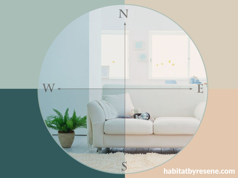
East, west, which direction is best?
15 Oct 2015
The magical thing about colour and light is that it's not static – this is why the same colour changes its depth and tone in different rooms in your home.
So how can you be sure to pick the right paint colour for each room? It’s all to do with which direction the room faces: north, south, east or west.
"Colour is not equal, unchanging and well behaved. This is why colour responds to the axis of light and why it looks totally divine in some rooms… and horrible in others," explains Resene colour expert Carolyn Atkinson.
"It's also why at certain times of the day the colour morphs into a monster and bears little resemblance to the colour we have carefully chosen."
To paint according to direction, Carolyn recommends the following:
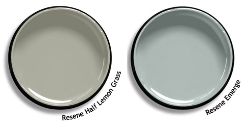
North
Cooler, denser colours will always work best in north-facing rooms. Because of our propensity for huge windows and skylights that allow plentiful sun (and glare) any bright, red, orange or yellow colours will only accentuate the heat and appear far brighter. Try Resene Half Lemon Grass for a lovely restful ambiance or Resene Emerge, a grey-green sea foam hue.
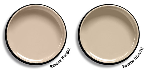
South
In south-facing rooms used during the day, use warm mid-toned colours. No amount of pale tints or white will make these rooms appealing because the natural light aspect is cool, grey or sour. Try Resene Nougat which has a subtle orange undertone or Resene Biscotti.
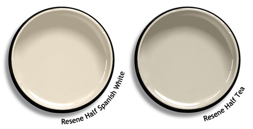
East
Complex neutrals work best in east-facing rooms illuminated by the white light of early morning. Because easterly light is so cool and clear, it may emphasise greens and blues. Green will be seen to be very green and blues may reflect more teal. The walls in east-facing rooms will be shadowy from mid-morning onwards. Try Resene Half Spanish White, which stays light even when the sun passes and doesn’t develop too much green undertone. Or try Resene Half Tea.
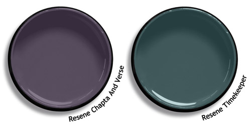
West
West-facing rooms that receive the sun’s low rays will suit mid-toned muted colours as the rosy natural light will enhance cream, beige and taupe until they turn peach or terracotta. Any deep reds will look far brighter and orangy. Blue walls may turn drab. Deeper colours will alter the least. Try Resene Chapta And Verse, a colour that warms up and gains a sunset glow. Or Resene Timekeeper which flashes blue, green and warm grey.
Anchoring your colour scheme
Using one neutral colour throughout the home is still a strong trend, and will work if you vary the paint colour’s strength – this will cater for the different light qualities of each room. It’s easy to do with a monochromatic colour palette from the Resene Whites & Neutrals range. And don’t forget to ask a Resene colour expert at your local Resene ColorShop for advice.
South and north-facing rooms usually work better with deeper versions of a colour while east and west rooms are better with the lighter variants. Accenting with colourful accessories (and mirrors where rooms are not blessed with light) can change how a colour is seen and help it be ‘forgiven’ if it doesn’t look as good as it does within another space.
If you want to use a true white on the walls, try soft furnishings in soft greys, charcoals and blacks, and metallic silver or pewter tones as this helps draw the eyes away from walls, keeping the scheme from looking too cold or lacking in personality.
Test your colours
The best way to see how colours react in different rooms is to test them. Using Resene testpots, paint your chosen colour onto a piece of A2 card (available from Resene ColorShops) leaving an unpainted border around the edges so your eye focuses on the reality of the colour. Move the card from wall to wall and from room to room. Watch how it changes not only with the light but against other colours in the room. To see how one colour will look on all four walls, roll the A2 card so the colour is on the inside, then look down into the cone to see how the colour will intensify once it is on all walls.
Other ‘colour by compass’ tips
· Extremely bright and glare-y rooms may benefit from a flat (matt) paint finish. Very dim rooms, and hallways, may benefit from low sheen or higher sheen paint finishes.
· In rooms where natural light is filtered through trees growing close to the house, a green cast may appear in any colour you use.
· Light reflecting through opaque glass will diffuse/soften any colour.
· The same colour seen in a room with floor to ceiling picture windows will intensify.
· In tropical countries, bright colours are doubly enhanced and appear well balanced. Colours often can’t be transplanted to another climate successfully. Think of that bold-coloured shirt or dress that was fabulous on holiday but lurks sadly at the back of your wardrobe once you’re back home.
· In cold countries, natural light is filtered through layers of mist and cloud. Natural colours in these countries are grey based. Bolder reds, oranges and yellows appear softer and less intense.
· When we turn the lights on in the evening, our colour undergoes another change. At night, an incandescent light source will make a yellow or cream coloured wall glow, but will turn beautiful blues and lavender walls grey.
Published: 15 Oct 2015

