
latest
habitat tv

Say goodbye to the morning scramble for keys, coats and sunglasses and hello to this… see this and more videos
blog

Reader roundup: See what our readers have been up to!
Refurbished vintage furniture, charming exteriors and magnet walls for kids. These projects are sure to… more
Colour trends: pairing fashion pastels
03 Jun 2015
If you've been keeping up with the latest colour trends, you’ll notice the pastel palette has had a change-up. Gone is the icy gelato style that was popular a few years ago... We're now welcoming much warmer, saturated shades of pastel.
“Saturated pastels have moved forward from the watery tones of coastal Scandinavia,” says Carolyn Atkinson, Resene Colour Expert. “This year, pastels are influenced by a retro inspired 1950s feeling, all about positivity and growth, young families and fun times – think of the mood post World War 2.”
Now that pastels are feeling a lot more grown up, it’s time to push the pastel palette out from solely kids' bedrooms and into your every day interior.
Using this season's fashion pastels
1. If you’re using different coloured pastels together, try to use those with the same quality. Combine either all light and bright pastels together, or all dusky pastels together.
2. An exception is if you use two paints in the same colour but alter their quality, for example using a dusky rose pink like Resene Sakura alongside a clean fresh pink like Resene Pot Pourri, which can look stunning. Same colour, different qualities.
3. Keep these new saturated pastels from looking too gluggy by teaming them with crisp white trims like Resene Alabaster, which is quite a dense white.
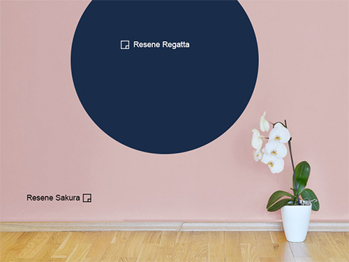
4. To avoid your room looking too much like a nursery, pair pastels with moody colours such as black framed prints, grey fabric curtains and dark trims. A marriage of Resene Sakura and Resene Regatta will make your home feel all grown up.
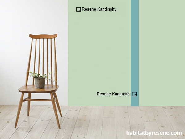
6. Believe in the relaxing power of pastels, especially when leaning towards a nature-inspired palette. Pick out Resene Kandinsky and Resene Kumutoto for your walls (see picture above), and feel the calm every time you walk into your room.
6. Pastels looks super mixed with metallics. Imagine a cabinet painted in apricot rose Resene Wax Flower, finished off with copper or brass pulls.
7. If you're only wanting a smidgen of pastel in the home, choose an architectural focal point and give it a paint. Cabinet doors, stool legs, and even ceramic vases with a touch of colour are always welcoming to the eye. Or just paint a quarter up on your walls. The only limit is your imagination.
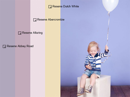
8. When it comes to decorating the kids' bedrooms, an ombre wall using saturated pastels is a beautiful and playful way to go about it without being overly cliché. Pick one colour as the pivotal shade and choose complementary colours around it. For example, Resene Abbey Road works beautifully with Resene Alluring, Resene Abercrombie and Resene Dutch White – both you and the kids will love it.
Top tip... want to learn more about which colours to choose for your ombre wall? Watch our video: Talking tonal colour schemes
Published: 03 Jun 2015

