
latest
habitat tv

Say goodbye to the morning scramble for keys, coats and sunglasses and hello to this… see this and more videos
blog

Brick Bay unveils its poetic new folly for 2026
The winner of the 2026 Brick Bay Folly competition has been unveiled. Within the Wings… more
The psychology of colour
04 Jun 2014
It’s long been known that different colours engender different moods and feelings – red stimulates appetite, green is soothing, blue feels safe. No more so than when you surround yourself in those colours by painting them on your walls.
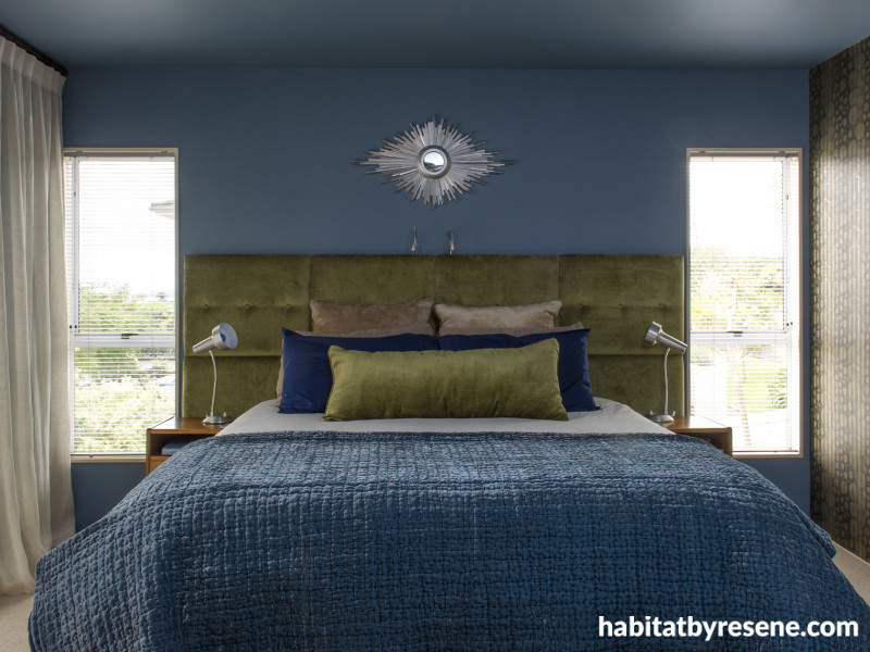
Blue is cool, refreshing and soothing, making it the ideal choice to cool a sunny room. Blue is often used for uniforms so makes us feel safe, standing for upright, traditional values. A popular colour for bedrooms due to its ability to relax the mind - like this soothing Resene Seachange chosen by homeowner Debra Yearsley for her main bedroom. Blue should generally be avoided in the dining room as it tends to suppress the appetite. Change your perceptions of a room’s size and lighting through the use of pale and pastel blues that will ‘open up’ the space.
Green is soothing, calm and harmonious. We feel comfortable living with green due to its prevalence in nature and nowadays it stands for all things eco-conscious. Lighter greens, such as Resene Rice Paper, are ideal in living rooms and bathrooms to promote a relaxing environment, while mid greens, like Resene Sushi, can give a clean accent in kitchens and dining areas.
Orange is cheerful, friendly, lively and dynamic, but it’s a colour you tend to either love or hate. Ideal for high activity, social areas such as kitchens and family rooms, it is also a popular choice in bold living room and children’s bedrooms. Try Resene Tango or Resene Golden Bell. Avoid orange in hot sunny rooms.
Red stimulates activity, increases blood pressure and heart rate making it the highest energy colour. An appetite stimulator, red is a popular choice in dining rooms and high-energy areas, especially deeper reds like Resene Pohutukawa and Resene Red Red Red. It is generally best used as an accent colour and kept out of the bedroom where it will make relaxing difficult.
Yellow is bright, bold, invigorating and attention-grabbing. Like road signs and highlighters, yellow is difficult to miss. Uplifting in a cold room, yellow may be overpowering in a sunny room. Yellows vary from green yellows (Resene Golden Fizz) through to orange yellows (Resene Bright Spark) so trial your colour with a testpot to make sure you have chosen the right hue. If in doubt, most rooms will work with buttery and golden yellows like Resene Milan.
Pink is sweet, warm and in the Western world, it’s a colour that suggests femininity, youth and romance. Used in moderation, pink is an uplifting colour but used too much or in too saturated a tone, it can be sickly. Pink ranges from nude (Resene Cornflower) and candy floss (Resene Cupid) through to crimson (Resene Disco) and screaming hot (Resene Smitten). Perennially popular in girl’s bedrooms.
Purple is a regal, fearless colour associated with glamour and luxury. In its darker forms, like Resene Vortex, it is rich and strong while in the lighter versions of lavender and mauve, like Resene Lola, it is softer and romantic. Use purple in moderation or to give an edge to greys and reds.
Brown is solid and reliable, a colour of the earth. It is grounding yet eminently flexible, ranging from tawny rusts (Resene Korma) through velvety chocolates (Resene Milk Chocolage), soothing coffee shades (Resene Mongoose) to deep smoky grey-browns (Resene Mondo). These myriad colours are hugely popular in all rooms of the house, in particular living areas for their soothing appeal.
Black and grey are urbane and sleek, contemporary and mysterious. Sophisticated and masculine colours, black and charcoal (try Resene Foundry and Resene Gravel) are great for creating drama in interiors either as whole room solutions or for feature areas. Paler greys and silvery tones, like Resene Half Stack and Resene Quarter Surrender, are replacing the ‘greige’ tea colours so popular in recent years.
Published: 04 Jun 2014

