
latest
habitat tv

Say goodbye to the morning scramble for keys, coats and sunglasses and hello to this… see this and more videos
blog

Reader roundup: See what our readers have been up to!
Refurbished vintage furniture, charming exteriors and magnet walls for kids. These projects are sure to… more
Schemes that work
31 Jul 2014
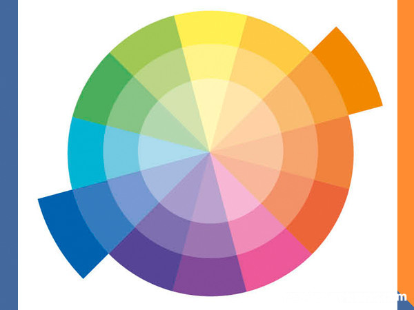
Why reinvent the wheel when there are various types of colour schemes that work well?
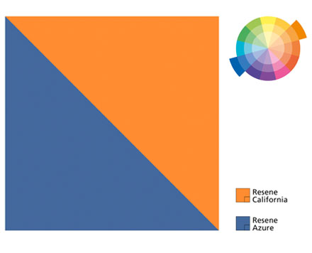
Complementary schemes
This is a more dramatic style of scheme, using colours that are opposite one another on the colour wheel. For example, red and green, blue and orange, yellow and purple. Of course, you’re unlikely to use the true colours in combination. In fact, if you use complementaries of the same intensity and dominance, it will give you an unsettling effect. So you might use more subtle combinations, for example, seafoam green walls with accents of rusty red, pale blue walls with tangerine, dusky gold with purple-aubergine accents.
Use one of the colours as the dominant hue, and use the other as an accent only.
Tip: If you want to tone down an intense paint colour, try adding a small amount of its complementary colour, rather than black. It gives a more interesting muted result.
Triadic schemes
These use three colors which are spaced equally around the color wheel for example, red, yellow and blue; orange, purple and green. Use one colour as the dominant colour and the other two as accents, or use pastel versions of the colours.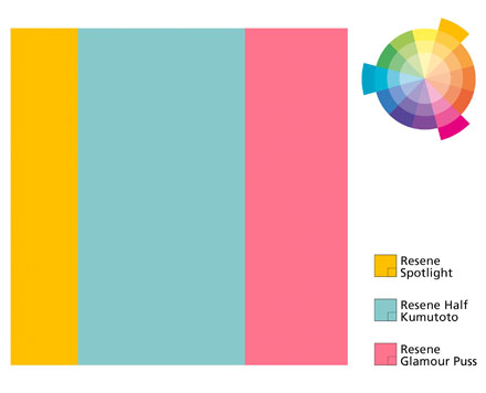
Monochromatic schemes
This is the simplest colour scheme, but it doesn't have to be dull and boring. A monochromatic scheme uses varying strengths (shades and tints) of the same colour. An achromatic scheme uses colour in the white to black range.
Popular monochromatic colour schemes have already been created for you by Resene – through The Range Whites & Neutrals collection which has varying strengths of a range of neutrals from wheaten yellow, through silver greys to classics like Resene Tea and Resene Spanish White.
In its easiest form, use the deepest shade on the floor, a mid-range shade on the walls and the palest form on the ceiling and trims.
To stop a monochromatic scheme from being boring, add accessories in accent colours, and use texture – deep-pile rugs, linen upholstery, grainy timber – and pattern.
Related schemes
A related scheme uses similar colours, those that sit next to each other on the colour wheel, for example green and yellow, or blue and purple.
These schemes work well if you use colours of similar intensity, like soft apple green and lemon, or pale blue and lavender. In these schemes it’s easier to mix pastel colours than deep saturated colours but add deeper colours as an accent in a pastel scheme.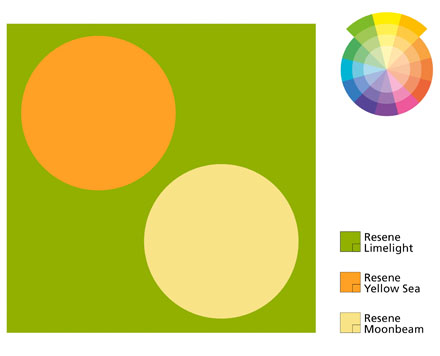
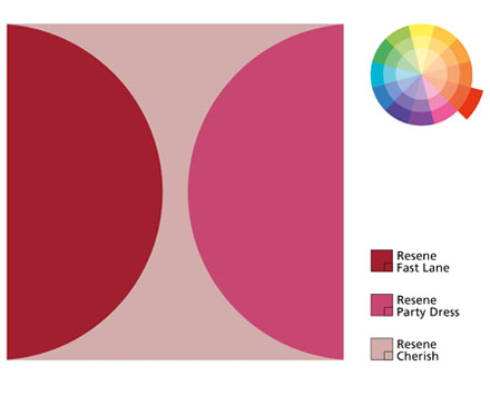
Split complementary
This scheme is one that uses any colour from the colour wheel in combination with the two colours that are directly on either side of the colour opposite, such as blue and violet with yellow-orange.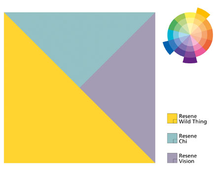
Also see understanding colour,the 6-step colour scheme and the psychology of colour.
Published: 31 Jul 2014

