
latest
habitat tv

Say goodbye to the morning scramble for keys, coats and sunglasses and hello to this… see this and more videos
blog

Reader roundup: See what our readers have been up to!
Refurbished vintage furniture, charming exteriors and magnet walls for kids. These projects are sure to… more
Which colour for which room?
29 Jun 2015
Some colours just don’t suit some rooms. Here’s our room-by-room guide for making the most of colour.
Living rooms are often part of open-plan spaces that link through to dining and kitchen areas. Knowing where to start and finish the colour scheme between each part of an open-plan space can be very difficult. There are two techniques that you can use:
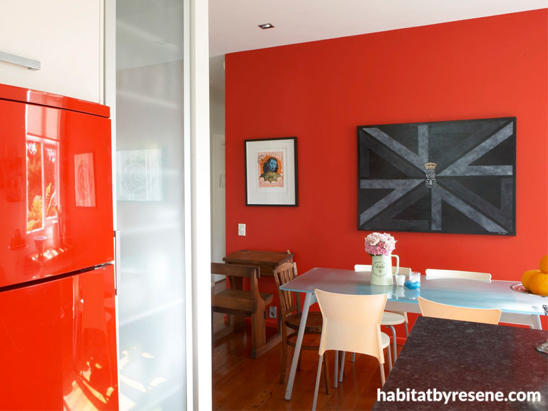
1) Paint a feature area between adjoining rooms or spaces to create a natural colour break – see the great effect Resene Guardsman Red has as a feature wall (pictured above), tying to the red fridge in the kitchen. See the full house tour here.
Use a tonal scheme based on something from the Resene Whites & Neutrals range. You can use one as a unifying colour throughout the spaces and then accent it with other strengths of the same colour.
2) Living rooms are the ideal place to create focal points or feature areas. Traditionally fireplaces acted as the focal point of most living rooms. If you don’t have a fireplace, select a focal point for your room and decorate around that. The focal point may be a feature area, lounge suite or similar.
Bedrooms need colours that help you sleep not keep you awake. Avoid bright colours or just use them on the bedhead wall so you see them when you come into the room but not when you’re lying on the bed. You are also likely to spend more time looking at the ceiling than you would in other rooms – how about painting it a soft egg-shell blue (Resene Duck Egg Blue or Resene Breathless) reminiscent of the sky?
Blue is generally popular for bedrooms because of its soothing qualities but most light and pastel shades are also ideal. If you have trouble getting up in the morning, try a few invigorating accent colours to get you going.
Bathrooms are normally one of the smallest rooms in the house and are cluttered with towel rails, vanities, showers and baths. While this can make them a decorator's nightmare, it also means you can afford to be a little more courageous with colour as there normally isn’t swathes of wall space – and if it doesn't work, you can repaint a small bathroom quickly.
Avoid using too many colours. Instead, try painting a dado-height panel in a stronger colour and paint the remaining two-thirds of the walls in white. Blues and greens (try Resene Frozen or Resene Coriander) being tranquil and clean are popular for bathrooms. Being cool colours, they can also make a small bathroom appear more spacious.
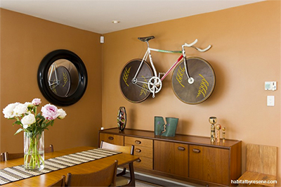
Separate dining rooms? tend to be reserved for special occasions so they are a good opportunity to experiment with colour that you might not be brave enough to use elsewhere. Red stimulates the appetite (try Resene Poppy) so is a good choice. Midnight blue, such as Resene Redemption Blue, or copper metallic, such as Resene Roasted Orange (pictured on the walls of the dining room above), are also dramatic colour schemes for night-time dining.
Family rooms? call for a tough durable finish that can take the inevitable wear and tear. A bright uplifting colour scheme is good for this sort of well-used space. Use one or two dominant colours and add accents for interest. Choose mid-tone colours to minimise the appearance of finger marks, animal fur and general light scuffing. Avoid using very dark or very light colours.
Hallways and entrances ?are transitional areas where you spend only a short time, so you can be more adventurous with colour. Ideally hallways should be treated as linking spaces to help give continuity to your interior colour scheme. To make a long hall look shorter, paint the end wall a vibrant warm shade. To make a hallway look longer, paint the end wall a light cool colour. Colour can provide a bridge between adjoining areas. It can be difficult to change colour when adjoining spaces are viewed together, so a feature area of colour may be a good way to create a natural colour break. When visualising a hallway or entrance colour scheme, leave the doors of adjoining rooms open so that you can see how the hallway will work with these other spaces.
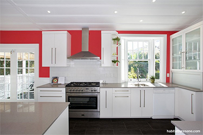
Kitchens are where you often spend a lot of time. Make sure you are comfortable with your chosen colour scheme. Bright, invigorating colour schemes can boost energy levels when you have a lot of cooking and cleaning to get through. As kitchens are dominated by cabinetry, benches and the floor, treat these elements as the starting point for your colour scheme.
The appearance of colours in the kitchen will depend on the properties and textures of each of the surfaces. Glossy surfaces, such as cabinets painted with glossy Resene ArmourCat, will reflect more light and look different to low sheen painted walls, so it is important to be careful when trying to match colours in different materials. Sometimes it is better to select a tone lighter or darker rather than trying to create an exact colour match.
You don’t see much of the wall in a kitchen so you can be bold. Choosing a classic off-white for the cabinets lets you use an adventurous fashion colour for the walls, which are then easily repainted when times and tastes change.
Published: 29 Jun 2015

