

latest
habitat tv

Say goodbye to the morning scramble for keys, coats and sunglasses and hello to this… see this and more videos
blog

Brick Bay unveils its poetic new folly for 2026
The winner of the 2026 Brick Bay Folly competition has been unveiled. Within the Wings… more
How to offset bold accent hues for better-balanced colour palettes
11 Mar 2024
Colour plays a pivotal role in creating atmosphere, defining spaces and evoking emotions within our built environments. While many popular light, understated and nature-inspired Resene paint colours are easy to love and implement, you might be at a loss for how to make stronger hues sit harmoniously within your palette. Given how prominent vibrant colours are among today’s top trends, having a handle on these hues has become much more important in recent years.
Some designers try and shy away from using vivid paint colours, but these hues have a lot to offer to interior and exterior schemes. Bold accent colours can be extremely effective at injecting energy and personality into your design and, when used thoughtfully, these hues can serve as focal points and add visual interest and depth to your project. However, excessive or poorly coordinated use of these hues can disrupt the harmony of a design and lead to sensory overload – so achieving balance is crucial to avoid overwhelming your design. The key lies in integrating stronger colours seamlessly within your broader colour palette, ensuring they complement rather than compete with other elements in the space.
We look at some of today’s hottest accent hues and the optimal pairings to offset and balance bolder choices within your overall Resene colour palette. By employing these strategies, a cohesive and visually-pleasing environment that resonates with your project users will be easily within reach.
Ultramarine blue
When it comes to bold accent colours, there are some that have broader appeal than others. Ultramarine blues like Resene Aviator and Resene Space Cadet and those from the Resene Beyond the Sea palette exude sophistication and tranquility, making them a top choice for accentuating architectural features inside and out. Not only are ultramarine blues one of the most popular options out there, they’re among the most timeless and flexible.
Ultramarine blues can be complemented with a wide range of neutral tones from white and beige to grey and black. Pairings like Resene Truffle, Resene Stonewashed, Resene Lignite and Resene Double Ironsand help temper the intensity of bold marine blues like Resene Ocean Waves or Resene Key Largo and can be used in different ratios to create a classic look. Integrate natural materials such as wood or stone to soften the contrast and add warmth to the space.
For a more dramatic look, ultramarine can be a very effect accent colour when used among deeper aquatic blues and algae greens such as Resene Time Traveller and Resene Welcome. In a scheme like this, limit your use of ultramarine blue to specific focal points or accents to prevent from overwhelming the design and incorporate touches of an equally intense verdant green like Resene Boundless for balance. Where levity is needed, add highlights in a warm beige like Resene Akaroa and a glassy pastel blue like Resene Morning Haze and opt for lighter timber flooring finished in Resene Colorwood Be Calm or Resene Colorwood Whitewash.
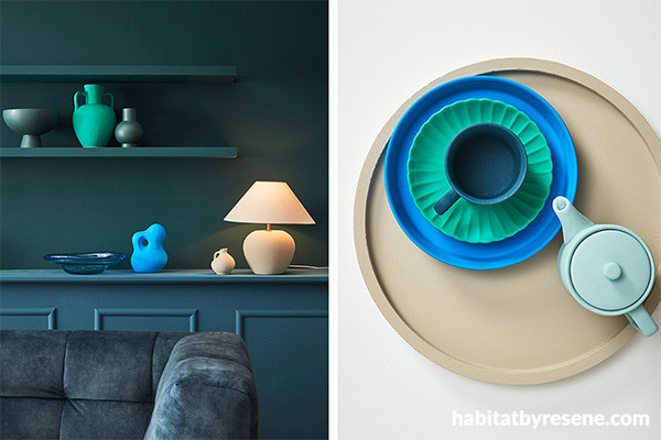
Left: Back wall and floating shelves in Resene Welcome, built-in sideboard in Resene Time Traveller, green vase (on floating shelf, centre) in Resene Boundless, abstract sculpture in Resene Key Largo and small jug and lamp base in Resene Akaroa. Sofa from Danske Mobler, deep green vases (on floating shelf) and glass bowl from Smith & Caughey’s.
Right: Background in Resene Half Black White, tray in Resene Akaroa, large plate in Resene Key Largo, scalloped plate in Resene Boundless, cup in Time Traveller and teapot in Resene Morning Haze.
Emerald green
Emerald green embodies sophistication and opulence, adding a touch of luxury to architectural and interior design schemes. Emerald lends itself well to experimentation with contrasting textures such as velvet, gold or brass metallic accents and glossy finishes to offset its intensity. But one of the easiest ways to work eye-catching emeralds like Resene Palm Green into virtually any colour palette is by layering in a healthy dose of living greenery. Plants will provide a visual link to this accent hue, but because their colour is often variegated, they help to soften the gap between your statement green and the other colours in your palette.
Offset the depth of emerald green with lighter shades like mint green, sage and chartreuse to create contrast and prevent the space from feeling too heavy – opt for selections like Resene Ottoman, Resene Secrets, Resene Green Spring or Resene Funk. Or for a quirky and lively look, use a mix of soft grey green, powder blue, crisp white, green-edged white and periwinkle as playful companions to a touch of emerald. Try Resene Eau De Nil, Resene Comfortably Numb, Resene Half Alabaster, Resene White Noise and Resene Sail Away with select accents in Resene Deep Teal.
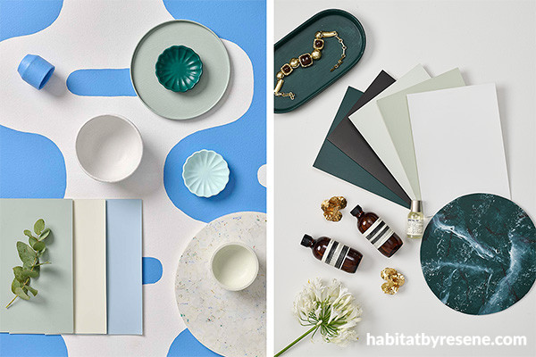
Left: Background painted in Resene Half Alabaster and Resene Sail Away with A4 drawdown paint swatches in (from left to right) Resene Eau De Nil, Resene White Noise and Resene Comfortably Numb, plate in Resene Eau De Nil, cup in Resene Sail Away, bowls in Resene Half Alabaster (centre) and Resene White Noise (bottom right) and scalloped dishes in Resene Deep Teal (top right) and Resene New Day (centre right).
Right:Background painted in Resene Double Sea Fog with A4 drawdown paint swatches in (from left to right) Resene Top Notch, Resene Bokara Grey, Resene Secrets, Resene Green Spring and Resene Double Sea Fog and oval tray in Resene Top Notch.
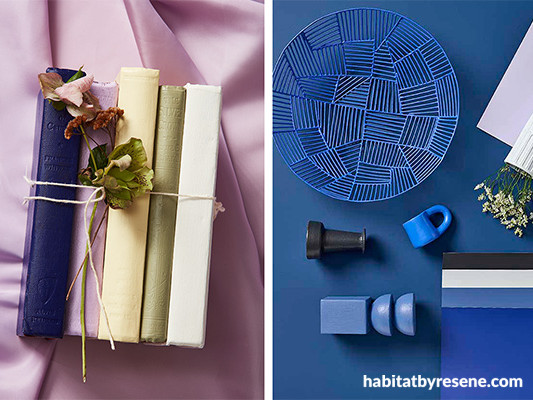
Lilac
It may be surprising but certain statement colours can actually benefit from being paired with stronger base hues – lilac is a great example. While lilac might stand out as a bold choice in an otherwise light and neutral colour scheme, the same colour can also exude a sense of tranquility when used as the point of difference among more pigmented options.
If you want to use a lilac like Resene Petal as part of a soft, romantic interior scheme, combine it with serene and delicate neutrals like ivory, dove grey or blush pink – try Resene Quarter Villa White, Resene Stepping Stone and Resene Valentine. For an elegant and inviting look with a bit more character, blend a lilac like Resene Wonderland with suede browns, pale summer greens and yellows and violet blues such as Resene Leather, Resene Flax, Resene Lemon Twist and Resene Paua. Introduce metallic accents in gold, silver or rose gold to add a touch of glamour and sophistication while grounding the airy lightness of lilac with subtle contrast.
Despite being a warm purple, lilac looks lovely with a wide range of rich blues like Resene Ocean Waves, Resene Aviator and Resene Rulebreaker. With these hues as the base of your palette, a lilac like Resene Poet becomes the point of difference and brings a touch of softness to offset the bolder blues. Finish the look with furnishings in classic black and white for highlights and contrast and use accent and task lighting to play up the moodiness of this colour scheme.
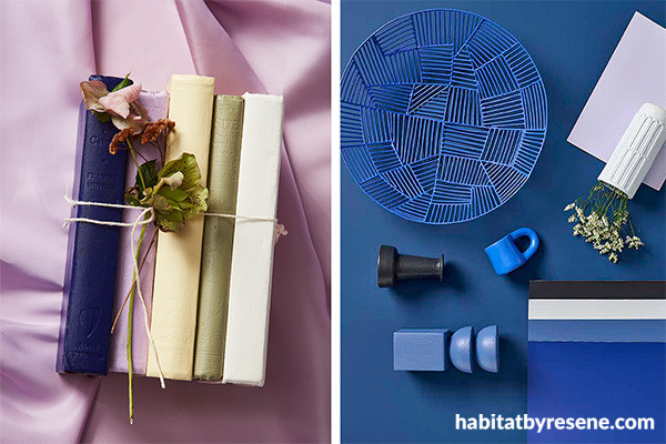
Left: Books painted in (from left to right) Resene Paua, Resene Wonderland, Resene Lemon Twist, Resene Flax and Resene Half Scotch Mist.
Right: Background painted in Resene Ocean Waves with A4 drawdown paint swatches in (from top to bottom) Resene Poet, Resene Invincible, Resene Timeless, Resene Rulebreaker and Resene Aviator, wire bowl in Resene Torea Bay, vases in Resene Timeless (top right) and Resene Invincible (centre left) and candleholder in Resene Rulebreaker.
Burnt orange
Burnt oranges like Resene Smoke Tree ooze warmth and vitality and evoke feelings of comfort and cosiness. As the popularity of 70s inspired looks are on the rise, burnt oranges are making a slow but steady reappearance in the colour trend forecast. Similarly retro colours like Resene Smashed Avocado, Resene Sunbeam, Resene Amaranth and Resene Tic Tac Toe can be fun options, but orange can also work surprisingly well as part of a tonal look to blend and balance it.
Pair burnt orange with analogous hues – those adjacent to it on the colour wheel – such as rusty reds, dulled yellows, muted browns and mushroom greys to create a cohesive colour scheme. Using two or three tones of each in different strengths will ensure the colours blend and prevents any single area from overpowering the design. Incorporate plants or botanical elements in your scheme to complement burnt orange’s earthiness and introduce timber stained in Resene Colorwood Natural (indoors) or Resene Waterborne Woodsman Natural (outdoors) to play to your statement hue’s warmth and enhance the overall sense of balance in your design.
Because a burnt orange like Resene Clockwork Orange will stand out sharply in contrast to the rest of the palette, it can be used indoors to strategically to guide the eye or outdoors to bring attention to architectural details against dark weatherboard cladding in Resene CoolColour Ebony Clay.
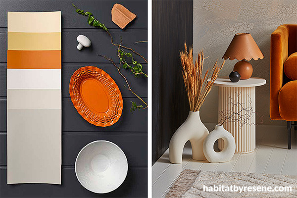
Left:Background painted in Resene Ebony Clay with A4 drawdown paint swatches in (from top to bottom) Resene Blank Canvas, Resene Putty, Resene Clockwork Orange, Resene Eighth Truffle, Resene Truffle and Resene Triple Truffle and bowl and door knob Resene Eighth Truffle.
Right:Back wall painted in Resene Bright Spark and Resene Rusty Nail, followed by a coat of Resene FX Crackle effect and a topcoat in Resene Oasis, plywood clad wall (left) finished in Resene Colorwood Pitch Black, floor in Resene Half Gin Fizz, side table in Resene Oasis, lamp base painted in Resene Rusty Nail, small vase (on side table) in Resene Blackout and floor vases in Resene Oasis (left) and Resene Half Gin Fizz (right). Sofa from Good Form, rug and side table from Mocka.
Golden yellow
Yellows like Resene I Dare You and Resene Buttercup radiate warmth and optimism, making them a versatile accent colour for infusing spaces with energy and vitality. It’s a hue that some designers find challenging to work with, but the secret to using yellow successfully mainly comes down to scale and proportion.
One of the best options to balance yellow is to use it sparingly with larger expanses of cool dark neutrals or muted blue tones in varying intensities. Yellow will standout and provide interest, but darker hues like Resene Neutral Bay, Resene New Denim Blue, Resene Athens Grey and Resene Nero will keep bold gold tones like Resene Bright Spark from overwhelming the space.
Another option is to blend golden yellow into an analogous palette with orange and brown balanced with creamy whites – try Resene Brown Pod, Resene Rusty Nail, Resene Oasis and Resene Gin Fizz to offset Resene Bright Spark. Or incorporate accessories or accent pieces in complementary hues like pale green or indigo such as Resene Transcend and Resene Rulebreaker. While these colours might command more attention in a restrained colour scheme, they can reinforce your golden yellow accents in palettes with a greater variety of hues while maintaining the overall harmony.
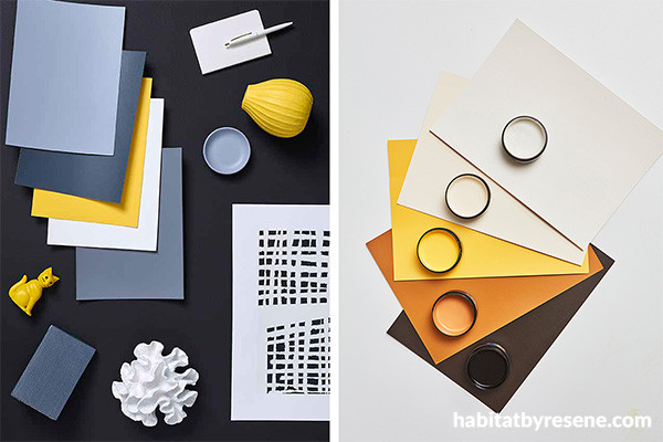
Left: Background painted in Resene Nero with A4 drawdown paint swatches in (from top to bottom) Resene Athens Grey, Resene New Denim Blue, Resene Bright Spark, Resene Half Black White and Resene Neutral Bay, vase in Resene Bright Spark, small dish in Resene Athens Grey, faux coral in Resene Half Black White, bookend in Resene New Denim Blue and artwork in Resene Half Black White and Resene Nero.
Right: Background painted in Resene Black White with A4 drawdown paint swatches and testpots in (from top to bottom) Resene Half Gin Fizz, Resene Oasis, Resene Bright Spark, Resene Rusty Nail and Resene Blackout.
Incorporating bold accent hues into architectural and interior design schemes can elevate the visual impact of a space, but achieving balance is paramount to creating a harmonious environment. By following these strategies and considering the unique characteristics of each Resene accent colour, designers can strike the perfect balance between boldness and harmony, resulting in spaces that are both visually captivating and inherently inviting.
Top tip: Order A4 drawdown paint swatches of your chosen colours online at www.resene.com/drawdown or via your local Resene ColorShop.
projects Kate Alexander, Amber Armitage, Melle van Sambeek
images Bryce Carleton, Wendy Fenwick
Published: 11 Mar 2024

