

latest
habitat tv

Say goodbye to the morning scramble for keys, coats and sunglasses and hello to this… see this and more videos
blog

Brick Bay unveils its poetic new folly for 2026
The winner of the 2026 Brick Bay Folly competition has been unveiled. Within the Wings… more

Muted but not mundane: why ‘quietly colourful’ designs are trending and how to nail the look for your clients
14 Mar 2025
When you are trying to balance your design’s aesthetics, functionality and psychological benefits, it’s likely you’ll want and need to take a nuanced approach to colour. Unlike stark minimalism or bold maximalism, a recent emerging trend might be particularly valuable to pay attention to if your client is after a space that’s equal parts dynamic and restorative.
What’s known as the ‘quietly colourful’ trend embraces muted yet expressive hues which introduce depth and personality without overwhelming a space – think softened blues, earthy greens, desaturated pastels and warm terracotta tones. By leveraging a palette of these subtle yet impactful Resene paint colours, you’ll be well on your way to creating an atmosphere that is visually engaging while maintaining that sense of serenity and sophistication so many clients are seeking.
The versatility of quietly colourful hues makes them workable across a range of project typologies, offering unique advantages to residential, commercial offices, schools, retail, hospitality, medical clinics and other public spaces. In homes, quietly colourful schemes make spaces feel curated and inviting, enhancing the emotional well-being of the home’s inhabitants without the sterility of ‘too white’ interiors or the intensity of highly saturated colours. In commercial offices and retail settings, quietly colourful hues can ensure environments remain approachable and conducive to productivity and making sales. And boutique hotels and restaurants can benefit from this aesthetic’s ability to evoke warmth and exclusivity, helping to shape a memorable experience for guests.
Although ‘quietly colourful’ is a trend, one of the things that makes it one worth paying attention to is that these looks are focused on longevity and align with the growing demand for timeless, adaptable interiors. The hues associated with it transition seamlessly between various design styles – including contemporary, classic and biophilic – ensuring that spaces remain relevant beyond more fleeting trends. Plus, the muted nature of these tones beautifully complements popular natural materials such as timber, stone and linen – which only strengthens the appeal of quietly colourful schemes for use in sustainable and wellness-driven design.
So, if you’re keen to create a look that’s as enduring as it is expressive, read on to discover the Resene paint colours that are synonymous with sophisticated quietly colourful designs.
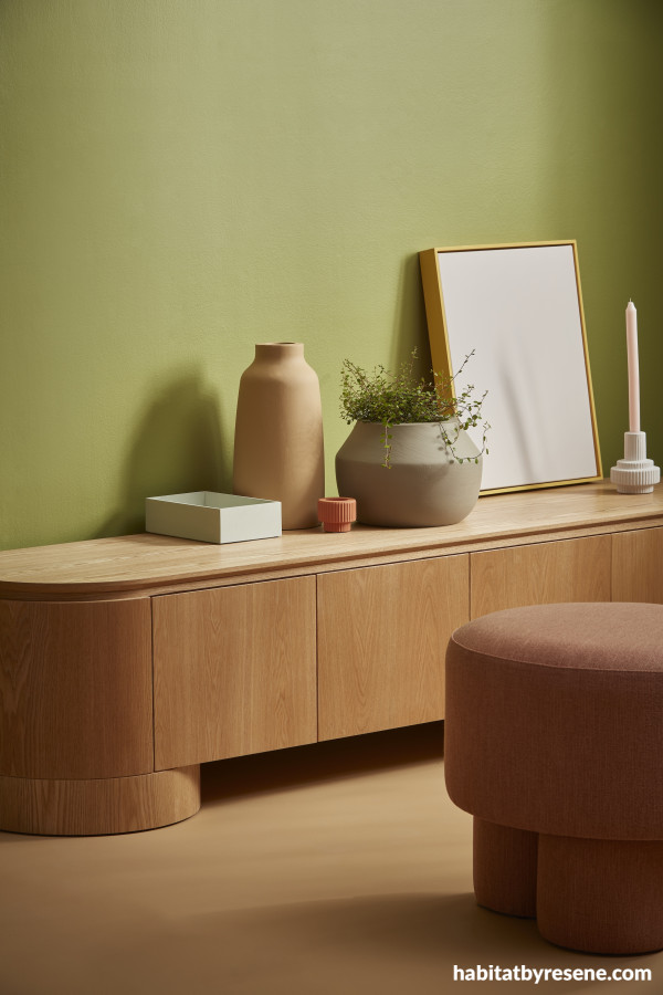
Wall painted in Resene Wasabi, floor and vase in Resene Amaranth, box in Resene Secrets, tiny pot in Resene Tuscany, plant pot in Resene Quarter Mondo, artwork in Resene Cest La Vie with frame in Resene Sunbeam and candleholder in Resene Cest La Vie. Sideboard and ottoman from Soren Liv.
How to choose tones that fit the quietly colourful trends
Rather than the bold brights popularised in recent years, the quietly colourful movement shifts towards a more subtle and sophisticated approach to colour favouring muted, earthy tones that introduce depth and warmth without overwhelming a space. The key to selecting colours that fit within a quietly colourful scheme is to look for hues that provide a calming and harmonious atmosphere that’s neither too shouty nor too neutral nor one-dimensional. These colours that evoke feelings of tranquility and sophistication, making them ideal for creating spaces that are both inviting and timeless that can be easily made to complement a variety of design styles.
However, in addition to choosing a colour that appeals, it’s important not to overlook the value of that colour. Although you may automatically assume that by colours that are ‘neither too bold nor too neutral nor too flat’ we mean mid tones, but that’s not always the case. Light and pastels and deeper saturated tones are perfect for this trend so long as they have a greyed-off feel to them – and these can be incredibly useful for ensuring there is adequate contrast in your design.
Of course, one colour that will come across as aesthetically pleasing, functional, comfortable and inviting for a certain group of users and meet the brief for a particular project typology may not be the right fit for another. So, while the goal is to evoke emotion and interest through colour ‘but in a quiet, thoughtful way’, how this aesthetic is ultimately implemented will depend on your project.
Commercial offices
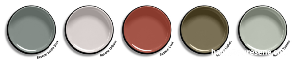
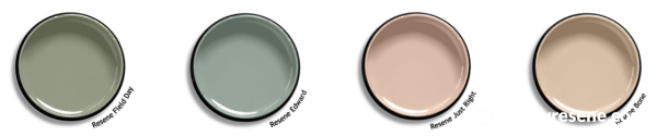
In commercial office environments, quiet colours can be particularly useful for supporting employee wellbeing and productivity by providing a calming atmosphere that avoids feeling dull or sterile. Gentle or dusty tones on walls, partitions or accent furniture in grey blues, complex violet-edged greys, terracotta and olive tones like Resene Inside Back, Resene Urbane, Resene Crail or Resene Lichen enhances the professional look of an office while fostering a positive, modern environment that strikes the right balance between calming and stimulating. Soft, muted green tones like Resene Tasman, Resene Field Day or Resene Edward or blush beiges like Resene Just Right and Resene Bone used in break rooms or meeting spaces help reduce stress, while stimulating creativity without distraction.
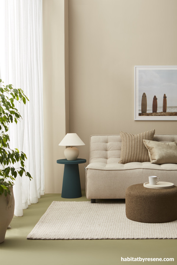
Walls, tray and plant pot painted in Resene Akaroa, floor in Resene Tic Tac Toe and side table in Resene Welcome. Sofa from Danske Møbler, ottoman from Mocka, rug and cushions from Baya, curtain from Curtain Studio, mug from Smith & Caughey’s.
Restaurants and hospitality spaces
Quietly colourful spaces in hospitality settings evoke comfort and relaxation without being overwhelming. Guests will feel more at ease in an environment that offers warmth but doesn’t bombard them with vibrant or overly saturated hues. This can lead to longer stays, better dining experiences, and increased customer satisfaction. In dining areas, use softer shades of warm colours for built-in benches, chairs, tables and wall accents. For example, a dusty rose like Resene Savour can be used for seating while a silvery sage green like Resene Ravine might be applied to a feature wall and large planters.
Since many clients are after a dramatic vibe for these types of spaces, deeper tones might be the ideal choice. To fit within the quietly colourful ethos, look for deep tones that have a greyed-off or slightly dusty appearance like Resene Black Doris, Resene Exactly or Resene Spitfire. Enhance the soothing effect of these hues by opting for a low sheen or matte formula, such as Resene SpaceCote Low Sheen, and incorporate soft lighting to enhance the cosy and cocooning vibe that’s gentle on the eyes.
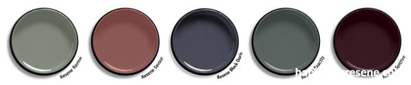
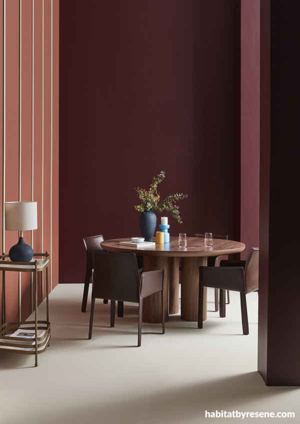
Back wall and pillars in Resene Spitfire, left wall in Resene Half Hairy Heath with trims in Resene Earthstone, floor in Resene Sugar Loaf, vase and lamp base in Resene Dark Knight and candleholders in Resene Malibu and Resene Pizza. Table, chairs and drinks trolley from Soren Liv.
Retail shops
Quietly colourful retail spaces can attract customers without overwhelming them with loud or garish hues. The right Resene colour selections can provide just the right level of stimulation that focuses attention on products by creating a backdrop that supports the hues present in the merchandise being sold. Retail spaces can integrate soft, neutral tones with hints of quiet colours in walls, display units or fixtures. A muted mustard accent wall in Resene Apache pairs well with adjacent walls in Resene Athena, pale cream shelving in Resene Solitaire, a chocolate brown like Resene Brown Pod applied to smaller furniture or accessories and a warm stain colour wash like Resene Colorwood Bask applied to timber accents.
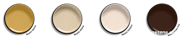
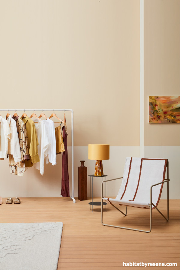
Upper walls painted in Resene Athena, lower walls in Resene Solitaire and floor stain washed in Resene Colorwood Bask. Chair from Slow Store, lamp from Faradays, rug and vase from Ligne Roset, table from Bradfords Interiors, artwork by Molly Timmins from Sanderson Contemporary.
Libraries and study spaces
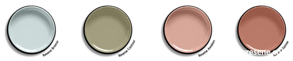
Quiet colours foster concentration and calm, making them a top choice for creating libraries that will be conducive to reading, writing and studying. Gentle tones reduce visual clutter and support mental clarity without the sterility or glare that can occur in spaces that have an excess of white walls. Soft tones also create a sense of peace, encouraging visitors to spend more time in the space. Focused areas where reading and studying will take place can benefit from muted tones like soft blues or greens like Resene Breeze or Resene Contour to create an environment conducive to focus and reflection. For more dynamic areas, such as activity zones or creative learning spaces, use gently contrasting colours such as a combination of soft peach and warm terracotta like Resene Awaken and Resene Soiree.
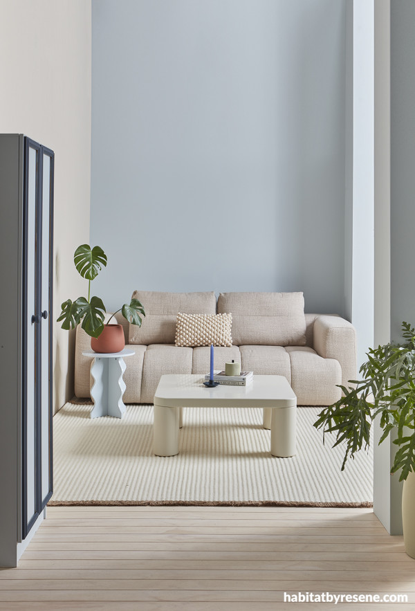
Back wall painted in Resene Breeze, left wall and pillars in Resene Sugar Loaf, flooring finished in Resene Colorwood Breathe Easy, cupboard in Resene Breeze with trim in Resene Dark Knight, planter in Resene Half Hairy Heath, candle holder in Resene Dark Knight and small container in Resene Earthstone. Couch and coffee table from Soren Liv, rug from Nodi, side table from Mocka.
Educational institutions
In educational facilities like schools and daycares, classrooms, corridors and common areas can feature soft pastels or gentle hues that foster creativity and engagement. Pastel green works well in study rooms, while soft yellows and coral tones in break areas or activity spaces stimulate energy and social interactions. Quietly colourful schemes promote a calm, safe environment that encourages focus and learning. In classrooms, pastel tones help reduce overstimulation while maintaining a cheerful, energetic vibe, making it easier for children to engage with their work.
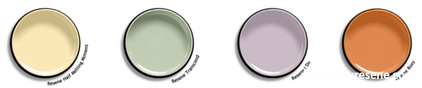
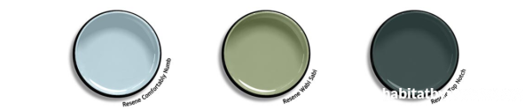
If there are younger learners, light yellow, pastel green, pale lavender or soft coral such as Resene Half Melting Moment, Resene Transcend, Resene I Do and Resene Roxy are calming yet gently stimulating options. For teens and young adults who are learning in a high school or university environment, nature-inspired green and blue tones like Resene Comfortably Numb, Resene Wabi Sabi or Resene Top Notch are more age-appropriate.
Walls and windowsill painted in Resene Solitaire, floor in Resene Top Notch, chair, side table and candleholder in Resene Bone and vase in Resene Roxy. Desk from Ligne Roset, floor lamp from Lighting Plus.
Residential homes and apartments
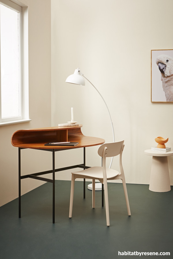
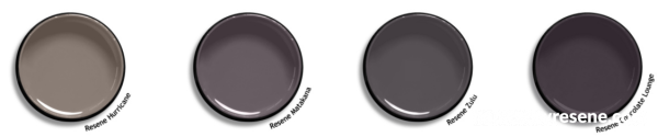
Quietly colourful residential interiors offer clients a peaceful, relaxing ambiance without feeling too cold or too vibrant. This trend also helps elevate the overall aesthetic, making a home feel curated and sophisticated without losing comfort and cosiness. Monochromatic and tonal colour palettes are ideal vehicles for implementing a quietly colourful look. Use varying shades or different strengths of the same colour to add depth and interest. Combining lighter and deeper tones of velvety violet-toned browns such as Resene Hurricane, Resene Matakana, Resene Zulu and Resene Chocolate Lounge create a cohesive and sophisticated look.
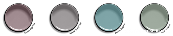
In living rooms, bedrooms or kitchens, layering subtly coloured walls, upholstery and accents like cushions, throws and rugs further adds to the warm, inviting atmosphere of a quietly colourful design. Use a chic mushroom mauve like Resene High Tea or Resene Shady Lady for the walls and ceiling to envelope a living space and a green blue like Resene Ziggurat or a muted sage such as Resene Haven to create a serene kitchen or bathroom.
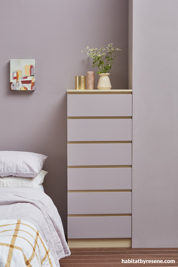
Walls painted in Resene High Tea, dresser painted in Resene Hampton with drawer fronts in Resene High Tea and floor stained in Resene Colorwood Bark. Gold candle from Ecoya, soapstone vessel from Asili, vase from Thea ceramics.
Practical tips
- Before committing to a colour, be sure to test your shortlisted Resene colours in situ whenever possible. Resene testpots can be brushed out to create a large sample which can be moved around the space throughout the day and night to observe how the colour interacts with your space’s lighting and existing materials, fixtures, hardware or décor.
- Be sure to consider your project’s lighting circumstances when selecting paint and wood stain colours that fit within the quietly colourful trend. Since many of these colours tend to shift in appearance depending on where and when they’re viewed, both natural and artificial lighting can significantly affect how a colour appears. Check to ensure your chosen Resene hues look the way you want under your project’s lighting conditions – ideally alongside your other material samples – or adjust your lighting accordingly.
For more quietly colourful Resene colour options for creating spaces that are both stylish and enduring, be sure to keep the latest Resene The Range fashion colours fandeck handy. For the latest on other emerging colour and decorating trends, check out our colour trend forecast in the most recent issue of BlackWhite magazine. If you’re not on the mailing list, you can pick up a copy at your local Resene ColorShop, read the online version or sign-up to receive future issues free.
projects Amber Armitage
images Wendy Fenwick
Published: 14 Mar 2025

