

latest
habitat tv

Say goodbye to the morning scramble for keys, coats and sunglasses and hello to this… see this and more videos
blog

Brick Bay unveils its poetic new folly for 2026
The winner of the 2026 Brick Bay Folly competition has been unveiled. Within the Wings… more
Six neutrals to turn to when your go-to white won’t do
10 Oct 2022
Every designer has a Resene white they cherish, a tried-and-tested favourite that they know they can come back to time and time again. But even the most beloved and flexible whites don’t work for every single situation. Perhaps the light is coming from the wrong direction or an existing element is a touch too greyed or too creamy for the two to sit well together. Or, your client may just want a white with a touch more pigment while still seeking something that feels neutral and ‘safe’.
In these circumstances, you’ll need to branch out. But with so many Resene whites and neutrals to choose from, it’s easy to feel overwhelmed by all the possibilities. Before you go off and stare down the wall of swatches at your local Resene ColorShop, take a look through our curated collection of reliable, heavy-hitting neutrals that are sure to become prized picks you’ll reach for again and again.
Resene Coconut Cream
While the Resene Whites and Neutrals Collection is understandably the first place many turn to when they need a neutral, there are some hidden gems peppered amongst the more pigmented Resene Multi-finish fandeck. Resene Coconut Cream is one of them. This refreshing and creamy white has a hint of green that makes it ideal to offset strong reds or oranges without having to resort to a neutral that’s too yellowed. The colour works equally well with warm green-edged blues, mustard golds and chocolate browns among many of other options, and you may find yourself surprised at how often Resene Coconut Cream becomes a contender for your colour palette. We love it teamed with Resene Bright Red, Resene Ayers Rock, Resene Jet Steam, Resene Digeridoo, Resene Dune and Resene St Kilda.
You’ll find Resene Coconut Cream on Resene Multi-finish palette R25. Order an A4 drawdown swatch online (make sure you register as a specifier and log-in to get your specifier drawdown orders free).

Wall painted in Resene Coconut Cream, floor in Resene Colorwood Dark Ebony, shelf in Resene Alert Tan, vases on top shelf in (from left to right) Resene Coconut Cream, Resene Alert Tan and Resene Dune, vases on top shelf in Resene Jet Stream, box in Resene Digeridoo, painted books in (from top) Resene Alert Tan, Resene St Kilda, Resene Bright Red, Resene Ayers Rock, Resene Dune, Resene Coconut Cream and Resene Digeridoo. ‘Le Chat Chic’ artwork by Kinfolk from Slow Store. Project by Amber Armitage, image by Wendy Fenwick.
Resene Half Sour Dough
There is no question: beige is back in vogue. Neutrals in general have been slowly but steadily warming up over the past two years, and for some, this shift away from stark and steely grey-based neutrals is a welcome one. However, if you or your client aren’t quite ready to say goodbye to grey completely, rest assured that there are ways to get the best of both worlds. A freshly-baked beige like Resene Half Sour Dough brings warmth through its soft and mellow peach undertones. But it also blends well with medium greys like Resene Half Scarpa Flow which have been the dominating neutrals of the past decade. Since neither hue is light enough to work as a highlight or dark enough to ground the scheme, be sure to bring in a deeper hue such as a chic navy blue like Resene Midnight Express and a touch of crisp white like Resene Alabaster for additional interest and to keep your palette from feeling washed out.
You’ll find Resene Half Sour Dough on Resene Multi-finish palette R57. Order an A4 drawdown swatch online (make sure you register as a specifier and log-in to get your specifier drawdown orders free).

Walls painted in Resene Half Sour Dough (left) and Resene Half Scarpa Flow (right), floor in Resene Midnight Express, vase in Resene Lucky Point and books in Resene Midnight Express and Resene Lucky Point. Chair fabric by House of Hackney. Artwork by Claire Stapleton. Slippers from La Tribe. Project by Amber Armitage, image by Wendy Fenwick.
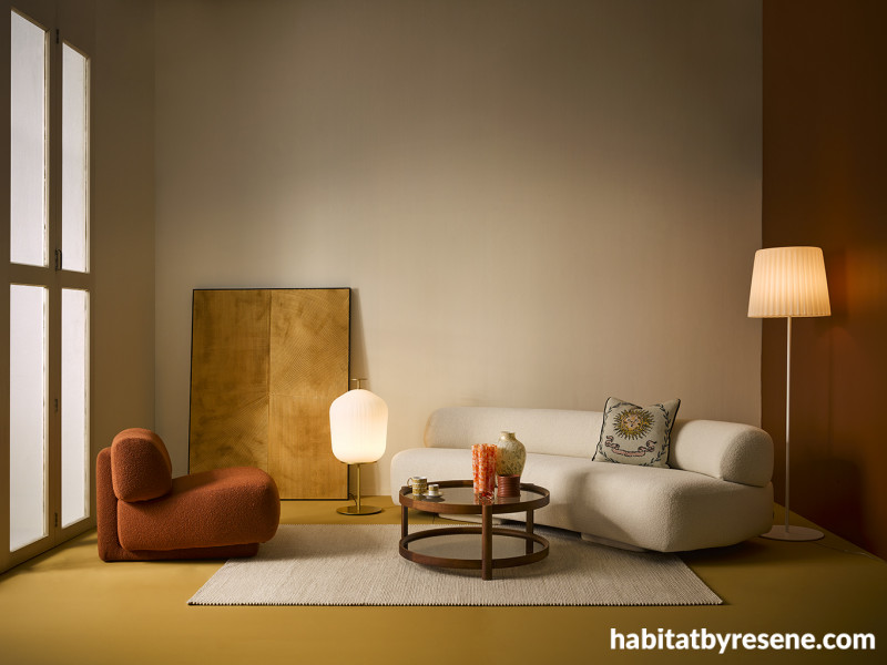
Resene China Ivory
Generously creamy, Resene China Ivory gets its elegant character from its hint of green-yellow. This surprisingly adaptive neutral looks amazing with other equally warm tones, especially as part of a throwback look. Try it with copper browns, oranges and brassy yellows as part of a 70s revival scheme. Or, try it in an 80s-inspired colour combo with pale blue-greys, pinks or yellow and a pop of lipstick rouge like Resene Bounty, Resene Pot Pourri, Resene Golden Glow and Resene Scrumptious for a completely different look.
You’ll find Resene China Ivory on Resene Multi-finish palette R25. Order an A4 drawdown swatch online (make sure you register as a specifier and log-in to get your specifier drawdown orders free).

Back wall painted in Resene China Ivory, right wall in Resene Cape Palliser, floor in Resene Teak. Sofa, armchair and brass lamp from Matisse. Artwork and tall lamp from Bradfords Interiors. Coffee table and rug from Città. Mug, espresso cup, saucer and tealight from Michael Joyce, cushion, candle, orange vase and clear vase from Faradays. Project by Amber Armitage, image by Wendy Fenwick.
Resene Bone
Blush beiges like Resene Bone are among the most comforting neutrals around. Soft and almost suede-like in appearance, it’s an ever-so-slight hint of red that brings rosy life to this cosy colour. Try it in a beachy yet contemporary bach with colourwashed timbers in Resene Colorwood Breathe Easy, Resene Be Calm, Resene Bask, Resene Shore Thing, Resene Rising Tide and Resene Shade balanced with a touch of grassy green like Resene Paddock and blue-greys like Resene Rolling Stone and Resene Mine Shaft for an easy, breezy nature-inspired vibe.
You’ll find Resene Bone on Resene Multi-finish palette R19. Order an A4 drawdown swatch online (make sure you register as a specifier and log-in to get your specifier drawdown orders free).

Wall painted in Resene Bone with tongue-and-groove panelling finished in Resene Colorwood Becalm, floor in Resene Colorwood Breathe Easy, sideboard in Resene Colorwood Bask, lamp and low platter in Resene Colorwood Shade, wooden plant pot and vase (on floor) in Resene Colorwood Shore Thing (left) and Resene Rising Tide (right), stool and painted vase (on sideboard) in Resene Paddock, faux coral in Resene Bone, painted book in Resene Brown Sugar and artwork in Resene Rolling Stone, Resene Paddock and Resene Mine Shaft. Project and artwork by Laura Lynn Johnston, image by Bryce Carleton.
Resene Copyrite
Neither a true grey nor a true taupe, Resene Copyrite is an outright chameleon that looks completely different depending on what it’s paired with. While it may not be immediately apparent (especially when looking at a small swatch), Resene Copyrite has a strong green undertone that is the key to its constantly evolving nature. From pale sky blues like Resene Solitude, warm terracotta oranges like Resene Tuscany, pale straw yellows like Resene Tussock, sun-baked browns like Resene Sienna, to ruddy reds and petal pinks like Resene Blossom, it blends beautifully with an astoundingly large portion of the colour wheel. Try it with warm-toned timber furniture stained in Resene Colorwood Walnut and blonde wood flooring finished in Resene Colorwood Whitewash to give you a solid base palette to build up from.
You’ll find Resene Copyrite on Resene Multi-finish palette R30. Order an A4 drawdown swatch online (make sure you register as a specifier and log-in to get your specifier drawdown orders free).

Wall and shelf wall painted in Resene Copyrite, timber floor in Resene Colorwood Whitewash, pendant lampshade in Resene Umber White, side table in Resene Sugar Loaf and vases, bowls and painted books in Resene Sugar Loaf, Resene Alpaca, Resene Half Rickshaw, Resene Castle Rock, Resene Tuscany, Resene Chelsea Gem and Resene Raptor. Sofa, coffee table, cushion and throw from Città, rug from Freedom. Project by Laura Lynn Johnston, image by Bryce Carleton.
Resene Triple Merino
Resene Merino has long been a popular white among designers for its fleecy, slightly greyed appearance that’s infused with warmth and comfort. However, Resene Triple Merino – which has about three times more pigment that the original – is an underrated option that brings more colour while still maintaining its lightness and neutrality. Although it may be on the cooler side, Resene Triple Merino works wonders with warm timber tones like Resene Colorwood Dark Rimu and Resene Colorwood Pickled Bean – especially when grounded with accents in sooty charcoal blacks like Resene Nero and Resene All Black and a blackened woodland green like Resene Quarter Karaka.
It is worth noting that the same theory can be applied to other popular Resene whites like Resene Spanish White, Resene Alabaster, Resene Thorndon Cream and Resene Black White. Don’t overlook their double or triple strengths variations when you need a neutral with a bit more pigment without it being overpowering. They may even become your first port of call when seeking out the right white for your next project.
You’ll find Resene Triple Merino in The Range Whites & Neutrals fandeck and palettes. Order an A4 drawdown swatch online (make sure you register as a specifier and log-in to get your specifier drawdown orders free).

Back wall painted in Resene Triple Merino, timber wall (left) and tissue box stained in Resene Colorwood Pickled Bean, tongue-and-groove wall (right) in Resene Quarter Karaka, shelves in Resene Settlement, floor stained in Resene Colorwood Dark Rimu, desk in Resene Enamacryl gloss tinted to Resene All Black, vases in Resene Nero, Resene Karaka and Resene Half Blanc and tray table in Resene Teak. Project by Kate Alexander, image by Bryce Carleton.
Still on the lookout for the right neutral? Check out the Resene The Range Whites & Neutrals collection or the Resene Top 20 tints for other popular picks. And as always, be sure to test your colours in-situ (when possible) before you commit. If you’re working on a new build and won’t be able to see your chosen colours on site before they need to be specified, it’s best to at least order A4 drawdown swatches of those you’re planning to build your palette out of so that they can be viewed together at a larger scale and you and your client can be more confident with the colour selections.
Published: 10 Oct 2022

