
latest
habitat tv

Say goodbye to the morning scramble for keys, coats and sunglasses and hello to this… see this and more videos
blog

Reader roundup: A whimsical shed, blushing doors and exterior refreshes
We’ve got a great roundup of projects from our readers this month. From community paint… more
 look book
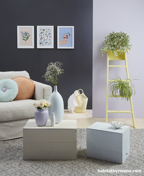
Lilac is fun because it’s slightly unexpected. Not as boyish as blue and a lot less saccharine than pink, mix a light lilac with other pretty pastels for a Scandi look. For balance, keep the rest of the room neutral with varying depths of greys and keep timber flooring light in Resene Colorwood Whitewash. Wall at left in Resene Nocturnal, wall at right in Resene Poet, smaller vase in Resene Poet, large vase and smaller coffee table in Resene Cut Glass, ladder in Resene Moonbeam and larger coffee table in Resene Sazerac. Props: Arlo Round Mint Cushion from Adairs and Kip & Co Velvet Pea Cushion in Peach from Good Thing. Project by Kate Alexander, images by Bryce Carleton.

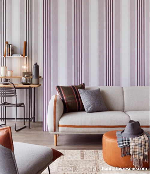
Partner a feature wall with neutrals for a room that has both drama and restfulness. Take the strong lines from Resene Wallpaper Collection E377102 and echo them throughout your space with other linear, angular and rectilinear shapes. Go for timber flooring in Resene Colorwood Light Greywash, a sofa in Resene Truffle and add an ottoman and accents in Resene Twizel.

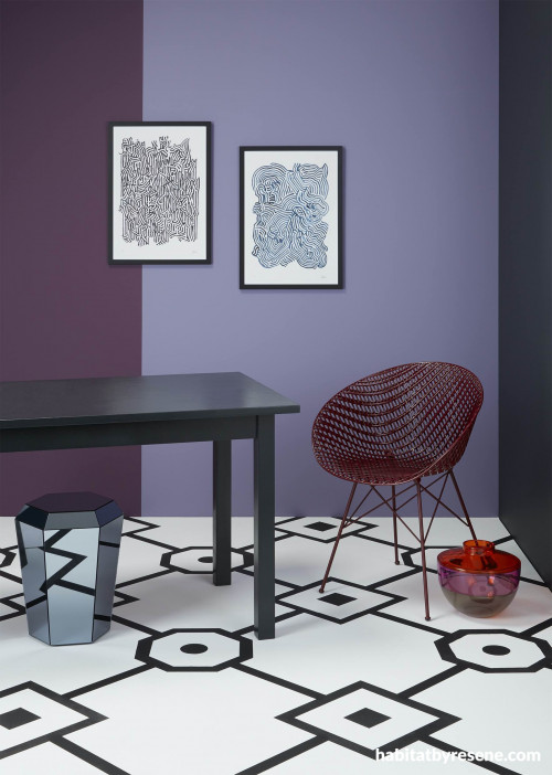
The muted violet Resene RSVP on the left and dusty mauve Resene Memory Lane on the right of the back wall gives a sense of exclusivity to the space, creating a luxe backdrop for parties to take place. The left wall in classic Resene Noir generates even more moodiness while the floor, which was first painted in fizzy warm white Resene Elderflower, keeps the room from feeling too dark or heavy. For added interest, it has been dressed up with a sophisticated geometric pattern painted in Resene Black. The dining table has been painted in high-gloss Resene Enamacryl tinted to Resene Blackjack. As a softer black, it brings a subtle point of difference to the other shades of black in the space while still maintaining its connectiveness to the palette. Other shiny surfaces, such as the mirrored stool and the vases, work alongside the glossy finish of the table to reflect light around the room – an element that is especially important for a space with darker wall colours. Table/stool from BoConcept, Wake Me When I'm Dead by Milly Watson from endemicworld, Kupang Motel by Milly Watson from endemicworld, Vase from Backhouse, dining room table (painted in Resene Blackjack) and chair from Backhouse. Project by Kate Alexander, imageby Bryce Carleton.

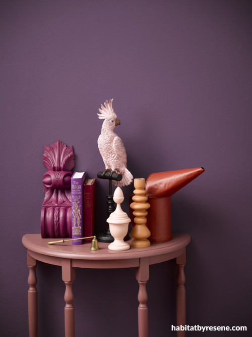
Despite this deep purple being a strong colour, it is surprisingly adaptable. However, if it’s your first time trying out a striking shade, a good rule of thumb is to stick to the same part of the colour wheel and add-on less-vibrant layers until you reach the right intensity. In this room, the Resene Couture wall has been layered with accessories in a range of pinks, plums and fuchsias including Resene Ringo, Resene Dawn Chorus, Resene Stetson and Resene Vanilla Ice. To mix it up and keep things from looking too tone-on-tone, the designer has incorporated a candlestick in Resene Entourage, an antique gas canister in Resene Pioneer Red and painted the bird’s perch in Resene NeroProject by Kate Alexander, image by Melanie Jenkins

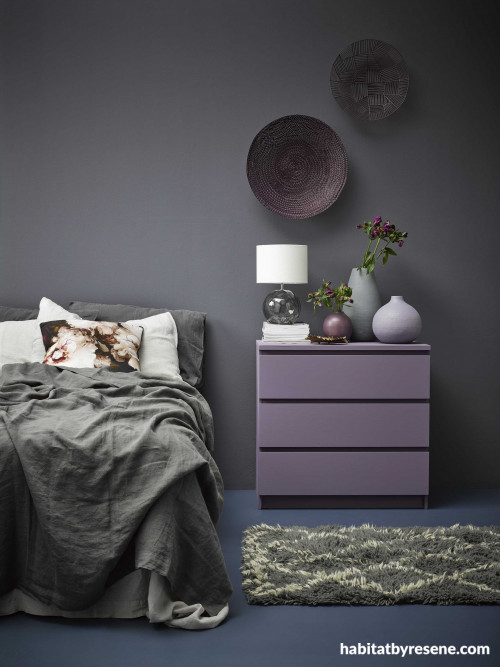
Luscious, bruised purples make this bedroom a cosy, cocooning space. The walls are in Resene Gun Powder, the chest of drawers is Resene Chapta And Verse, the vases are in Resene Steam Roller (tall), Resene Mamba (medium) and Resene Couture and the wall hangings are Resene Couture and Resene Sumptuous. The wall colour is charcoal with just a touch of purple, which keeps it from being overpowering. The floor colour is an unexpected colour choice. To stop the room from being too matchy-matchy, the floor is an inky blue – Resene Avalanche. It’s what the experts call a ‘related’ scheme where you choose colours next to each other on the colour wheel. Project by Claudia Kozub, image by Melanie Jenkins.

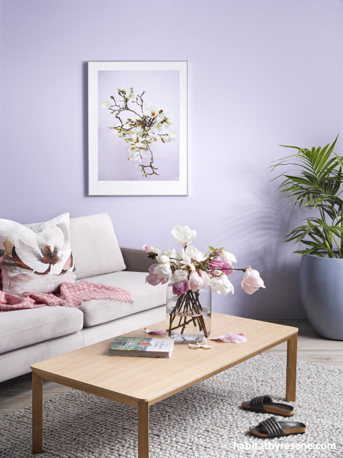
Resene Whimsical is a pastel lilac, a fanciful dreamy colour. Try Resene Whimsical with chilled whites, velvet mauves or fuchsia pinks, such as Resene Poured Milk, Resene Memory Lane, or Resene Smitten. Wall in Resene Whimsical, large pot painted in Resene Excalibur, Hugo sofa from Contempa, coffee table, Citta. Rug Nodi rugs Magnolia cushion fabric in copper, James Dunlop Textiles. Blush Magnolia print, Amber Armitage, wool throw and vase, Citta and Cut Flower Garden book, Father Rabbit. Project Amber Armitage, image Melanie Jenkins.

In the purple – shades of mauve, lilac and aubergine are frontrunners in 2022
Whether your pick is a full-on purple or more of a neutral undertone, it’s easy to find a purple to suit your personality and home. Purple is a bold and brave colour, the colour of royalty, luxury and glamour. Yet in its many variations and shades of mauve and lilac, it can be ethereal and atmospheric. Even a quick glance at the range of purples Resene has on offer will show you how rich and varied the tones can be – no need to be wary of this rich and rewarding colour palette.
A new millennial

Lilac is fun because it’s slightly unexpected. Not as boyish as blue and a lot less saccharine than pink, mix a light lilac with other pretty pastels for a Scandi look. For balance, keep the rest of the room neutral with varying depths of greys and keep timber flooring light in Resene Colorwood Whitewash. Wall at left in Resene Nocturnal, wall at right in Resene Poet, smaller vase in Resene Poet, large vase and smaller coffee table in Resene Cut Glass, ladder in Resene Moonbeam and larger coffee table in Resene Sazerac. Props: Arlo Round Mint Cushion from Adairs and Kip & Co Velvet Pea Cushion in Peach from Good Thing. Project by Kate Alexander, images by Bryce Carleton.
‘Millennial pink’ has been upstaged after ruling for nearly a decade. Lilac or ‘millennial purple’ is a colour trend that has emerged from the sunset pinks that have been so popular during recent years. And who can be surprised? According to colour psychology, lavender and lilac are known for supporting healing and creating soothing environments for troubled minds. They stand for calm, renewal and joyful pursuits, and make you feel pretty and light-hearted. Hues like Resene Poet, Resene Santas Grey and Resene I Do are soft and subtle.

Classical studies
Partner a feature wall with neutrals for a room that has both drama and restfulness. Take the strong lines from Resene Wallpaper Collection E377102 and echo them throughout your space with other linear, angular and rectilinear shapes. Go for timber flooring in Resene Colorwood Light Greywash, a sofa in Resene Truffle and add an ottoman and accents in Resene Twizel.
Wallpaper can add another level to your textural palette, and there are plenty of Resene wallpaper choices in the purple to lavender and burgundy range. To avoid it being too overpowering use wallpaper on a feature wall and for balance, go for adjacent walls and the ceiling in Resene Half Sea Fog, a floor in Resene Whiteout and bring in a few small accessories in Resene Foundry and Resene Apple Blossom to pick up the detail colours in the wallpaper design.
Putting on the glitz

The muted violet Resene RSVP on the left and dusty mauve Resene Memory Lane on the right of the back wall gives a sense of exclusivity to the space, creating a luxe backdrop for parties to take place. The left wall in classic Resene Noir generates even more moodiness while the floor, which was first painted in fizzy warm white Resene Elderflower, keeps the room from feeling too dark or heavy. For added interest, it has been dressed up with a sophisticated geometric pattern painted in Resene Black. The dining table has been painted in high-gloss Resene Enamacryl tinted to Resene Blackjack. As a softer black, it brings a subtle point of difference to the other shades of black in the space while still maintaining its connectiveness to the palette. Other shiny surfaces, such as the mirrored stool and the vases, work alongside the glossy finish of the table to reflect light around the room – an element that is especially important for a space with darker wall colours. Table/stool from BoConcept, Wake Me When I'm Dead by Milly Watson from endemicworld, Kupang Motel by Milly Watson from endemicworld, Vase from Backhouse, dining room table (painted in Resene Blackjack) and chair from Backhouse. Project by Kate Alexander, imageby Bryce Carleton.
Purple is the pick if you’re after a little glitz and glam. A rich violet like Resene RSVP or a dusty mauve like Resene Memory Lane will uplift any room and add a Hollywood-glam vibe to the whole milieu.
Bold and beautiful

Despite this deep purple being a strong colour, it is surprisingly adaptable. However, if it’s your first time trying out a striking shade, a good rule of thumb is to stick to the same part of the colour wheel and add-on less-vibrant layers until you reach the right intensity. In this room, the Resene Couture wall has been layered with accessories in a range of pinks, plums and fuchsias including Resene Ringo, Resene Dawn Chorus, Resene Stetson and Resene Vanilla Ice. To mix it up and keep things from looking too tone-on-tone, the designer has incorporated a candlestick in Resene Entourage, an antique gas canister in Resene Pioneer Red and painted the bird’s perch in Resene NeroProject by Kate Alexander, image by Melanie Jenkins
Brights and bolds may be just the thing you need to inject some life into your space. One of the main reasons people typically opt for inoffensive shades like white, cream, grey and taupe is just that – to avoid offense. But often enough, this ‘chromatic-evasion’ results in spaces so sterile that they skip right over fresh, contemporary and clean and end up feeling vast, bare and bland instead. If your space is giving off more drab than drama, a healthy dose of colour might be just what the doctor ordered.
Lilac fantastic
In its lightest hue lilac can have a muted look much like an off-white and can become the neutral tone when styling, making it a shade that can be used in almost any setting, and lends itself to many moods. Try Resene Dreamtime and for a shade that heads towards the greys, but partners well, Resene Grey Friars.

Resene Whimsical is a pastel lilac, a fanciful dreamy colour. Try Resene Whimsical with chilled whites, velvet mauves or fuchsia pinks, such as Resene Poured Milk, Resene Memory Lane, or Resene Smitten. Wall in Resene Whimsical, large pot painted in Resene Excalibur, Hugo sofa from Contempa, coffee table, Citta. Rug Nodi rugs Magnolia cushion fabric in copper, James Dunlop Textiles. Blush Magnolia print, Amber Armitage, wool throw and vase, Citta and Cut Flower Garden book, Father Rabbit. Project Amber Armitage, image Melanie Jenkins.

Luscious, bruised purples make this bedroom a cosy, cocooning space. The walls are in Resene Gun Powder, the chest of drawers is Resene Chapta And Verse, the vases are in Resene Steam Roller (tall), Resene Mamba (medium) and Resene Couture and the wall hangings are Resene Couture and Resene Sumptuous. The wall colour is charcoal with just a touch of purple, which keeps it from being overpowering. The floor colour is an unexpected colour choice. To stop the room from being too matchy-matchy, the floor is an inky blue – Resene Avalanche. It’s what the experts call a ‘related’ scheme where you choose colours next to each other on the colour wheel. Project by Claudia Kozub, image by Melanie Jenkins.
Purple is a rich addition to any colour scheme – and it has many shades, ripe for the picking.
Top tip: Resene SpaceCote Flat is a matte paint that’s perfect for master bedrooms. For higher wear and tear areas like living rooms and children’s bedrooms, choose Resene SpaceCote Low Sheen. The enamel style durability of both products means they are durable and easy to wipe clean.
Published: 26 Jan 2022
Do you have a home full of wonderful Resene paint and colour? Send us some snaps by emailing [email protected].
the look
If you're stuck on what
colour to use or need colour
advice, try out the Resene
Ask a Colour Expert service.
more inspiration

Create a complementary colour palette worthy of compliments
If you can remember back to your days in primary… more

Tuck into this beautiful bedroom painted in Resene Dreamtime
This elegant yet relaxed bedroom is the master in a… more

For some, the love of rattan was left in the… more

On trend: tone on tone goes dark
There was a time when a ‘tonal’ scheme was all… more

Purple is one of those colours that we can't seem to get… more
the look
If you're stuck on what
colour to use or need colour
advice, try out the Resene
Ask a Colour Expert service.

